Benchmarking your data visualizations is an excellent way to convey an important
factor in your graphs, what the numbers should look like, and how they fare
in comparison to that number. Helpful in showing outliers like how something is over-
or under-performing, or showing how perfect fit a value is towards some specified goal
benchmarks are a powerful tool that can be added to most graphs.
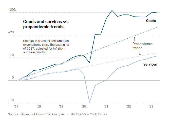
To show you an example, the following graph tracks goods and services pre-
and post-pandemic.
https://www.nytimes.com/2023/07/27/business/economy/us-economy-gdp-q2.html
It is easy to see the strengths of the trend lines as a way to measure the expected
values for the services and goods and how they compare to the trendlines before and
after the pandemic.
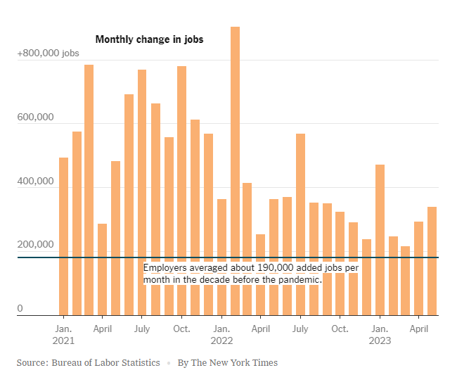
The following graph makes use of a perfectly horizontal benchmark line. This makes
reading the graph even easier than trend lines as being able to reference the single
value of the benchmark reduces user effort.
https://www.nytimes.com/2023/06/08/business/economy/us-economy-inflation-fed.html
The anomaly of the employment boom following the pandemic is immediately apparent with this example, highlighting the clarity that benchmarking provides.
Finally, this benchmark is just an average of the values in the graph. While not as
easy to interpret as the other methods, this one is a near-universal improvement that
can be made to any graph.
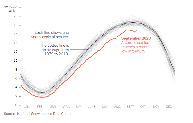
https://www.nytimes.com/2023/10/04/climate/antarctic-sea-ice-record-low.html?searchResultPosition=4
This post was very informative and I like that you added links to your data sources to add context to your post. The post was clear and did a really good job explaining the benchmark graphs’ capabilities. A recommendation would be to break up your post with subheadings so it breaks up the reading a little bit.
The graphs you chose to show benchmarking are great. I especially like the first one. The trend line shows what forecasted demand would look like as a benchmark. The variance of actual demand during the pandemic was way off the projected trend. The second story in the graph is how over time most things will trend back to normal.
I agree that benchmarking provides clarity. If they keep tracking this data, we will have more understanding of how certain events affect many aspects of our lives and what things tend to “normalize” over time, like economic conditions, or skew further from the norm, like climate conditions.
Do you think that graphs like these can help people to understand what intensity interventions, if any, are necessary?
This is a good post that offers an abundance of examples of different kinds of benchmark graphs. Furthermore you did a great job at citing each one as well, in case the reader wanted to see the graph from the original source themselves. One simple suggestion that I would make would be to make it very clear where the description for one graph ends and where it begins, either by creating more space between each section or color coding each are. With that being said, I really like the pandemic bar graph. Out of the 3 which graph is your favorite?