By Ryan Metch
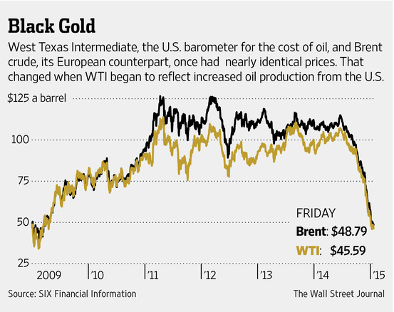
Using visualizations such as benchmark graphs allows us to better understand different types of data. The definition of a benchmark graph according to google is a visual tool that shows how fractions compare to a whole on a number line. Going off this graph from the Wall Street Journal, we can see how prices of European and American oil compare to one another. We can clearly see when changes occur on this graph, which is why a benchmark graph is a great tool to display this type of data.