Insightful data visualization comparison: Statista Chart
Statista.com is an excellent infographic source with exceptional examples of how data research and the art of digital design merge to tell a story. For this week’s blog post I will be sharing several examples of infographics I found to be interesting.
Many individuals, myself included, may fear the thought of wading or swimming through waters containing sharks. However scary this may seem; sharks are not the bloodthirsty and ravenous creatures they are depicted as in the media. Statista’s infographics on data pertaining to shark attacks does an excellent job at backing up this claim, as the numbers speak for themselves. The information sourced for both of the following infographics was obtained from the Florida Museum of Natural History located at the University of Florida.
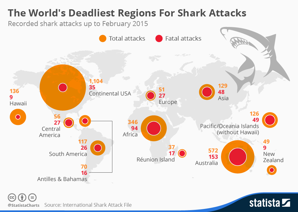
Chart: The World’s Deadliest Regions For Shark Attacks | Statista
The first excellent thing about this infographic that I noticed, is how quickly a few stories or interpretations may be picked up upon viewing this chart and the numbers. The concentrations of the total attacks are greater in the continental USA, Australia, and Africa. This sheds light upon which regions of the world contain the most concentrations of individuals swimming in large bodies of water. Additionally, by providing the total attacks versus the fatal attacks via a circle with increasing area within another, more interpretations may be derived. Do some of these regions have geographical constraints inhibiting healthcare providers from responding quick enough to attacks? Or are there different species resulting in different severity of the ultimate damage from these attacks across different regions? I also felt that the placement and scale of the circles atop the world map was strategically smart. By scaling the circles area roughly in unison with total attacks directly above the associated region, one can easier visualize where the most attacks were occurring.
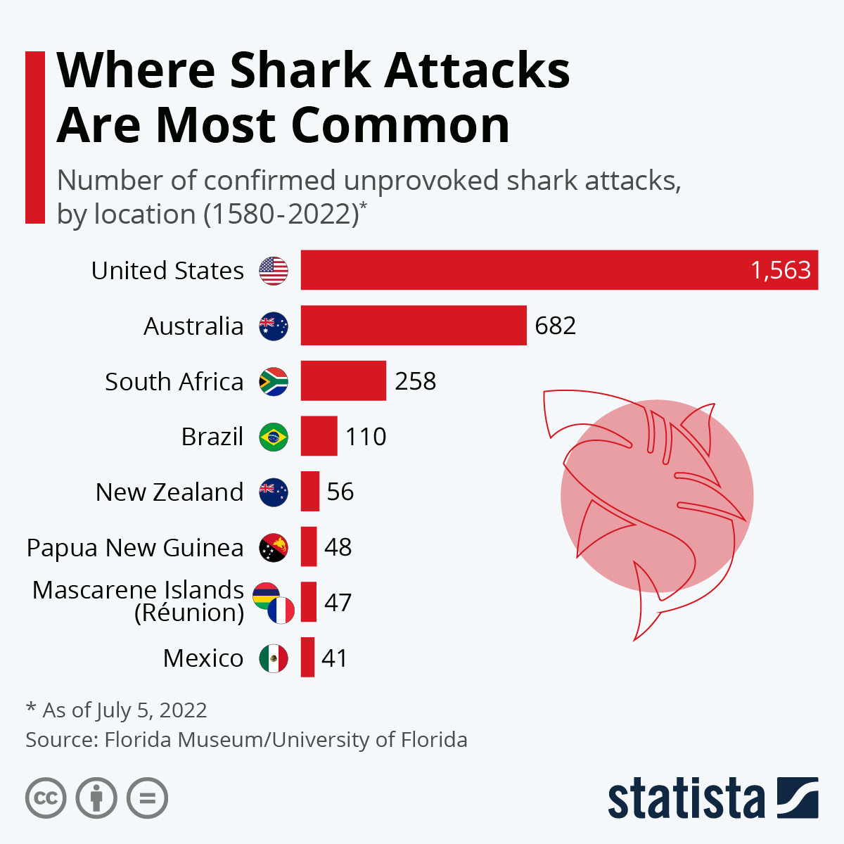
Chart: The World’s Shark Attack Hotspots | Statista
This chart provides an interesting and efficient addition with a miniature frame of each country’s flag, allowing the viewer quick association of the shark attacks per country. An interesting observation from the last infographic to this one, is how the number of sharks attacks has significantly increased in the last 7 years in the United States.
Sources:
McCarthy, N. (2015, May 25). Infographic: The World’s Deadliest Regions For Shark Attacks. Statista Infographics. https://www.statista.com/chart/3590/the-worlds-deadliest-regions-for-shark-attacks/
Armstrong, M. (2022, July 5). Infographic: The World’s Shark Attack Hotspots. Statista Infographics. https://www.statista.com/chart/8272/the-worlds-shark-attack-hotspots/