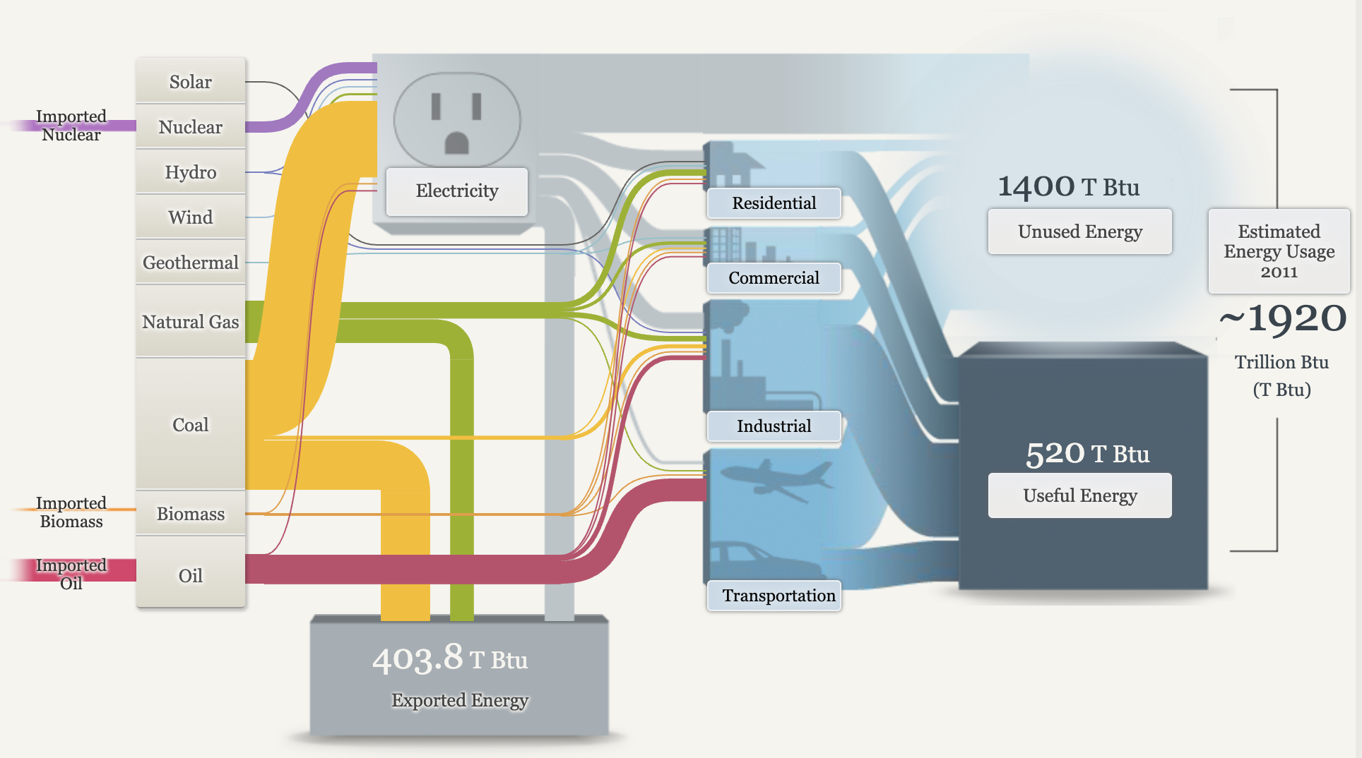
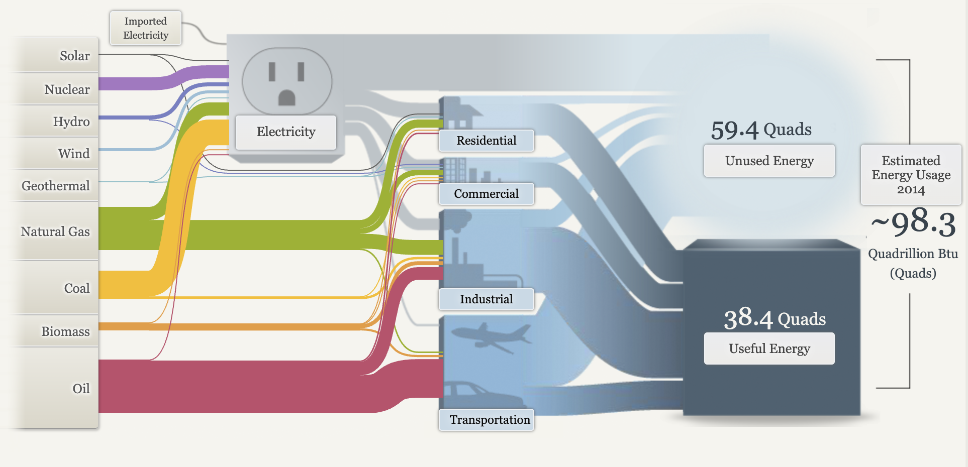
Sankey visualizations are a specialized form of flow diagram that provide a powerful means of illustrating the movement of resources, energy, or information across various entities or stages within a system. Named after the Irish engineer Matthew Sankey, who first used this type of diagram in the late 19th century to depict energy flows, Sankey diagrams have since evolved into a versatile tool applicable in numerous fields.
One of the defining features of Sankey visualizations is their use of arrows whose widths are proportional to the magnitude of the flow they represent. This visual representation allows viewers to quickly grasp the relative sizes of different flows, making it easier to identify significant relationships and distributions within complex systems. For instance, in an energy management context, a Sankey diagram can effectively illustrate how energy is generated, consumed, and lost across various processes, providing insights into efficiency and areas for improvement.

After viewing the data provided by the Sankey visuals, there is plenty of data about energy consumption we can gather from them. The United States imports a small amount of its electricity from Canada and Mexico, mainly from hydroelectric power and fossil fuels. Electricity is called secondary energy as it is generated from primary sources like coal, natural gas, and nuclear power, accounting for about 39% of total U. S. energy supply. In 2015, residential energy use was 21% of total consumption, with major uses being space heating, water heating, space cooling, and lighting. The commercial sector, including offices and stores, consumed 18% of energy, primarily for heating and lighting. The industrial sector used 32% of energy, focusing on energy-intensive industries like refining and paper production. The transportation sector, dominated by oil, consumed 28% of energy to move people and goods.
There are opportunities to improve energy efficiency, though some energy loss as heat is unavoidable. Useful energy refers to the energy that effectively performs tasks like moving a vehicle or heating a space. The total energy consumption in the U. S. is immense, measured in quadrillions of British thermal units (quads), with one quad equal to the annual energy use of a city the size of Chicago.

After learning about Sankey visualizations and the data being represented, I do feel that they are the right visual choice for this data. Sankey visualizations are effective for illustrating data on energy consumption due to their ability to clearly represent the flow of energy between different sources and uses. By employing proportional arrows, these diagrams facilitate an intuitive understanding of how energy is distributed and consumed, allowing for easy identification of trends and inefficiencies. This visual format enhances the comprehension of complex data, making it accessible for analysis and decision-making.