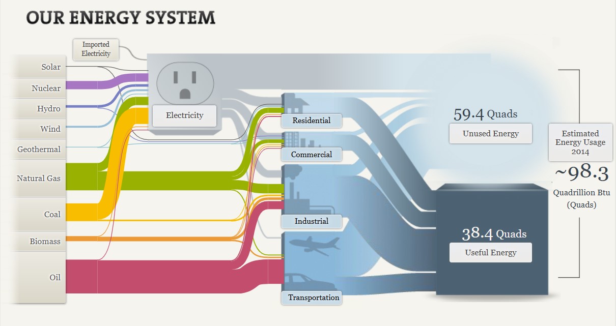
The National Academies’ interactive feature, “Our Energy System,” offers a comprehensive overview of the United States’ energy production, distribution, and consumption. Central to this presentation is a Sankey diagram, which visually represents the flow of energy from its sources through various sectors to its end uses.
Sankey diagrams are effective for illustrating the flow of resources, highlighting the proportions and pathways from origin to destination. In this context, the diagram delineates how energy from sources like coal, natural gas, nuclear, and renewables is allocated across sectors such as residential, commercial, industrial, and transportation. The width of each arrow corresponds to the quantity of energy, providing an immediate sense of scale and distribution.
Displayed below is a screenshot of the Sankey visualization created by The National Academy of Sciences which depicts the different avenues of energy production and use for the nation.

There are many strengths to this visualization. Not only does it provide clarity through succinct conveyance of complex energy flows, it provides both proportional representation and a comprehensive overview. The varying widths of the arrows effectively depict the relative contributions of different energy sources and their utilization, providing a visual proportional representation. By encompassing the entire energy system, the diagram facilitates an understanding of the interconnectedness of energy production and consumption.

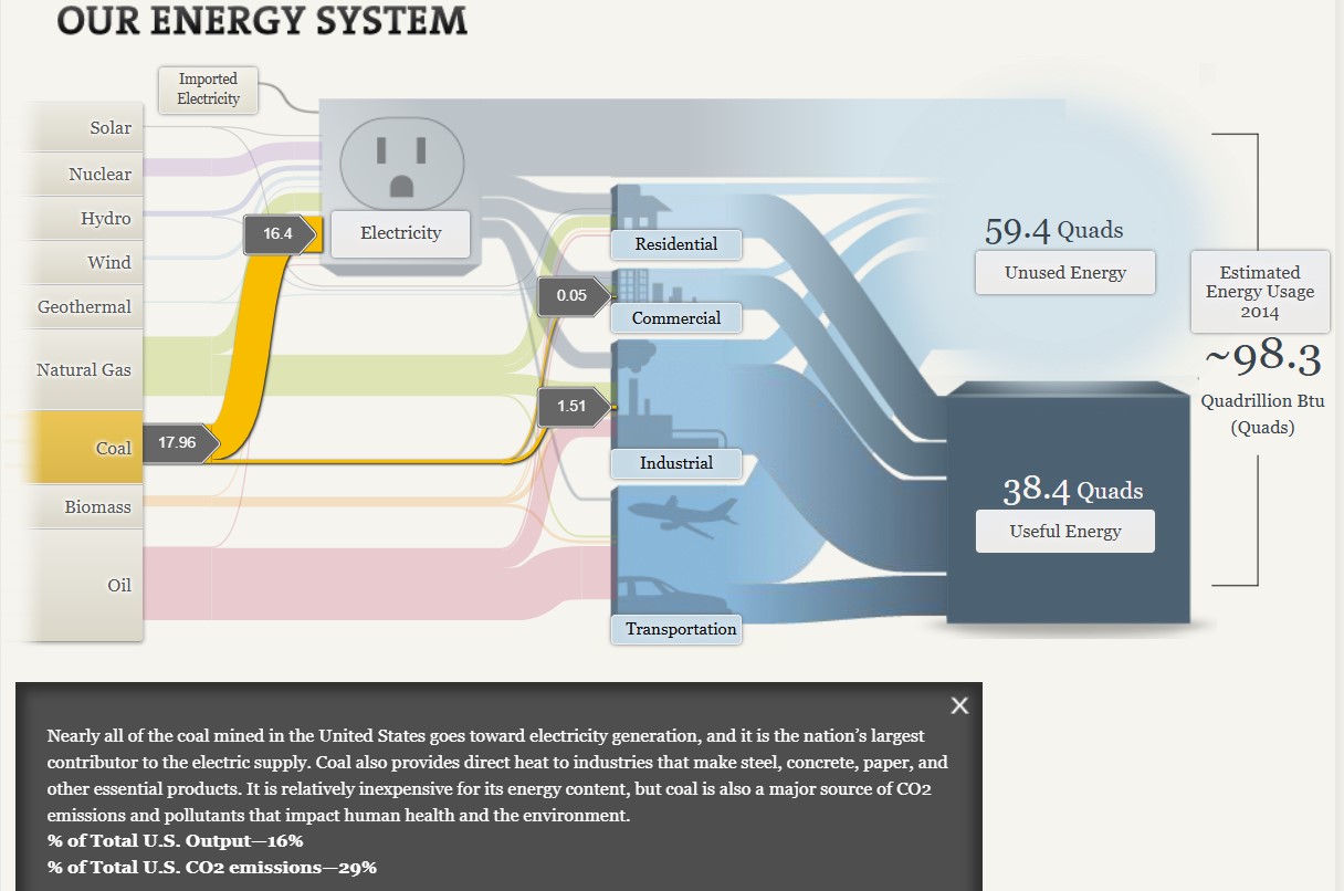
Additionally, the visualization is highly interactive, allowing users to click on different aspects of the graphic to see more information. As seen above, when selecting the coal energy source, it is highlighted in the graph and additional information is provided to the viewer. This capability allows the viewer to focus on one section of the graph at a time, as the visualization as a whole can become overwhelming with all off the details equally highlighted at once.
Interactivity also helps to more clearly explain details of the graph to the viewer. Having already viewed the section on coal, I clicked on the natural gas tab within the graph. Although the width of the coal and natural gas lines are visually similar, when you click on these sections separately you are given information about the output percentages of each of these types of energy. By viewing this information, I learned that while coal makes up 16% of the total U.S. output while natural gas makes up 29%.

The Sankey diagram on the National Academies’ “Our Energy System” page serves as a valuable tool for visualizing the complexities of energy flows in the United States. I believe that while there are multiple benefits to this type of graph when displaying data such as this, the interactivity of the graph is one of the most important aspects.