Overview of the Sankey Diagram
The Sankey diagram effectively illustrates the complex relationships between various energy sources and their end-use applications. It shows how energy flows from primary sources (like fossil fuels, nuclear, and renewables) to different sectors, including residential, commercial, industrial, and transportation.
Key Findings
Energy Flow Representation:
The diagram visualizes both useful and unused energy, highlighting that a significant portion (~59.4 Quads) is wasted, primarily as heat. This effectively communicates the inefficiencies in our energy system.
Interactive Features:
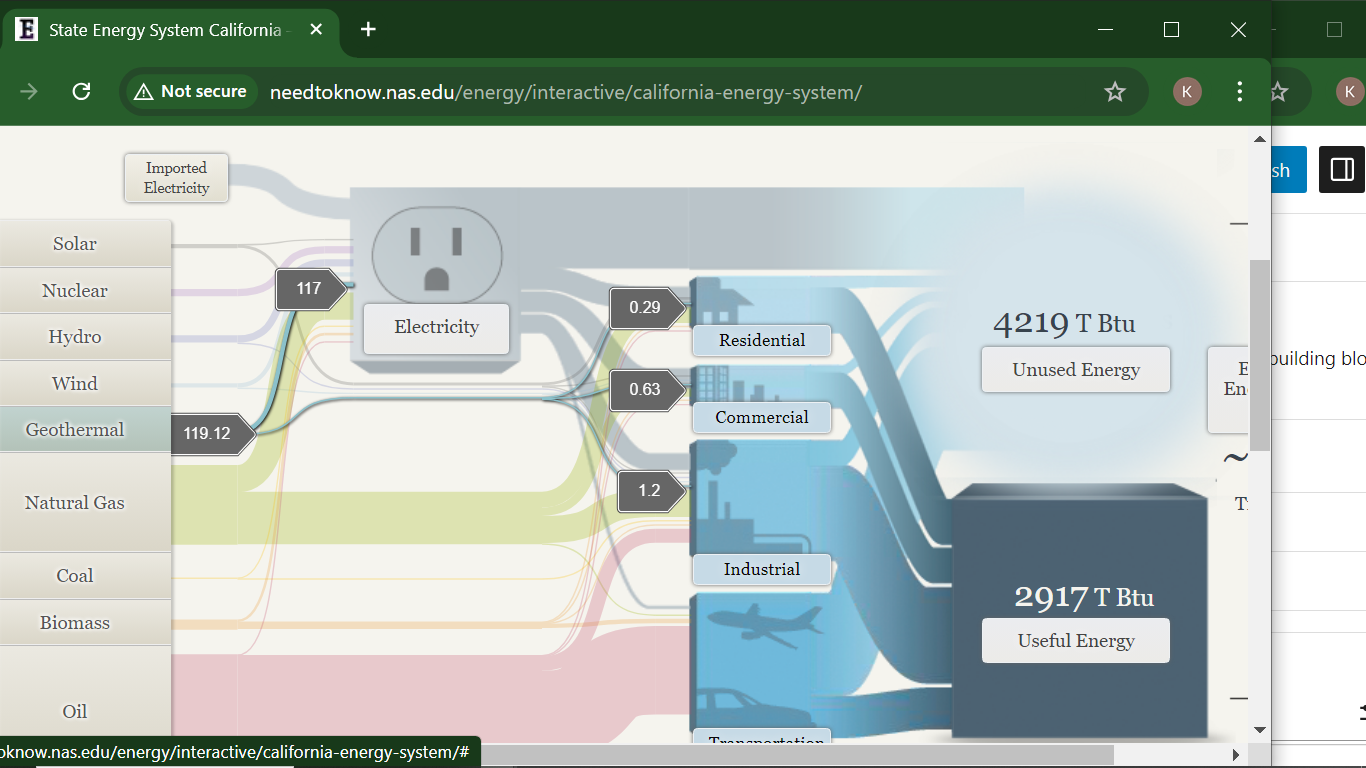
Users can click on different energy sources (e.g., solar, wind, hydro) to see detailed information and visualize their contribution to useful and unused energy. This interactivity enhances engagement and allows users to explore specific data points more thoroughly.
Comparative Analysis:
The representation of renewables alongside traditional fossil fuels on a similar basis helps demystify their efficiency relative to conventional energy sources. This is a strong point of the visualization, as it underscores the role of renewables in a comparable framework.
End-Use Efficiency: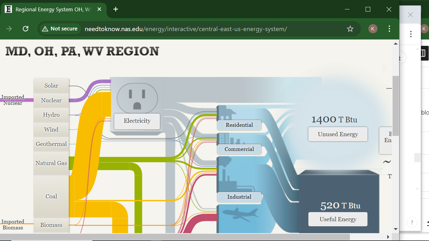
The efficiency metrics provided for various sectors (65% for residential and commercial, 80% for industrial, and 21% for transportation) are crucial for understanding where improvements are needed. However, the stark contrast between the transportation sector and others raises questions about potential reforms.
Critique of the Sankey Visualization
While the Sankey diagram is effective, there are areas for improvement:
Complexity:
For some users, the complexity of the diagram might be overwhelming. Simplifying the design or providing a guided walkthrough could enhance comprehension, especially for those unfamiliar with energy systems.
Static vs. Dynamic Data:
The diagram focuses on 2014 data, which may not reflect current trends. Regular updates or an option to view historical data trends could provide deeper insights into how energy usage patterns have evolved over time.
Alternative Visualizations:
Other visualization methods, such as bar graphs or pie charts, could complement the Sankey diagram by providing quick visual cues about the proportions of different energy sources or waste versus useful energy. This could help in communicating key takeaways at a glance.
Narrative Context:
The addition of narrative context or case studies could help users understand the implications of the data. For example, linking specific energy sources to current policy discussions or technological advancements would enrich the learning experience.
Conclusion
The Sankey diagram on the website serves as a powerful tool for visualizing the energy flow in the U.S. It successfully highlights the interplay between energy sources and their efficiency. However, incorporating user-friendly features, updating data, and using supplementary visualizations could enhance its effectiveness and accessibility. As the energy landscape evolves, such tools will be vital for educating the public about energy use and efficiency.