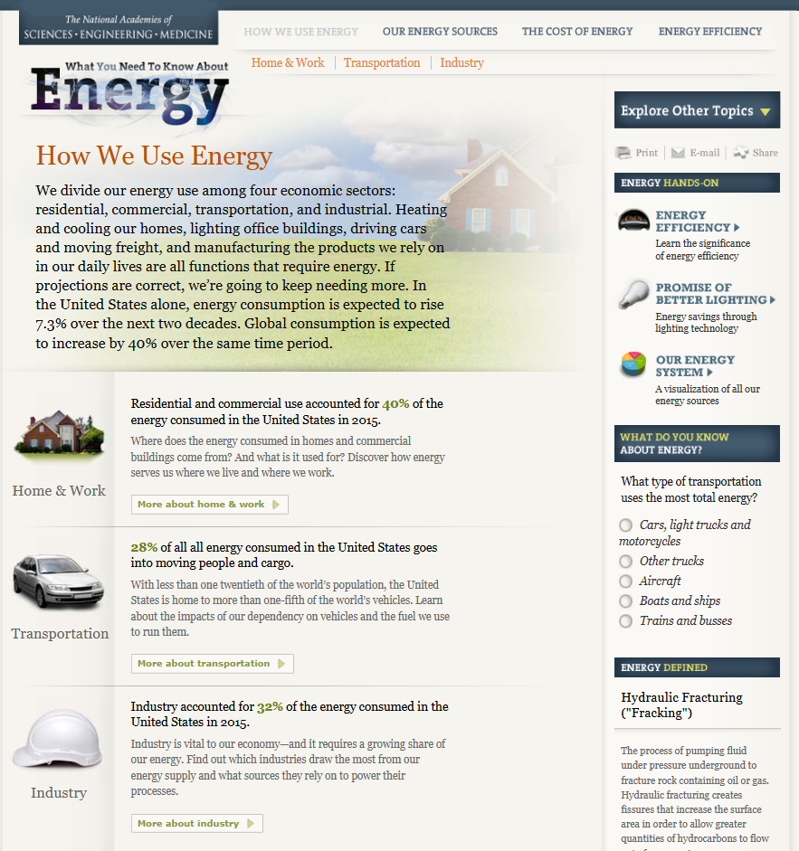
After reviewing the blog titled “What You Need To Know About Energy” (http://needtoknow.nas.edu/energy/energy-use/) i really enjoyed how the information is presented and how the site is laid out. At the top of the page we have four main navigation buttons that give the broad topic about what that page is going to cover. Within that page the data is broken down into other sub topics based on the main topic. Each sub topic has a small blurb about it and uses colors and a slightly larger text to highlight key points of the sub topic. I had no idea how much our energy consumption affects things such as security and the different energy generation forms we can use to create energy.

If you click on the sub topic you will get a more in depth explanation about it and reveals any charts used to represent the data.

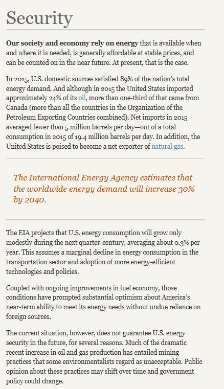
While this seems to be more of a professional setting and display of data I believe the author could have used more visuals and less text to more efficiently display the various statistics referenced throughout the blog. For example this page does not have any visual representation. Rather then writing about the international energy estimates the author could have used a single large number or even a donut or pie chart with a large percentile and contrasting color to highlight the significances of this estimate and what it means specifically for our security in this instance.
