Tools that may help us construct visualizations that compare numbers.
Some tools that will help us compare numbers are graphs. Like pie graphs, bar graphs, scatter plots, line charts, histograms, etc. Many other types of structures will help us to compare numbers or data. However, I am mainly focusing on bar graphs and pie graphs. Bar charts or bar graphs represent categorical data using rectangular bars whose lengths or heights correspond to the values they represent. Vertical or horizontal bars can be plotted. Vertical bar charts are also known as column charts. A pie chart illustrates numerical proportions by dividing a circle into slices. Pie charts represent quantities by arcs whose lengths are proportional to their width. Also, another tool you can use is called Tableau. This service offers several options, including a desktop application, a server version, and a hosted version, as well as a free public version. CSV files, Google Adwords and Analytics data, Salesforce data, and many other data import options are available. A variety of chart formats and mapping capabilities are available as output options. As a result, designers can create color-coded maps that showcase geographically relevant data in a format that’s much easier to understand than a table or chart. Anyone looking for a powerful tool to create data visualizations that can be used in a variety of settings can use Tableau’s free public version. Whether you are a journalist or a political junkie or just want to quantify your data, Tableau Public can be used by anyone. They have a large gallery of infographics and visualizations created with the public version that can be used as inspiration for your own. In addition to creating charts and graphs, Tableau lets you create maps. If you want to create visualizations that are accessible to the public, Tableau Public is a great tool to use.
An Example from Tableau
TV’s Sci-Fi DataVerse by Heather Cox

Data Visualizations for Comparing Numbers
Data visualizations are powerful tools that help convey complex numerical information in a clear and accessible manner. Various types of visualizations can effectively compare numerical data, each serving different purposes and audiences.
Bar charts are one of the most common forms of data visualization used to compare quantities across different categories. Each bar represents a category, and the length or height of the bar corresponds to the value it represents. This makes it easy to see which categories have higher or lower values at a glance.
Line graphs are particularly useful for comparing numerical data over time. By plotting data points on a graph and connecting them with lines, viewers can easily observe trends, patterns, and fluctuations in the data. This is especially effective for time series data, such as stock prices or temperature changes.
Scatter plots display values for two different variables for a set of data. Each point on the plot represents an observation, allowing viewers to see relationships, correlations, or clusters within the data. This type of visualization is particularly useful for identifying trends and outliers. A great video that goes in depth on how to make these plots can be found at https://www.youtube.com/watch?v=Vyg9qmBsgAc&t=2s.
While often criticized for their limitations, pie charts can be effective for showing the proportion of a whole. Each slice of the pie represents a category’s contribution to the total, making it easy to compare relative sizes. However, they are best used when there are a limited number of categories.
In conclusion, the process of selecting the right data visualization is not merely a technical decision; it is a strategic one that requires careful consideration of the data type, the intended message, and the audience’s characteristics. By thoughtfully integrating these elements, you can create visualizations that are not only informative but also compelling and accessible.
Examples of insightful data visualizations that compare numbers + Tools that may help us construct visualizations that compare numbers.
Lamar Miller
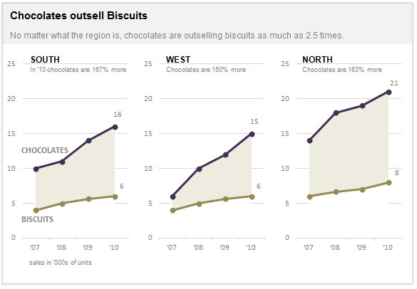
Here I found an informative article on making Small Multiples. This chart type stood out to me in Chapter 3 of our text not because of its design but the purpose behind the design. In our text, it explains the human psychology behind why the Small Multiple visual must be constructed in a way so it can be quickly interpreted with accuracy. It stated that eye-tracking studies show that people see a set of line graphs like the one depicting chocolate sales vs biscuits as one chunk. This style of visual is clearer than putting all lines in one graph which creates a confusing cluster of data points. This style also allows an illustrator to compare more than two pieces of data while maintaining visual cohesiveness. The key here is to ensure all lines along the X axis are symmetrical and that the Y axis numbers are mirrored within each subsequent data set so that an audience can see the comparison being made.
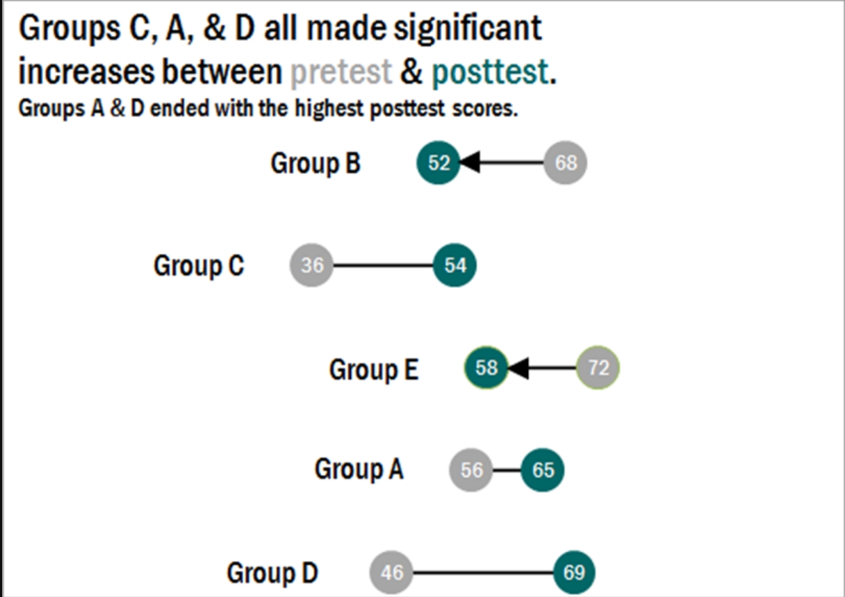
Here I found a step-by-step process on how dumbbell plots are constructed and a useful visual when comparing numbers. The main difference between the dumbbell plot and the standard dot plot is that the line connecting two data points emphasizes the distance between the data being compared. This helps an audience scan a graphic quickly and interpret the visuals intended purpose or story. This type of chart stood out to me because it’s a concise way of comparing two or more numbers across multiple groups or regions. The chart shows groups from A through E and their scores both pretest and posttest. This can be beneficial when segmenting groups of people to conduct case studies.
Comparing Numbers
Examples of Insightful Data Visualizations that Compare Numbers
Data visualizations can be a great tool to use when comparing numbers. Comparing numbers can show many different stories, including the following examples:
“Option A is better than Option B”
“Posttest scores are higher than pretest scores in almost all subject areas”
“Group F and Group G disagree on five of the eight measures”
“There were no differences between the treatment and control groups”
“Youth rates are significantly lower than adult rates”
“We have equal participation from boys and girls with the exception of girls ages 10 to 13”
“All sites increased performance, but Site L did so at a faster rate than other sites”
“The performance of Class L is in contrast to Class K”
Results such as these can be shown in various types of charts. Below are some examples of insightful data visualization that compare numbers.
- Pie Chart

2. Bar Chart
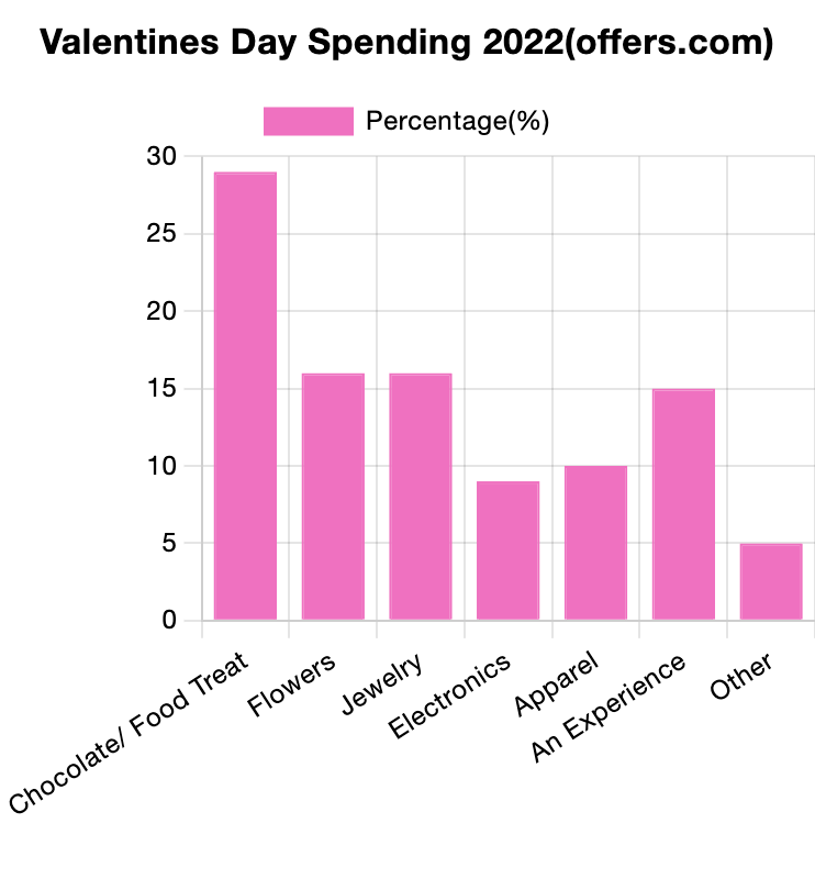
3. Histogram

4. Line Chart

5. Doughnut Chart

6. Overlapping Area Chart

Comparing Numbers
This week in Chapter 3 of Effective Data Visualization we learn about how two or more numbers are alike or different. There are several ways to visualize comparisons between two numbers, as well as multiple, which is very important when choosing your visualization. The main question we have to answer is why Option A is better than Option B.
Bar Charts

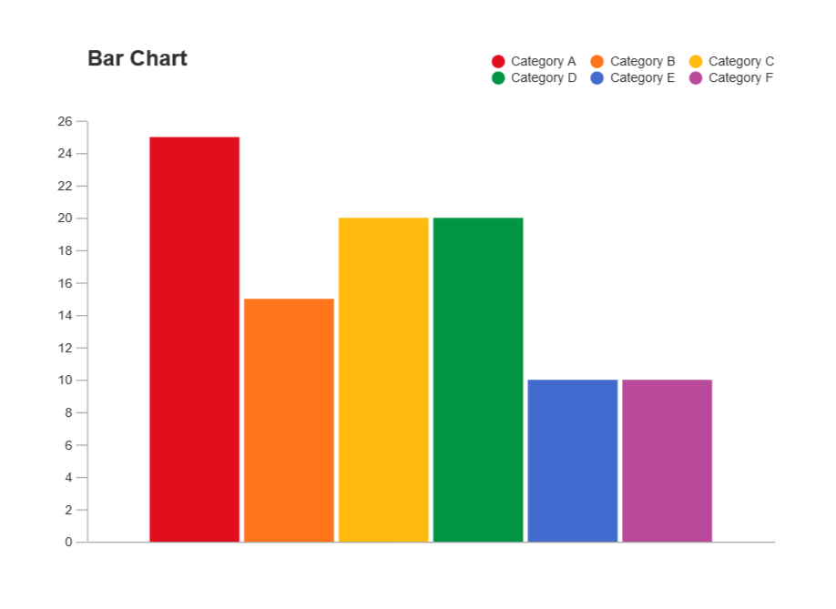
Bar charts are an extremely popular option, but its ability to convey data works best when comparing just two things. Any more can become difficult to interpret because it is challenging to compare the lengths of nonadjacent columns. The textbook also explains how it helps to have some extra white space between each set of clustered columns. The data visualization shown above is very insightful because you can easily digest the information comparing profits and discounts between products. The colors are distinguishable from one another and the columns are grouped so the viewer can easily decipher between products 1-6. The creator also included data labels above each column which makes it easy to tell the definitive amount and compare the numbers.
Dumbbell Dot Plot
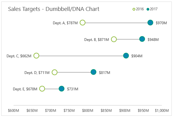
Dumbbell Dot Plots are similar to standard dot plot graphs. The only difference is a line between two dots to emphasize growth between points. The example above is a great data visualization of sales targets for the years 2016 and 2017. The use of empty dots to represent the previous year versus the filled in dot for the more current year is easy to comprehend before really analyzing the data. The line draws your attention from left to right and its length makes it easy to compare the growth between each department. Department C clearly had the most growth within a year, and the data points at the end of each dot helps solidify the viewer’s observation. I believe it is important to have a thin and simple line like above so the chart does not appear too cluttered. I was not aware of dumbbell dot plots until reading Chapter 3 this week, but they have definitely become one of my favorites.
This site provides more valuable insights on how to choose the right data visualization.
Data Visualization & Insightful Comparison
In today’s age data is generated and shared at an unprecedented rate, making the transformation of raw numbers into meaningful (and shareable) displays to be crucial. One of the most effective ways in which this can be achieved is through the use of data visualization. By representing data visually, viewers are more easily able to unlock patterns or trends that may be hidden within spreadsheets or datasets.
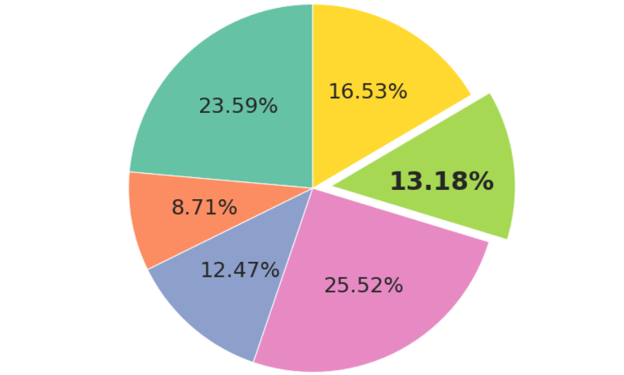
Especially when comparing datasets, or different facets of the same dataset, data visualization enables clearer interpretation and analysis of complex information. By utilizing charts, graphs, and other infographics, complex information can be simplified which encourages informed decision making by presenting insights in an easily digestible format. The infographic below compares the different status classifications for endangered species with the percentage at which they make up the amount of vertebrates that are internationally traded.
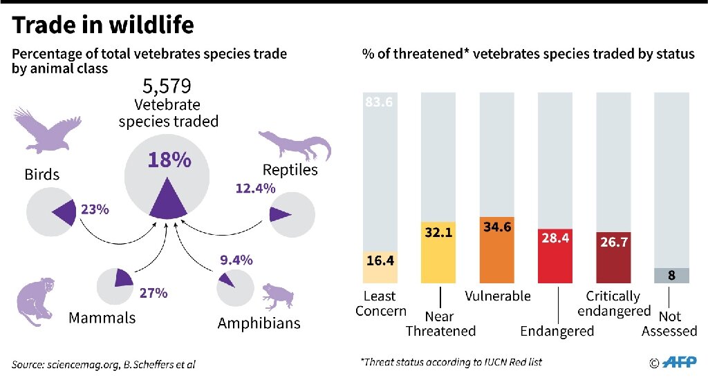
Visualizations such as the one seen above help to enhance cognitive understanding by capitalizing on some individual’s ability to process images more quickly than they do text.
They can also be used to display simple comparisons that are effective when displayed in simple ways. The graph below shows a comparison of the E-Commerce sales between different states around the contiguous US.
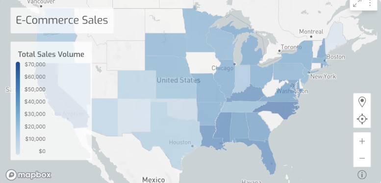
Although this graph is less complicated than the previous visualization, it is concise and includes a legend which allows the comparison that is being shown to be clearly evident to the viewer. While the subject matter that this graph covers may not be a perplexing one, the visualization that is provided gives the viewer an additional resource other than text with which they can assess the data.
Comparing Numbers through Data Visualizations: A Look at Global Health and Wealth
Data visualization plays a powerful role in helping us understand and compare numbers. Whether we are examining trends over time, differences across countries, or correlations between variables, visualizations offer a clear and compelling way to interpret complex datasets. One of the most insightful examples of comparing numbers is Hans Rosling’s World Health Chart, which visualizes the relationship between wealth and health across different countries.
Rosling’s World Health Chart is a groundbreaking data visualization that compares average lifespans and incomes of countries over the last 200 years. The chart uses bubble sizes to represent countries, where the horizontal axis (east-west) shows income and the vertical axis (north-south) shows life expectancy. This visualization allows us to easily see patterns and outliers.
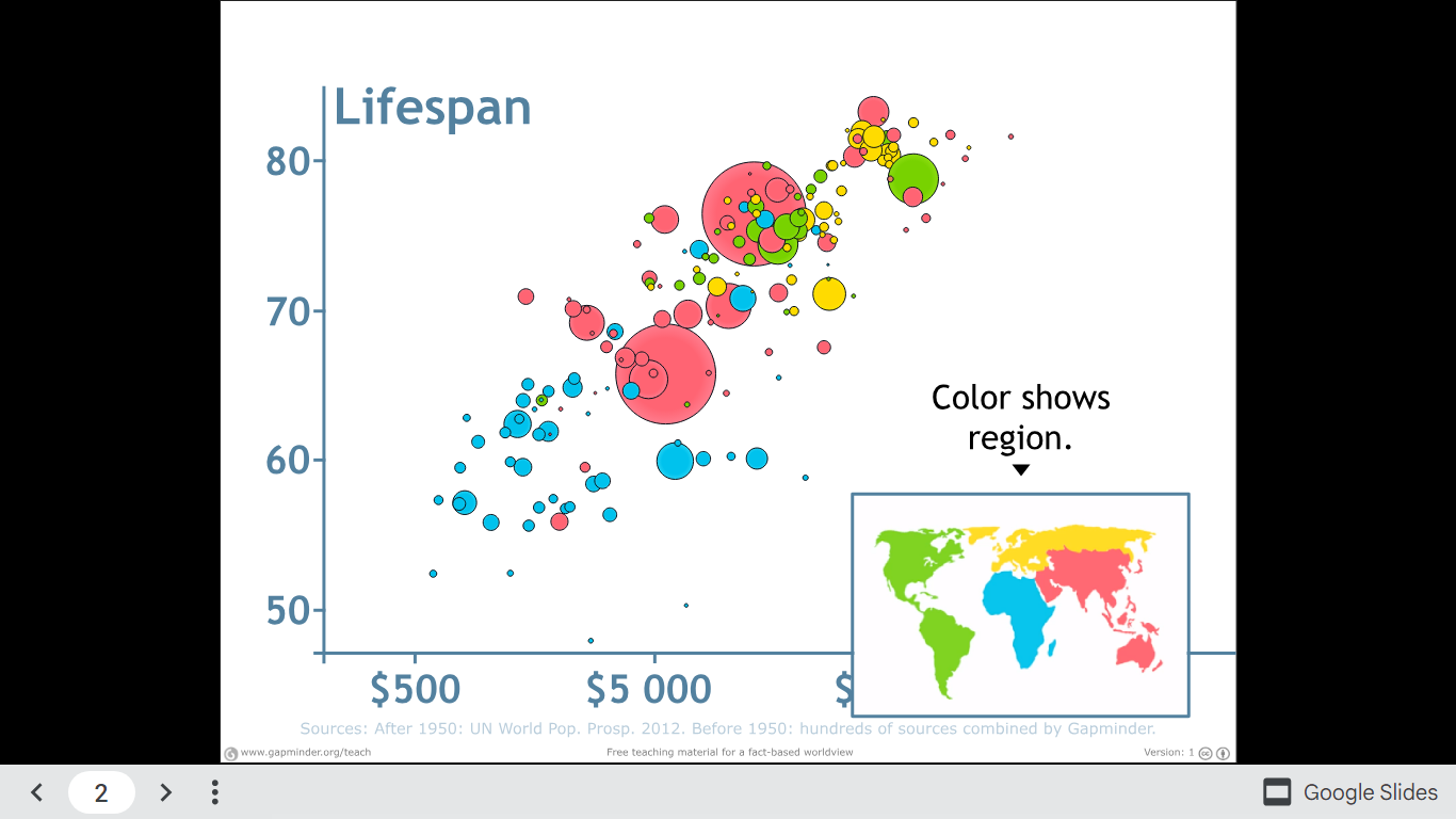
One striking insight is how health and wealth have moved hand in hand over time, with wealthier nations generally enjoying longer life expectancies. This visualization helps us not only compare countries in a specific year but also observe global shifts as we play the animation across centuries.
Watch Hans Rosling explain the chart and explore the full visualization.