Benchmark Comparisons
There are dozens of ways to refer back to a baseline to compare your data to. But, none are as efficient as using a benchmark to compare an average (or even a group of something), to measure against your own data. For example, if a man or woman were to mention that they were able to do 60 push-ups, you may realize that’s a lot, but you aren’t sure how this person may measure up to others. When adding the additional information that the global average is between 26-35, it drastically changes your perspective and makes you realize where that person fares up against most. This applies to any form of data visualization by adding depth to the topic you cover and also helping to give the reader a better understanding of the strength or severity of something.
Recently, Florida has been hit with an onslaught of catastrophic-level hurricanes, taking the lives of many and wrecking millions of dollars worth of damage. But, when measuring out the strength and magnitude of these hurricanes, how can we understand their true strength?
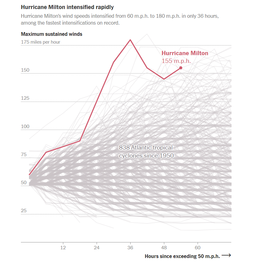
This visualization uses historical data and inserts previously recorded hurricanes as the benchmark to measure up against the new Category 5 hurricane, Hurricane Milton, that will soon make landfall in Florida. As shown in the visualization, and made abundantly apparent to the reader, Hurricane Milton is one of the strongest hurricanes to ever be recorded in modern times. We know this by using the line graph to measure up Hurricane Milton against all the other recorded hurricanes in history.
By using benchmarks, readers are able to quickly determine the scale of a given event and compare it against previously established benchmarks. In the example of Hurricane Milton, we are able to see the horrifying strength of the winds compared to hundreds of other hurricanes, and quickly understand just how severe the force of the hurricane will be in Florida.
Benchmark Comparisons
This week we review Chapter 4 in our textbook, Effective Data Visualization, which goes over the importance of including a benchmark in our visuals. Benchmarks are extremely important because without that context, we limit the amount of information we can pull from a graph. Adding benchmark information clearly displays what the data is being compared to. This simple detail allows the viewer to easily determine whether performance was good, bad, or close to the mark.

This graph from The New York Times shows the monthly global temperature compared with preindustrial levels. The benchmark on this graph is the data for the year 2023, and the other years since 1940 are what is being compared to the benchmark. Just by quickly looking at this visual we can tell that global temperatures were much lower in previous years than in 2023. This benchmark stands out because the line is a darker color and much bolder than all of the others. This visualization is highly effective because the years prior to 2023 are a lighter opacity and color. The creator also only included data labels for the points in 2023.

Another graph from The New York Times displays the daily average sea surface temperatures. This visualization also includes a benchmark to help viewers easily process the data being shown. The gray dotted line, representing the average temperatures from 1991-2020, is the benchmark in this data. The blue line is the most current information which is being compared to the benchmark. In this graph we see that the temperatures in 2023 are much higher than the average between 1991-2020.

Lastly, this graph of Antarctica’s sea ice mass shows that levels in 2023 are much lower than the average from 1979-2010. The gray dotted line is the benchmark, while the red line is the data being compared. While this visualization is still effective, I believe the previous two were better. This is because the gray dotted line is not as prominent as the benchmarks in the other graphs. It gets lost in the data and takes a second for the viewer to notice it is there. Making the benchmark line a different color would help make it stand out.
Benchmark Comparisons
This post demonstrates the understanding of different types of graphs and data sets being compared to a benchmark line. By definition, a benchmark is a measure or comparison. The article includes many different graphs demonstrating climate change over the years. This article aims to compare the climate of previous years to the climate of 2023. The two following charts come from the same article on climate change.

The graph above is an example of a line graph. The orange line in this example is the benchmark line. The primary goal of this graph is to compare the climate change cross an entire year to the climate in 2023 which is highlighted.

Similar to the previous graph, this graph conveys a similar message except the creator has used two different benchmark lines instead of one.
Overall a benchmark line can convey a compelling message to a viewer. A benchmark line can allow a viewer with no previous knowledge of a certain topic to be able to follow along with a certain infographic. A viewer having other data to compare something to can help keep an audience engaged for extensive periods of time.


Podcast: Play in new window | Download
Benchmark Comparisons
Data visualizations play a crucial role in how we interpret and understand information, especially when it comes to making comparisons against a benchmark. One common method is through the use of bar charts, which allow viewers to easily see the differences in values between various categories. For instance, if a company wants to compare its sales figures to industry standards, a bar chart can clearly illustrate how its performance stacks up against competitors. This visual representation makes it easier for people to grasp the data at a glance, highlighting areas of strength and weakness.
Another effective way to showcase comparisons is through line graphs, which are particularly useful for displaying trends over time. By plotting data points on a timeline, viewers can observe how a particular metric, such as revenue or customer satisfaction, changes in relation to a benchmark. This method not only provides a clear visual of the data but also allows for the identification of patterns, such as seasonal fluctuations or long-term growth. Line graphs can be especially powerful when comparing multiple datasets, as they can show how different entities perform relative to one another over the same period.

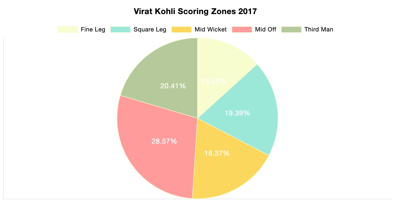
Additionally, pie charts can be employed to represent parts of a whole, making it easy to see how different segments compare to a benchmark. For example, a pie chart could illustrate the market share of various companies within an industry, with one segment representing the benchmark company. This type of visualization helps to convey proportions and percentages effectively, allowing viewers to quickly understand how each entity contributes to the overall picture.
Lastly, x, highlighting key factors that contribute to the differences observed. By combining qualitative insights with quantitative data, one can create a comprehensive picture that not only shows the comparison but also explains the underlying reasons for any discrepancies. This multifaceted approach ensures that the audience fully understands the context and significance of the comparisons being made.

Benchmarks and Economics
The United States economy and stock market like many other countries is driven by forecasts and hitting those expectations also considered to be benchmarks. In addition, most economies are dependent on how other countries economies are performing as we operate primarily in a global economy where the news and events of one country directly impact other countries. Forecasts act as benchmarks for particular data news such as consumer price index (CPI), producer price index (PPI), job creation numbers and unemployment rate to name a few. This forecasts act as targets and if the news comes in above or below expectations this can create volatility in the markets.
Above is a chart of the unemployment numbers represented as percentages. Each month the forecasts are created by analysis displayed as the gold bar. The actual number is the blue bar. When major news is released it is typically released at 8:30am EST an hour before the New York Stock Exchange opens. This is important as this will influence in what happens in the market that day and how it affects long term trends. A majority of people save for retirement by investing in 401ks, IRAs, and other retirement plans and the numbers being released give you a read on the pulse of the economy. These negative reactions can create downward pressure on the markets and lead to losing money or having diminishing returns on those accounts.
Another way benchmark performances are evaluated is by comparing a particular stock versus an index fund that is similar to the underlying stock. Take a look at the chart below.
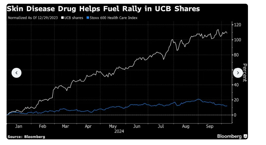
The chart above uses line graphs to compare ticker symbol UCB versus the Stoxx 600 Health Care Index. This shows that the shares of UCB has outperformed the index significantly. This largely is because of their release of a drug to treat psoriasis. This is important when managing funds and rotating different investments to receive the highest return possible.
Benchmark analysis is a critical component to not only our economy but the global economy. By being able to accurately evaluate the data it can help make informed decisions. There are different ways to display benchmarks but all are important when understanding the data and how to evaluate it.
Benchmark Comparisons for Phones
By Kevin Barksdale, in Benchmarks on October 2024
Introduction
In the cutthroat Smartphone market, any major parameter such as performance score, battery backup or market share comparison gives the users or manufacturers an idea of how a particular device fares against the other. These visualizations can be in any form of bar graphs, line graphs or the radar graphs depending on how the various phones are placed in relation to the standards or competitors.
Smartphone Performance Benchmarks
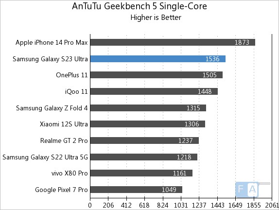
One common way to compare phone performance is through benchmarking software scores such as those from Geekbench or AnTuTu. A bar chart is often used to compare models, with the benchmark score indicated as a horizontal bar across the chart. In the example below, phones like the iPhone 15 and Samsung Galaxy S23 are compared against an industry benchmark score.
Battery Life Comparison
In this line chart from Tom’s Guide, various smartphones are compared based on battery life measured during standard tests. The benchmark is the industry-standard average, indicated by a dotted line. Phones that exceed this benchmark, like the iPhone 14 Pro Max, are shown above the line, while those with below-average battery life fall below it. This visualization allows consumers to easily spot which devices perform better in terms of battery longevity.
Market Share Comparison
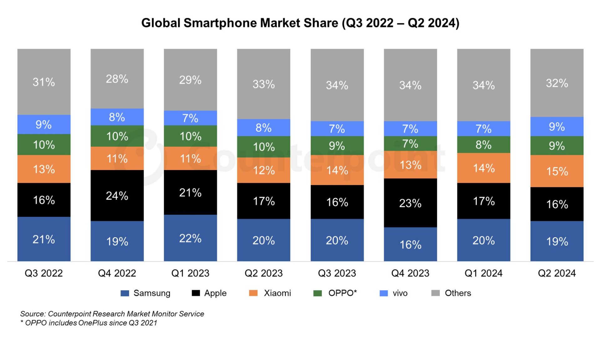
In this stacked area chart, global smartphone market shares for different brands (Apple, Samsung, Xiaomi, etc.) are compared to the benchmark of global market trends. The visualization highlights how each brand’s market share has grown or shrunk over time. A consistent color represents the benchmark (overall market growth), while each company’s share is visually stacked, making it easy to compare how individual brands are performing relative to global trends.
Customer Satisfaction
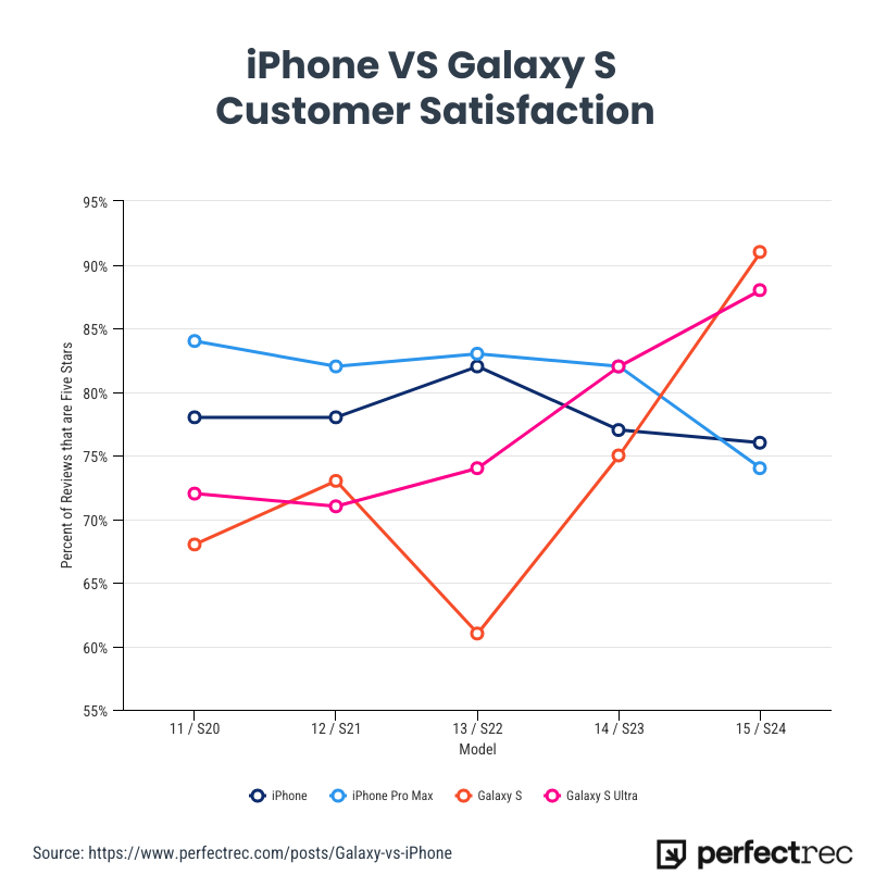
For the first time, the Samsung S24 line has surpassed the iPhone in customer satisfaction, according to a recent survey. Samsung’s latest flagship models received high praise for their superior battery life, advanced camera features, and customization options in the Android ecosystem, leading to a slight edge over the iPhone in overall user happiness. This marks a notable shift in the ongoing rivalry between the two tech giants, as the iPhone has traditionally dominated in customer satisfaction metrics. Samsung’s focus on user experience and performance appears to have resonated strongly with consumers, setting a new benchmark in the smartphone market.
Conclusion
Comparing smartphones to benchmarks helps consumers understand the strengths and weaknesses of a device, whether it’s performance, battery life, or camera quality. Using visualizations like bar charts, line graphs, and radar charts makes these comparisons clearer, offering valuable insights for buyers.
Benchmarks Comparison
What is a Benchmark and why does the World use them? Well, a Benchmark is a standard or point of reference used to measure the performance, quality, or value of something. To get literal, according to the Cambridge Dictionary, a benchmark is “a level of quality that can be used as a standard when comparing other things“. Therefore, a benchmark has endless opportunities to be used in the World. Some may use them for a finance report to compare performance or investments. Others may use a benchmark in technology comparing speed, efficiency, and capabilities of a program. For me I would be using it in the education world maybe to compare my students grade point averages, or how they have progressed or declined in performance. Overall, benchmarks help establish goals and measure progress or success in any aspect you use one.
In this case I am going to show you a few examples of how Benchmarks can compare in the benefits of using one to display data versus how they compare in the ways they were used.
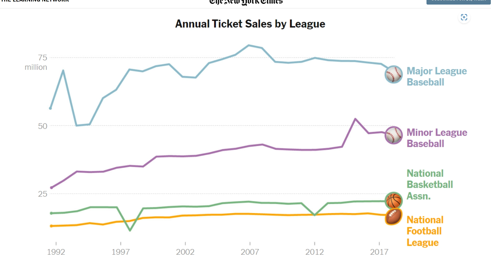
Below is a picture of a line graph used to compare Annual ticket sales by different Sport Leagues. The difference in color used for each specific league, as well as the icon attached at the end of the line to differentiate each benchmark really caught my eye. Clearly Major Leage baseball has the most consistently high sales. Perhaps that is because tickets prices compared to NFL prices are lower, or maybe America just likes their past time sport of baseball best. You would need to read this NYT article to get the details, but the benchmark is a great example of data visualization and the different ways to enhance them. https://www.nytimes.com/2019/10/24/learning/whats-going-on-in-this-graph-oct-30-2019.html
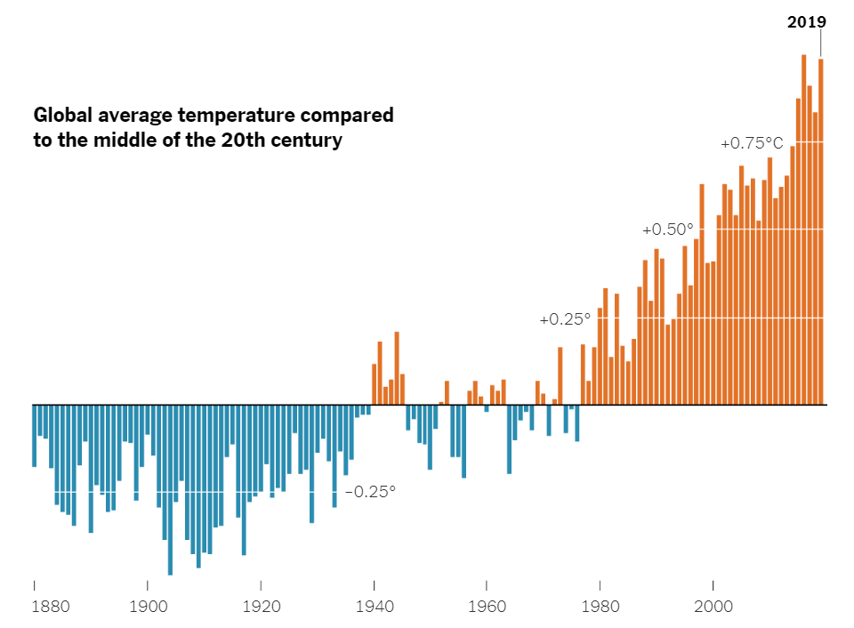
Now lets look at something compeltely differernt than Sports and ticket pricing. There was another article in the NYT digital genre that compared the Hottest and Coldest temperatures of the world on a timeline from 1880 to mid 2000’s. https://www.nytimes.com/2020/04/23/learning/whats-going-on-in-this-graph-global-temperature-change.htmlThis data visualization used the blue color for cold temps, and red for hot temps which the brain typically relates as one another as well. Also, the bars on the graphs go below the benchmark used in this graph to show freezing/cold temps while the bar go above the benchmark for hot temps. The benchmark is used for the comparing of data and was used really well here in my opinion. There is a lot of data being displayed but it doesn’t seems as congested or confusing in this delivery.
Benchmarks to circle back around are a great tool to use when comparing information or data. The means of them are endless and can be used in many different ways. I hope this Blog was helpful in explaining their purpose and giving some insight on how they have been used successfully.
Comparing Numbers
An efficient way to visualize data is with comparison charts, which are clear and well-organized. By simplifying the data, they can help viewers see patterns among the variables. A person may choose a good or service more efficiently by comparing data points visually. Understanding complicated data is made much easier and faster with the use of comparison charts. Comparing numbers visually is a way to focus attention to connections and distinctions that allow for improved data analysis.
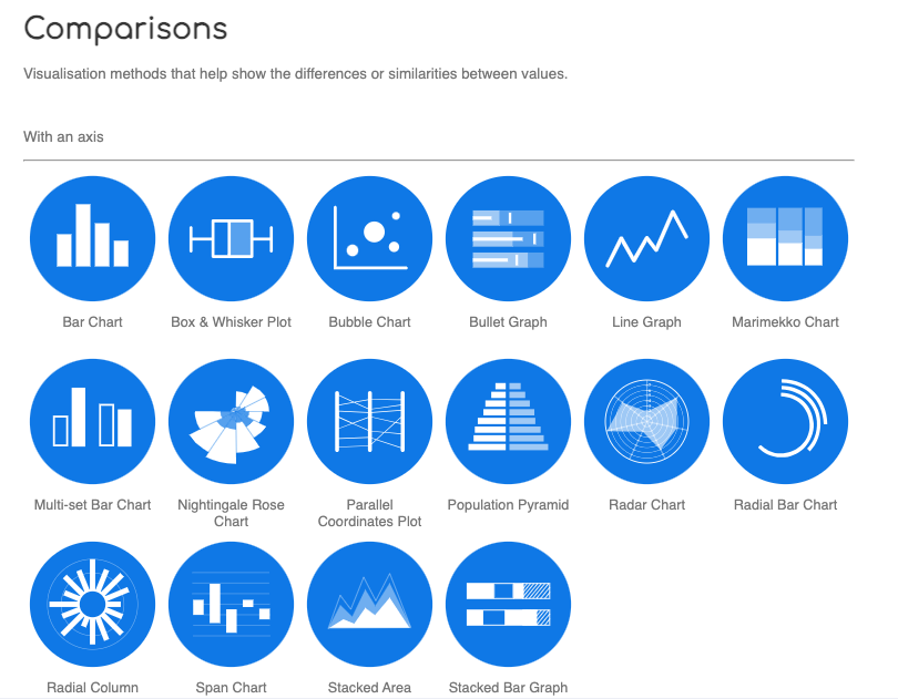
I found a website called the Data Visualization Catalogue. It is a great resource to have when trying to decide which chart is best to use for your data. This image above is a screenshot I got from the website, it gives examples of different comparison charts. If you click on any of the blue circles, the catalogue will provide a page full of details for each chart/graph. In the Data Visualization Catalogue an example, a description, and the anatomy of each chart/graph are shown in the details. A link to the website is posted below.
Comparing Polio Cases
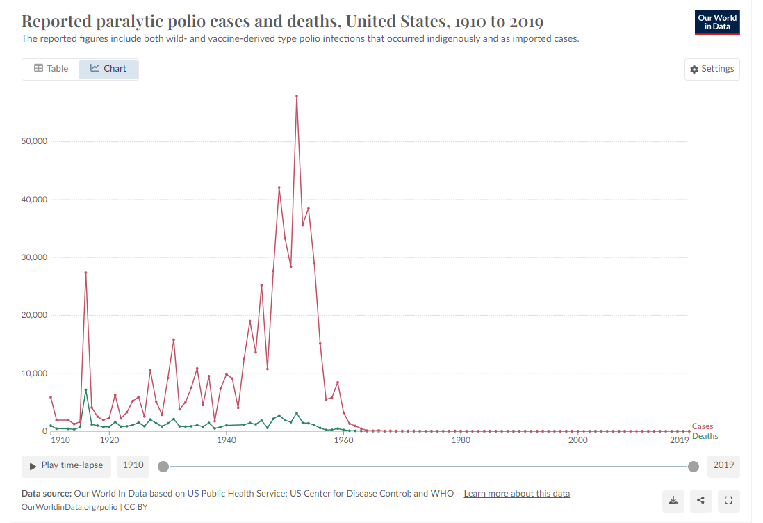
Being one of the few diseases that we’ve effectively eliminated through the usage of vaccines, this dataset of the number of polio cases by year caught my eye. Graphs that focus on a disease’s number of cases aren’t anything new, but the fact that polio has been nearly eradicated turns the dataset into a story with an end. Most disease infection graphs go on forever, no distinct end or beginning due to the continued existence of the disease. Polio had many major outbreaks in the first half of the 20th century, giving a beginning. With the introduction of the polio vaccine, the cases drop off sharply to the point that they reach zero – the graph’s end. This graph really drives home how instrumental vaccines are in eliminating infectious diseases from our world.
Comparing Numbers
The photo above is included in the linked article of this post. The article demonstrates the importance of using the correct infographic when comparing different data sets. It discusses the importance of making comparison charts, the best types of data comparison charts, and when to use each type of chart. One of the most commonly used comparison charts is the pie chart which is shown above. Pie charts are most effectively used when comparing sizes or percentages of numbers within a single data set.
Podcast: Play in new window | Download