Lollipop Chart
Lollipop Charts are used to compare objects or groups the same way that bar or column charts do. So why not just use a bar chart? Lollipop charts are a great way to make longer bars less visually distracting by removing the ink from actual bars themselves and highlighting the key data being portrayed. That has been some research conducted (Blasio &Bisantz, 2002) that supports that ideology and that by making a more ink friendly design can impact readers ability to interpret the data and lead to faster response times.
Lollipop charts are derivates of more commonly known charts and can be created by modifying a scatter chart or line with marker charts. While this may be a little more complex and require you to have a better understanding of excel it is a great tool to add to the toolbelt. They are essentially a large dot with a tail attached to it which is adjusted based on the height of the bar.
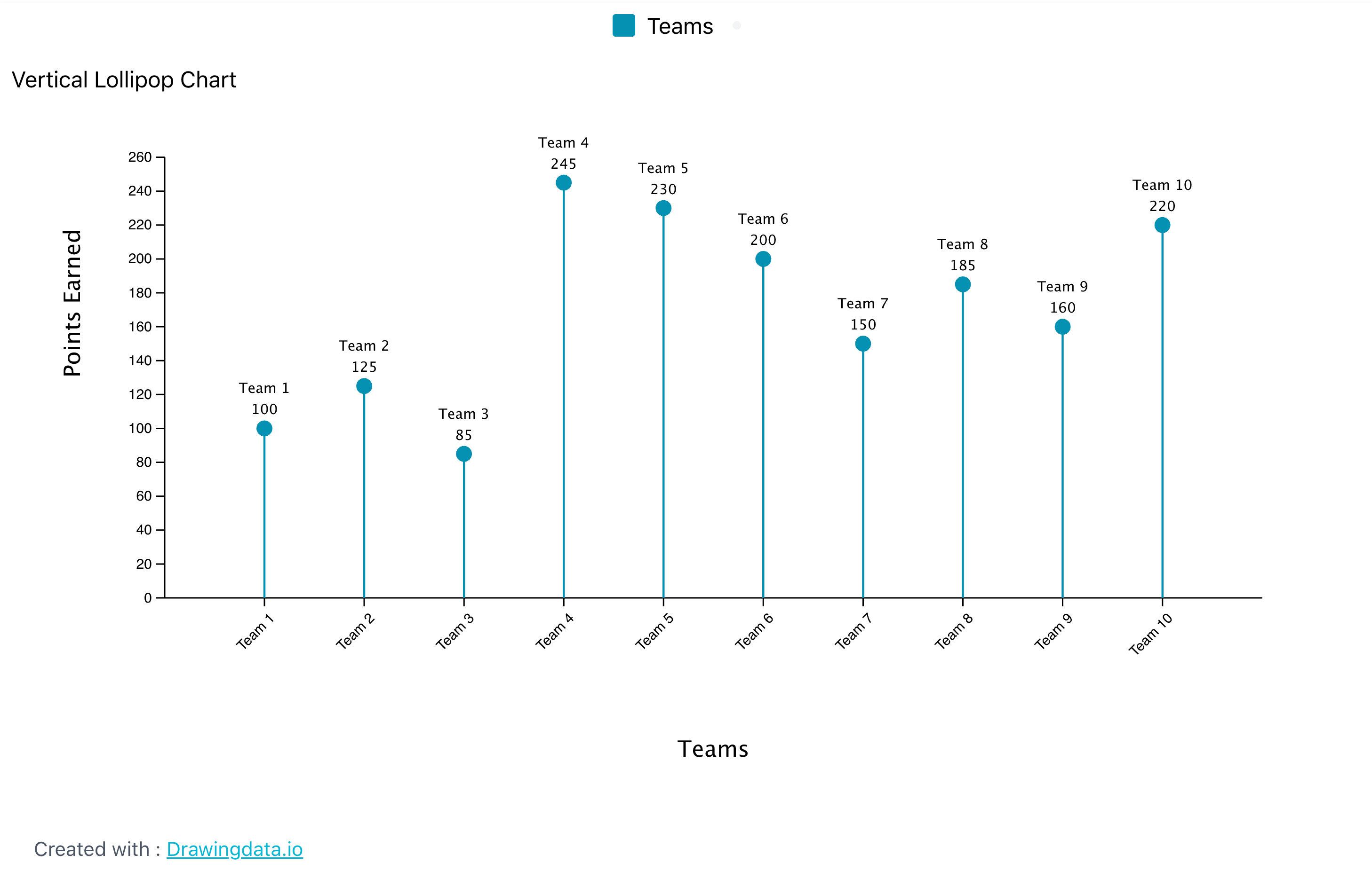
It a normal everyday practical use like the chart below they can very easily highlight the end point data you are looking for without the other distractions. Below is a chart of the average points allowed per game by NFL teams so far this 2024 season. The NFL has 32 teams in it and to have a thick column or bar chart could lead to the bars being closer together and more difficult to read. By eliminating that we can clearly see the data that we are focused on looking at.
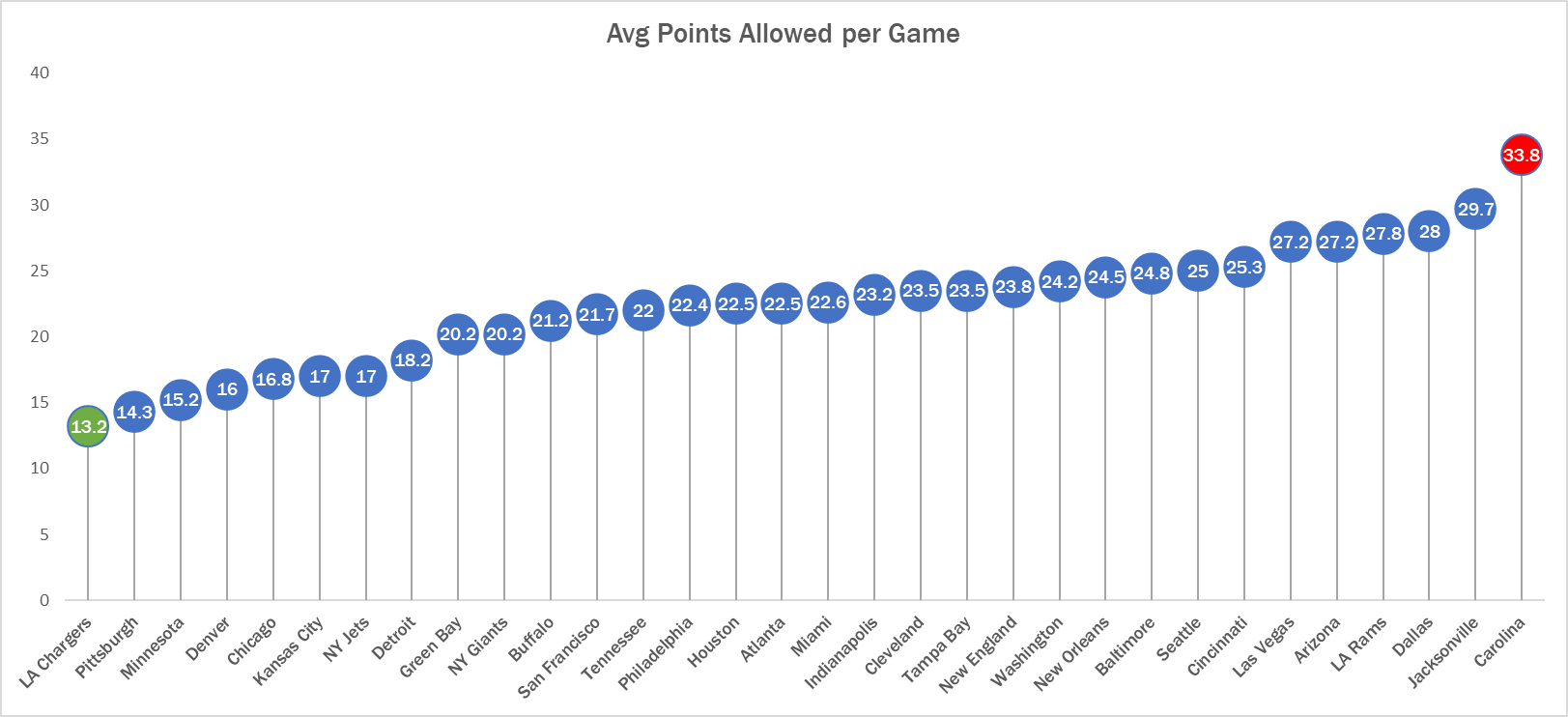
See! Super easy to read. Here we can clearly see that the Carolina Panthers are allowing the most points in the NFL while the LA Chargers are allowing the least. Simple but very effective.
Visualizing New York’s Monthly Temperatures
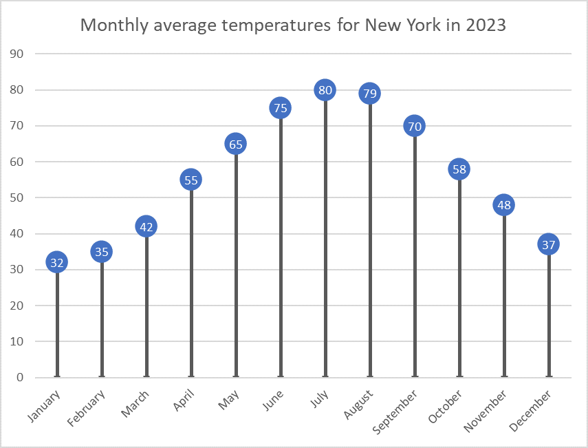
For this data visualization exercise, I created a lollipop chart using the average monthly temperatures in New York City. This chart type, though lesser-known, provides a clean and effective way to present data. It minimizes visual clutter while maintaining accuracy, focusing on the values at the endpoints of each data series, making it an ideal choice for certain data types.
Why Use a Lollipop Chart?
Lollipop charts are a variation of bar charts that simplify the visual representation of data by removing the bars and retaining just the “lollipop” shape, which consists of a dot at the end of a vertical line. This design emphasizes the most crucial part of the data: the endpoint, where the value is represented. By doing so, it eliminates excess “ink” from the chart (i.e., the visual elements that aren’t necessary), creating a minimalist yet effective graph. Lollipop charts are particularly useful when you have many categories to display but don’t want to overwhelm the viewer with dense visuals.
In this example, I used a dataset of New York’s monthly average temperatures for each month of the year. Lollipop charts are ideal for this type of sequential data because they clearly show fluctuations in temperature without the visual bulk of bars filling up the space. Each lollipop (dot) represents the average temperature for that month, while the connecting lines provide a reference for the range, making it easy to compare temperature changes across months.
The Process of Creating the Chart
To create the lollipop chart, I used Excel, which provided a straightforward way to manipulate the data and customize the chart format. I started by inputting the data for New York’s average monthly temperatures. After inserting a simple line chart, I removed the line connecting the points and increased the size of the markers at each data point to resemble lollipops. This method gave the chart a clean and modern look, perfect for drawing attention to the changes in temperature over the year without unnecessary visual noise.
When Should We Use Lollipop Charts?
Lollipop charts are most effective when you need to compare a single variable across categories or time periods, especially when your goal is to highlight the extremes or focus on specific values rather than trends. They are useful for visualizing survey results, ranking data, or time-series information like the monthly temperatures I used in this example. If you’re presenting a lot of data and want to simplify the display, a lollipop chart is a great alternative to the traditional bar chart.
In conclusion, lollipop charts offer a minimalist and efficient way to convey data while maintaining clarity. My visualization of New York’s monthly temperatures shows how this chart type can be both functional and aesthetically pleasing, helping viewers focus on the most important data points without distraction.
Lollipop Chart
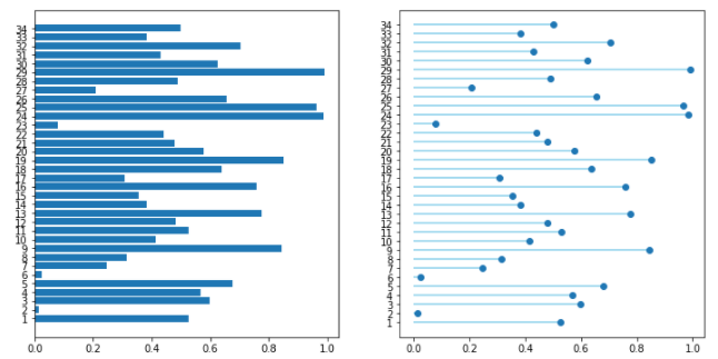
Lollipop charts are used to compare several objects or groups, similar to the purpose of bar graphs. They can be very useful in analyzing and visualizing trends. A lollipop chart can work well for comparing the values of different groups while accentuating individual data points, especially if some values are extremely high or low. They make it easier to identify deviations or substantial differences between data points. Lollipop charts should not be used for distribution or relationships in data. The Lollipop chart that I created in excel is shown below.
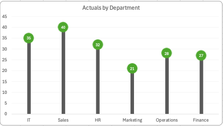
Lollipop charts are modified bar charts with dots representing points and thin lines for bars so that more data may fit in a smaller space. A lollipop chart is a good option for placing or focusing on specific values within a dataset because it minimizes visual clutter from crowded bars. The line helps guide the viewer’s eyes directly from the data labels on the x or y-axis straight to the data point value. The image shown below is a good example of how sometimes bar graphs can look cluttered with too much data. Using a lollipop chart takes some excess color off the screen making it easier to visualize the values of each data point for analysis or comparisons.
Lollipop Charts
One of the primary advantages of using a lollipop chart is its ability to highlight specific values while maintaining a clean and straightforward visual presentation. This is particularly beneficial when dealing with a limited number of categories, as it enables the audience to focus on the key differences without being overwhelmed by excessive information. The visual simplicity of the lollipop chart helps to draw attention to the most important data, making it easier for viewers to interpret the results. Moreover, lollipop charts can enhance the aesthetic appeal of your data presentation. Their playful design can make your report or presentation more engaging, capturing the audience’s attention and encouraging them to interact with the data. This visual appeal is especially valuable in settings where you want to convey information effectively while also keeping the audience interested. Whether in business meetings, academic presentations, or public reports, a lollipop chart can serve as a powerful visual tool that aids in communication.
In addition to their visual charm, lollipop charts are also versatile. They can be used to represent various types of data, including categorical data, numerical comparisons, and even time series data when adapted appropriately. This flexibility allows you to tailor the chart to fit the specific needs of your analysis, making it a valuable addition to your data visualization toolkit. When considering the use of a lollipop chart, it is essential to ensure that the data being presented is suitable for this format. The chart works best when there are clear distinctions between categories and when the data points can be easily compared. By selecting the right context and data, you can leverage the strengths of the lollipop chart to convey your message effectively.
In summary, a lollipop chart is an engaging and visually appealing data visualization tool that combines the best features of bar charts and dot plots. It is particularly useful for highlighting specific values and making comparisons between a limited number of categories. By using a lollipop chart, you can enhance the clarity of your presentation, capture your audience’s attention, and facilitate a better understanding of the data being presented.
Benchmark Comparisons
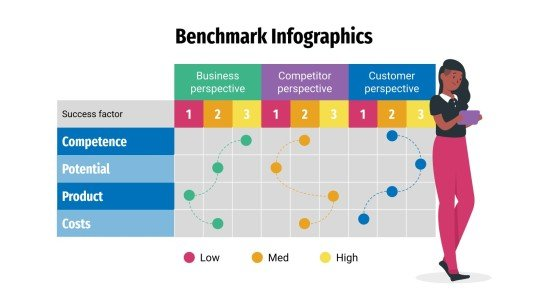
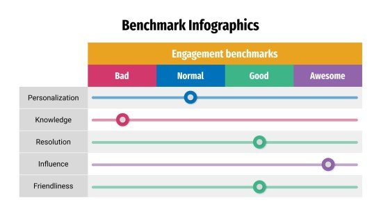
Visual components are used in comparison infographics to compare two or more objects, such as ideas or products. They may be a useful tool for assisting individuals in the comprehension of difficult facts and making reasonable choices. By comparing a company’s operations to other businesses’, benchmarking infographics can help find areas for growth. Benchmark graphs illustrate how various groups, like nations or businesses, perform against one another by comparing statistics. For example in the image shown below, benchmark comparisons assist in evaluating the performance and quality of products, goods, and industries as well. As shown below through a series of procedures and tests, you can find out if your system is operating at peak efficiency or whether there are issues that need to be fixed.
Infographics may be used in a variety of ways to display comparisons to a benchmark. Comparison infographics are frequently used by marketers when comparing a competitor’s product against their own. A great way to compare two items directly is by using comparison infographics. Utilizing a range of charts while choosing the appropriate chart and including visual features are some strategies for using infographics to display comparisons to a benchmark. To illustrate how a topic performs when compared to several groups, use a scatter plot with a solid benchmark line, a stacked bar chart, or a pie chart to compare portions of a whole. An infographic may display several kinds of information using a variety of chart formats. A table can be used to arrange information so that readers can look it up, or a numbered list can be used to indicate rank or order. Infographics demonstrate relationships between data, procedures, or individuals through the use of visual components.
Benchmark Comarpsions
This week in Chapter 4 we reviewed different ways to present benchmarks to show comparisons. Whether it’s a dashed line, or outstanding color, or even a dot, there are many ways to show the comparisons. They are extremely useful for comparing actual data to an average or target and provide useful insight on forecasting, trends, and success rate.

For example, here we have an infographic comparing the monthly change in jobs in the US. In this particular graph, the bar that is a different shade acts as the benchmark result. It is clear and concise and is useful when comparing to the other graphs. This article is from the New York Times.
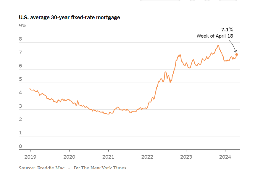
Another example from The New York Times, is the rates on a 30 year fixed rate mortgage. This dot serves as the benchmark for the graph. It is easily identifiable and shows the trends of the mortgage rates.
Benchmarks and Electric Cars
The graph containing a benchmark that I wanted to look at was this one from the New York Times focusing on electric vehicle sales in the US, excluding Tesla. Tesla has been excluded from this graph since they are far and away in first place, with 140,187 vehicles sold in the first quarter of 2024. For comparison, this is seven times larger than Ford, who is in second place with 20,000 vehicles sold Q1 2024.
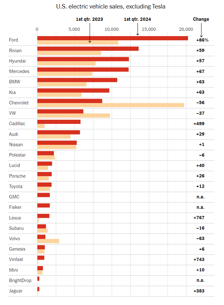
This visualization has a different benchmark for each company. The benchmark is their performance one year prior, in Q1 2023. Benchmarks are commonly represented as a line, but since each company is being compared to a different data value, they opted to represent the benchmarks as lighter colors that do not detract from the current year’s data. Using a dark red for current data catches the eye. It sticks out more than the old data, ensuring that there’s a clear distinction and the bars don’t fight with each other for clarity.
Overlapped bars could have been used as well, but I think I understand why the author opted not to. With 25 companies in this chart, overlapping the bars could lead to a lack of whitespace. All in all, this graph is a wonderful representation of its data. I’d also like to note the fact that this is a horizontal bar graph instead of a vertical one. With so many data points, it becomes hard to label the data in a way that preserves readability. Vertical bar charts such as this one help to alleviate that issue.
Benchmark Comparison
Benchmarks in graphs provide a reference point, allowing viewers to quickly assess how data compares to a standard goal or historical average. They help to contextualize values, which highlights trends or performance gaps. By including benchmarks in graphs, data visualizations become more informative, making it easier to interpret progress, identify outliers, and support information assessment at a glance.
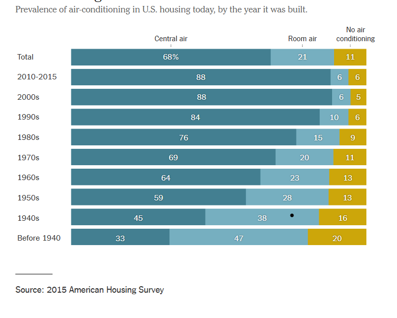
The graph below depicts the change over time of air conditioner use within residential buildings. By constructing this informative graphic using bars, the data can easily be assessed even by those who are not adept at data analysis. The topmost bar shows the benchmark for central air, room air, and no air conditioning while the bars below show a breakdown of each category in 10 year increments. The use of stacked row bars and a clearly separated benchmark lend to an organized, easy to read graphic that allows viewers to clearly determine the difference of each category over time. By visiting this article, you can read more about the changes in air conditioner use over time.
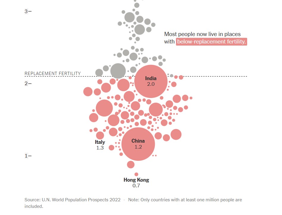
The next graph, found below, shows a comparison of countries (with populations over one million) and their replacement fertility rates. While there are only a few markers that have labels attached to them, population size is indicated by the size of the circle used to represent the country. This is not only a visually pleasing detail in this graph, but it is a simple and effective way to offer knowledge to the viewer without overcomplicating the graph. In this graph, the benchmark is displayed in the form of a dashed line with a label. This shows a clear indication of which countries fall above or below the benchmark for replacement fertility rate. Additionally, the coloration of the country markers help to indicate which countries are below the benchmark, even if it appears that they are touching it. To read more about population growth and decline, follow this link.
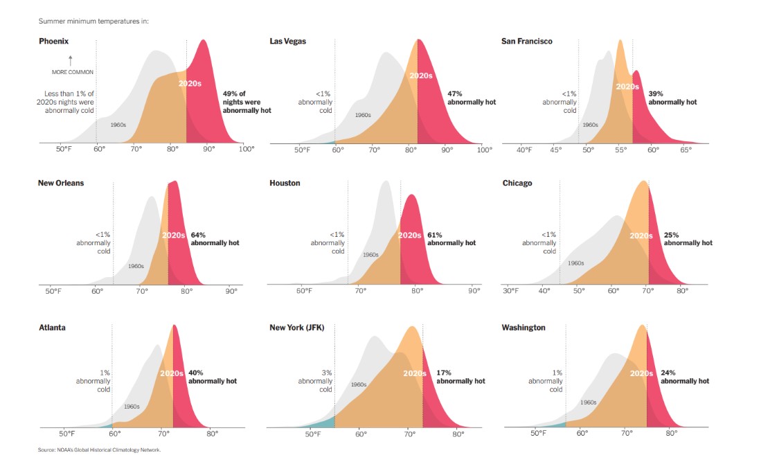
Another use of a line as a benchmark can be seen below in various graphs used to compare summer minimum temperatures in different cities across the United States. By utilizing vertical solid lines to show boundaries of where outlier temperatures are located, density plots are able to be used to properly display the temperature information for each city. Not only are solid vertical lines used, but temperature data from previous years are displayed as a benchmark to show the difference between summer temperatures in the 1960’s compared to 2020’s. There are additional graphs and information to compare climate change over time at this webpage.
Benchmarks
An important element in any display of data is a benchmark– this can be a target, long-term goal, average, or standard. Oftentimes, benchmarks are written down in memos, but aren’t included in the actual data visualization. This can potentially help an audience visually the data in a more informed and efficient manner. The stories that can be told include:
“Our key indicators met the preestablished targets in three out of seven areas.”
“Regions A and B did not meet quarterly benchmarks”
“Here is how our groups compared to the national norm”
“Students in the Chemistry Department are above average on final exams this year.”
“We did not meet our fundraising goal, but we got very close.”
“Our click rate was 25.6%, while the industry standard is 4.3”
There are many different ways to include benchmarks in data presentations. The most common form is a simple line.
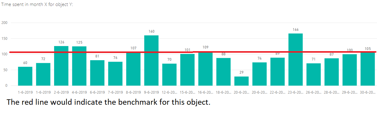
Another example is a bullet chart, which has gray shaded area of comparisons behind a bar of column.

Benchmark Comparisons
Lamar Miller
Here you will find a visual on phone phishing data. This visual uses the dashed line to indicate the benchmark for the industry. The visual goes on further to use stacked columns to indicate the different ways phishing can be delivered. The dashed line is a good way to show a benchmark because it is simple and stands out on a visual without a need for additional labels. Not using a solid line also allows a viewer to quickly interpret that it is intended to stand out and be different than the other lines in the visual.

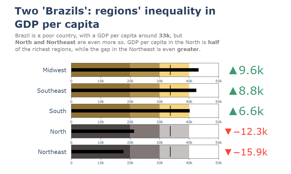
Here you will find a horizontal bullet chart depicting a comparison between North and Northeast Brazil GDP per capita while also indicating where the other regions stand. The benchmark is represented as a target line of 33k which can be easily interpreted. The visual goes on to show the gap in GDP by region.
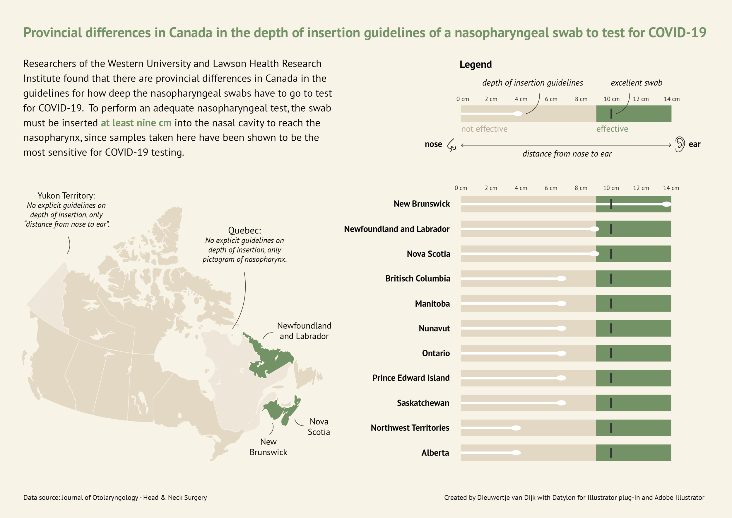
Here you will find a more in-depth horizontal bullet chart. I like this visual as it combines not only elements of a benchmark visual but incorporates other visual elements and really tells a story. This chart also uses target lines depicting the provincial differences in Canada regarding nasopharyngeal swab tests of Covid-19. The benchmark is indicated as 10cm in depth for the most effective swab.
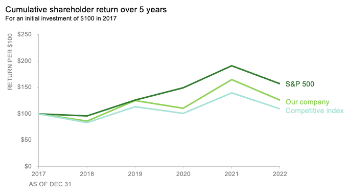
Here you will find a line graph with benchmark lines. The lines are represented as the competitive index and S&P 500 index versus their company. This chart incorporates two comparable benchmarks for a viewer to interpret against their trend. The visual shows the cumulative shareholder return over 5 years on an initial investment of $100 back in 2017. This chart is quick and to the point and provides an audience with just enough data to compare.