Introduction
Pie charts are an ideal way to display parts of a whole, especially when showing proportional data. In this post, I’ll illustrate why the pie chart is a perfect fit for visualizing the global market share of mobile vendors, where each segment represents a clear percentage of the total market. With clear, distinct categories, a pie chart effectively communicates the dominance of each vendor relative to its competitors.
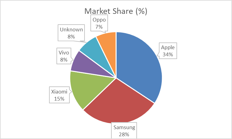
Visual: Mobile Vendor Market Share Worldwide – September 2024

For this data, I’ve created a pie chart that clearly shows Apple, Samsung, and Xiaomi as the top three competitors, with other vendors representing smaller segments. This format enables viewers to quickly assess the relative size of each brand’s market share.

Argument for Using a Pie Chart
The pie chart works well here because:
- Distinct Categories: Each vendor represents a distinct, easily identifiable part of the mobile market.
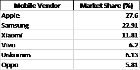
- Relative Comparison: With Apple leading at 27.6%, the chart’s circular form highlights the gap between top competitors like Samsung (22.91%) and others.
- At-a-Glance Readability: For readers looking to grasp key takeaways on market share distribution quickly, the pie chart’s simplicity and proportional representation make it an excellent choice.
Alternative Visualisations
Though the pie chart serves this data well, a bar chart could be used to show exact values more precisely. However, in this context, the pie chart’s layout emphasises the proportions without requiring precise numeric comparison, which is sufficient for understanding general market dominance.
Design Tips for Effective Pie Charts
Here are some design tips that helped me make an effective pie chart:
- Limit the Number of Slices: Too many slices make pie charts hard to read. Keeping it to significant players (Apple, Samsung, Xiaomi, etc.) helps maintain clarity.
- Use Contrasting Colors: Each segment should stand out visually without overwhelming the chart. For this chart, I used distinct, brand-associated colors for the top brands.
- Label Percentages Directly on the Chart: Avoiding a legend makes it easier for readers to associate values with segments directly.