Pie charts are a popular, but often misused, tool for displaying data. They are best used when illustrating proportions or parts of a whole. Typically, they are divided into slices to represent numerical values as percentages with each slice corresponding to a category. These characteristics make pie charts ideal for comparing the relative size of different components.
Displaying proportions, categorical data, and non-complex comparisons are all instances in which pie charts are a proper choice for graphical visualization. Pie charts also offer visual simplicity for the audience and can easily be displayed in presentations or reports because of their simple and straightforward appearance.
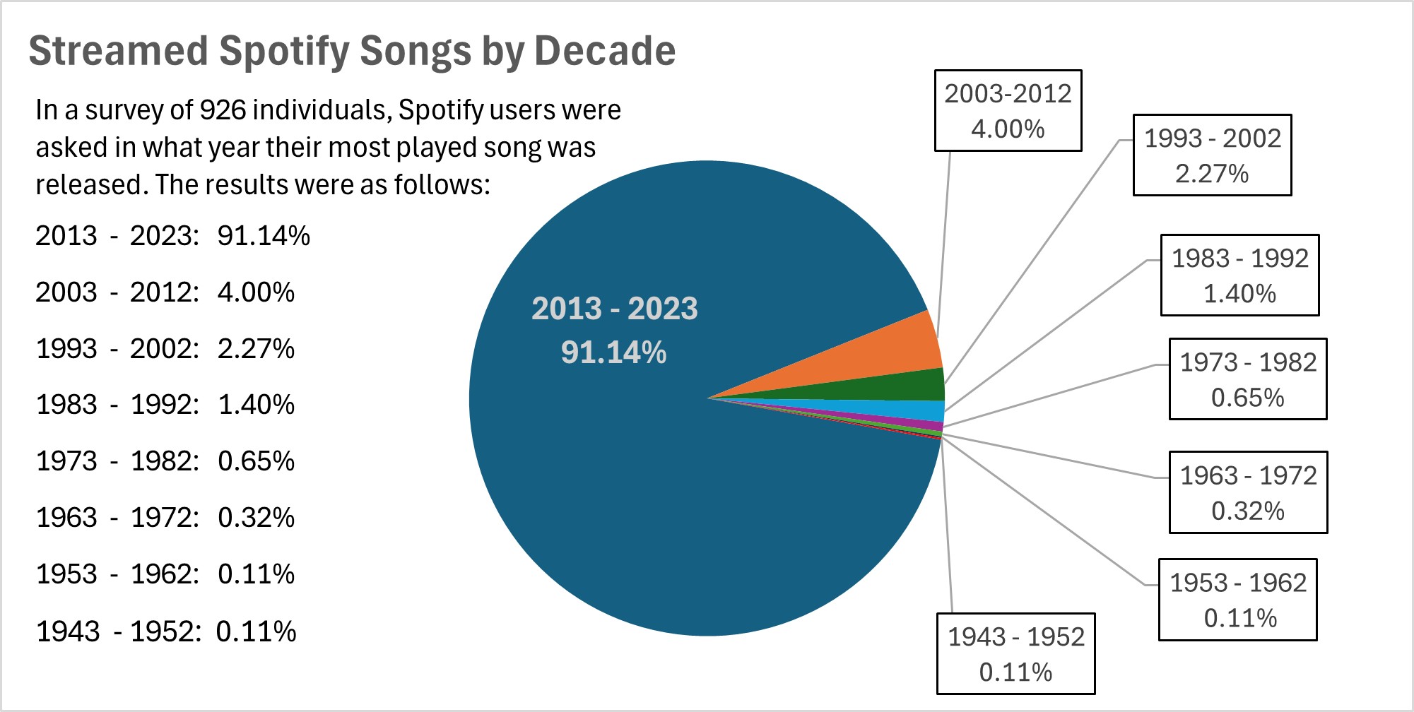
The pie chart below displays the proportion of streamed Spotify songs for a survey group, organized by decade.

The data in this pie chart, showing the distribution of most played Spotify songs by decade, is a good choice for pie chart representation because it effectively illustrates proportions and highlights significant contrasts.
One of the key strengths of this data set is that a significant majority (91.14%) of the most streamed songs for this survey group were released between 2013 and 2023. The pie chart visually emphasizes this dominance with a large, unmistakable slice. The overwhelming size of the 2013 – 2023 segment makes the dominant trend immediately clear, which is exactly what pie charts are designed to do — highlight proportions.
Although there are several other decades included in the survey, their contributions are relatively small. The remailing decades, such as 2003 – 2012 (4.00%) and 1993 – 2002 (2.27%), have much smaller slices. A pie chart allows for quick, visual comparisons between these smaller values without having to actually read through numbers. For instance, it’s easy to see that the 2003 – 2012 period represents about double the share of 1993 – 2002, but both are much smaller compared to the dominant period shown.
I believe that visualizing data such as this is important because it allows artists and producers to quickly assess whether they should be making new music or if older music should be re-worked and released. If the data showed that Spotify users were more consistently streaming songs from 1983 – 1992, then artists and producers may want to use songs from that time period in their own work in an effort to boost streaming numbers.