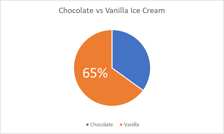
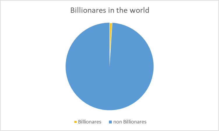
Probably one of the first charts we learned at a young age was a pie chart. I can remember learning percentages in elementary school and seeing pie charts used to help us visual what a percentage represented. According to story story telling with data (https://www.storytellingwithdata.com/blog/2020/5/14/what-is-a-pie-chart) “pie charts are probably better than any other visual for expressing part to a whole relationship.” There are two primary uses for a pie chart and when they make the most amount of sense. First, if you want an audience to have a sense of a part to whole relationship and the size of the slices is less important. This leads us into our second best use is to convey a piece of something that is small or large. This is beneficial when emphasizing how small or large a percentage is in reference to the whole thing. When piece of the pie are similar in size it makes it difficult for us to understand the significance of those pieces.
I made a pie chart comparing two items with data that i completely made up for educational purposes. This helps show parts of a whole in large and small proportions in order to convey a message. I do not think that displaying this data would be done in a better way and believe to be the best possible option for these scenarios.

