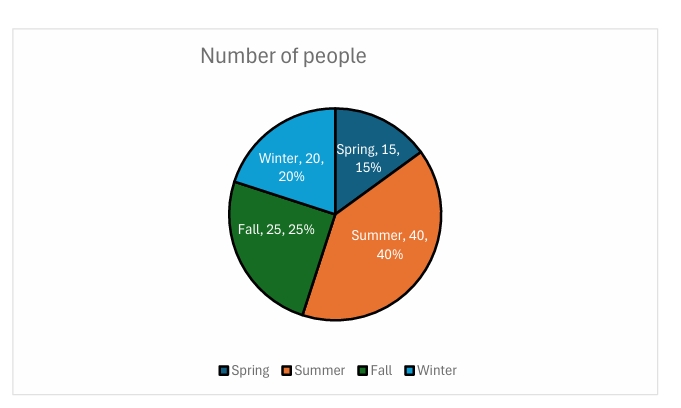
Pie Graphs are one of my favorite data visualization tools. One they are simple to read, two they are easy to make, and three they are easy on the eyes. Pie graphs are defined as “A pie chart is a type of graph representing data in a circular form, with each slice of the circle representing a fraction or proportionate part of the whole. All slices of the pie add up to make the whole equaling 100 percent and 360 degrees” https://www.jaspersoft.com/articles/what-is-a-pie-chart. It looks like a pie with slices made to identify the different data labels you’re displaying. Now a pie graph is great in some instances, but not for all. For example, I surveyed 100 people on Facebook (to make it easily and quickly accessible) and asked them which of the four seasons was their favorite. I also included myself in this survey and summer is mine for anyone interested. And if you look at my pie chart below you can see easily by the labels I included, and the size of the slice clearly larger than the rest, that Summer was the winners choice.

I used excel to create this pie chart in a matter of minutes thanks to this course. Oh, how I love Pie charts. I simply made two columns one for each of the four Seasons: Winter, Spring, Summer, Fall. Then I made a second column with the data I accumulated from my survey of Facebook friends. I then highlighted all the data in both columns and inserted a Pie chart from the selection of graphs. I added some flare to the chart by changing the outline of the series to black so it would stand out to the audiences eyes against the contrasting white background, I clicked the data labels and percentages to be displayed so the viewer would not have to toggle back and forth to the data, and then I also included a ledger for each season with corresponding color of its slice. I even tested this on my six-year-old son to see if he could tell which season was the most favored and which was the least and he answered after just a few seconds…and correctly. See folks the proof is in the pie in this case.
Now to sum it up, a pie chart is not always best used for every type of data visual. Like I said in the beginning I like Pie charts because of their simplicity. So, when you have large quantities of information or let’s say more than 4 or 5 topics to compare then it is not the best choice of infographic. This website from Inforiver had a lot of great information on when and when not to use a pie chart in fact. Or better said… To Pie or Not to Pie. http://Pie charts are most effective when there are fewer categories, ideally less than or equal to 5. As the number of observations increase, readability becomes difficult. It also becomes challenging to distinguish colors of similar tones or contrast. The slices/pies also get smaller and crowded.