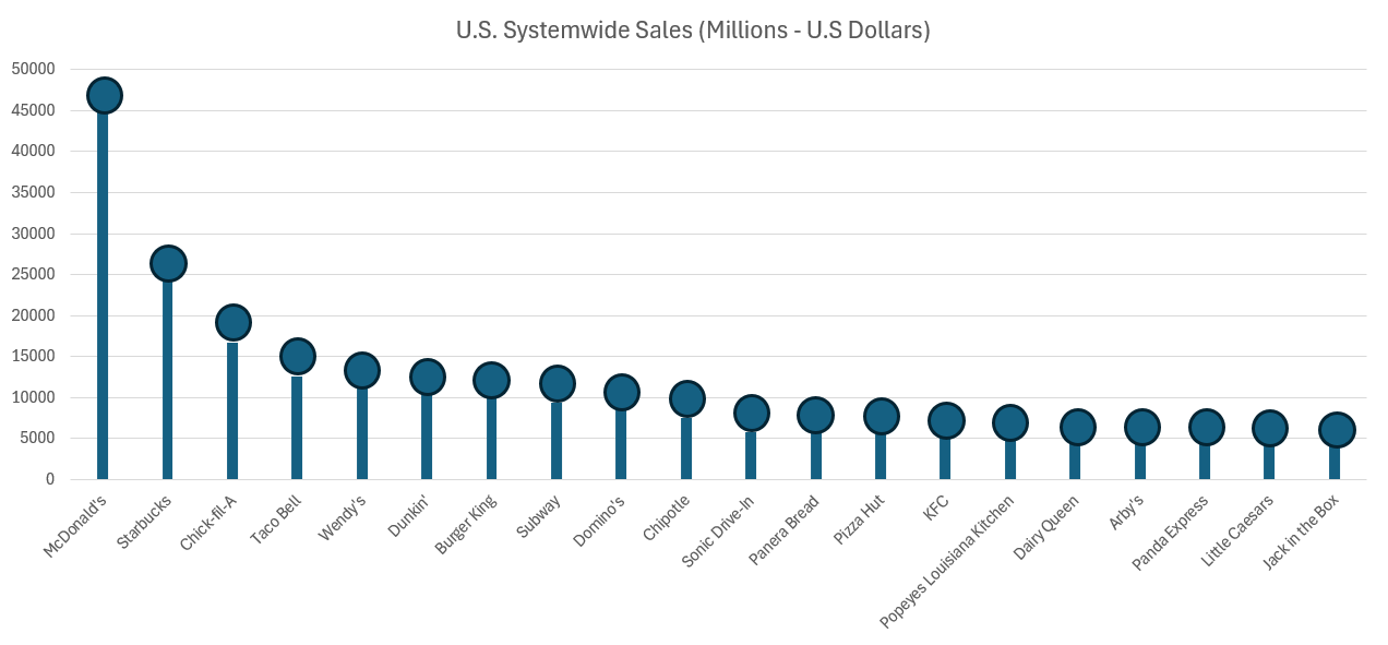
Lollipop charts are a different spin on the classic bar chart. Though they fill the same uses, the lollipop chart has some advantages over the bar graph that might be more useful in some situations.
These types of graphs are very useful in sets of data with many different bars. The lollipops make it easier to focus directly on the data, and notice outliers. The key of the lollipop chart is that it focuses the viewer’s attention at the value of the data itself. A more advanced chart can put data directly into the lollipop itself, or recolor the parts that the presenter isn’t focusing on. An important thing to remember about lollipop charts is that they are applicable to any situation where a column or bar chart would be applicable as well.
I definitely see myself using more lollipop charts in the future. The lollipop enhances an already-existing bar chart, and would be very useful in reducing the amount of ink used for visualizations with lots of data. When the emphasis is on a specific data value, or specific set of data values, a lollipop is the way to go.
Hey Cuzzoli,
I love the use of a lollipop chart here. The data set is simplistic enough to work seamlessly with this style of graph. I like how you used the vertical alternative and highlighted the bullets with a border.
My question to you is, did you also conduct research on international sales for these fast-food chains?
I think it would be interesting to see how the data changes or does not change when incorporating a broader data set. We discussed the use of resources such as Kaggle that may assist with this suggestion.
Good work.