Who doesn’t love a lollipop? Well in the data world we are not talking about a sugary yumminess atop a stick. We are talking about a a chart that breaks and categorizes information into a clear, concise, easy on the eyes graph. A lollipop chart is a type of data visualization that displays information using a series of vertical lines (or “sticks”) topped with circles (the “lollipops”). Each lollipop represents a data point, with the length of the stick indicating the value of that point. Typically, a lollipop chart can be made off of a scatterplot or line graph with markers but would take some extra steps to achieve the ultimate goal.
I chose to survey the 61 people whom I work with daily and watch consume countless cups of coffee to get through the day. Some like it black with no added enhancements, while others use a variety of flavors and toppers to make their perfect “cup of joe”. Firstly, I interviewed each staff member and asked whether they drank coffee or not and if they did (which was everyone) they moved on to the next round of questions. I asked and tallied who used cream, or milk, or sugars, and who used nothing. Then I tallied who used non dairy plant based products. The final question was left for the two people who used a little cinnamon spice in their coffee for some fun flavor additive. Here is what the final product of my lollipop chart came out to be.
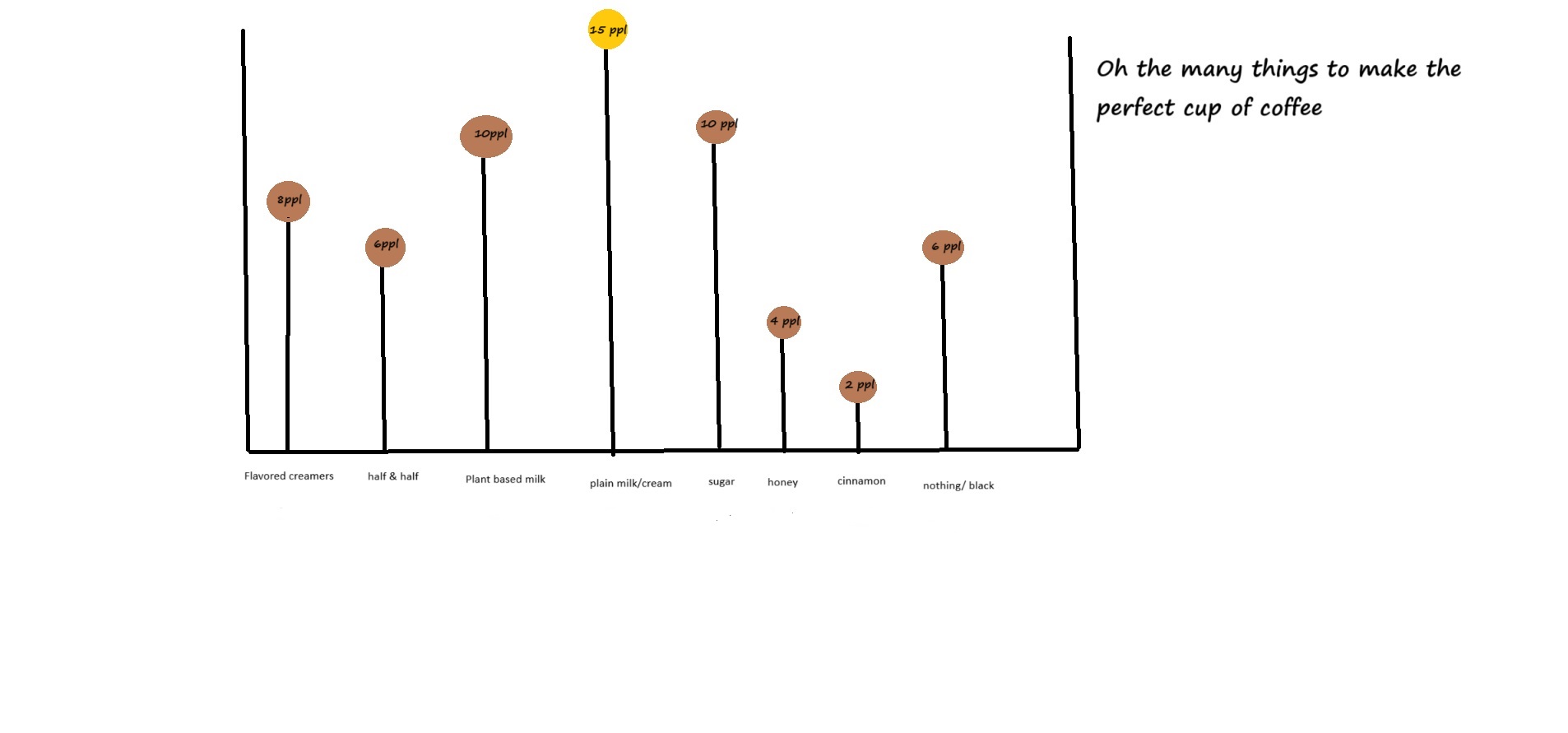
As you might be able to tell I decided to go the route of making my lollipop chart using a tool on my computer at work called abstract paint. I had to take the data I accumulated and count up the tallies into numerical value. Then I organized the results so that the most common additive of plain milk or creamer was in the center(ish). I wanted there to be a variation between the heights of my lollipops so that the data was easier for the viewer to decipher. I also added in some esthetic colors to represent the brown that coffee would usually entail. Then I changed the color of the highest used product (milk/plain creamer) and made it stand out so the viewer would be drawn to this and remember it being the one most used. I did attempt to use excel and canva online databases to make my chart and follow the steps in the course textbook, but it was just not looking the way it was supposed to every time I tried to label the lollipops appropriately. So old school it was for me! I hope everyone enjoyed the blog and I look forward to seeing your own infographics!
I like the color coordination involved with your chart as I wish I did a little more in mine. I think you did a great job showing which ingredients are involved and where you got the data from.
Well said, i like it
Lollipop charts are great for showing relationships among data points, and this was no exception. I like how you chose to give the most popular choice’s lollipop a different color. It makes it more eye-catching and draws the viewer’s attention to the highlight: the most popular choice. Great work!