Lollipop charts offer a unique and visually engaging way to present data, especially when the focus is on comparing specific data points along a single axis, such as categorical or numerical variables. They are often used as an alternative to bar charts when presenting fewer data points because lollipop charts simplify the visual load while emphasizing individual values effectively.
A lollipop chart typically consists of a line extending from the axis to a circular marker at the end, where the marker highlights the exact value, making the comparison across categories straightforward. Unlike bar charts, where the visual weight can become overwhelming due to the solid fill of the bars, lollipop charts use a minimalistic approach that reduces the visual clutter, making them an excellent choice when clarity is prioritized for a dataset.
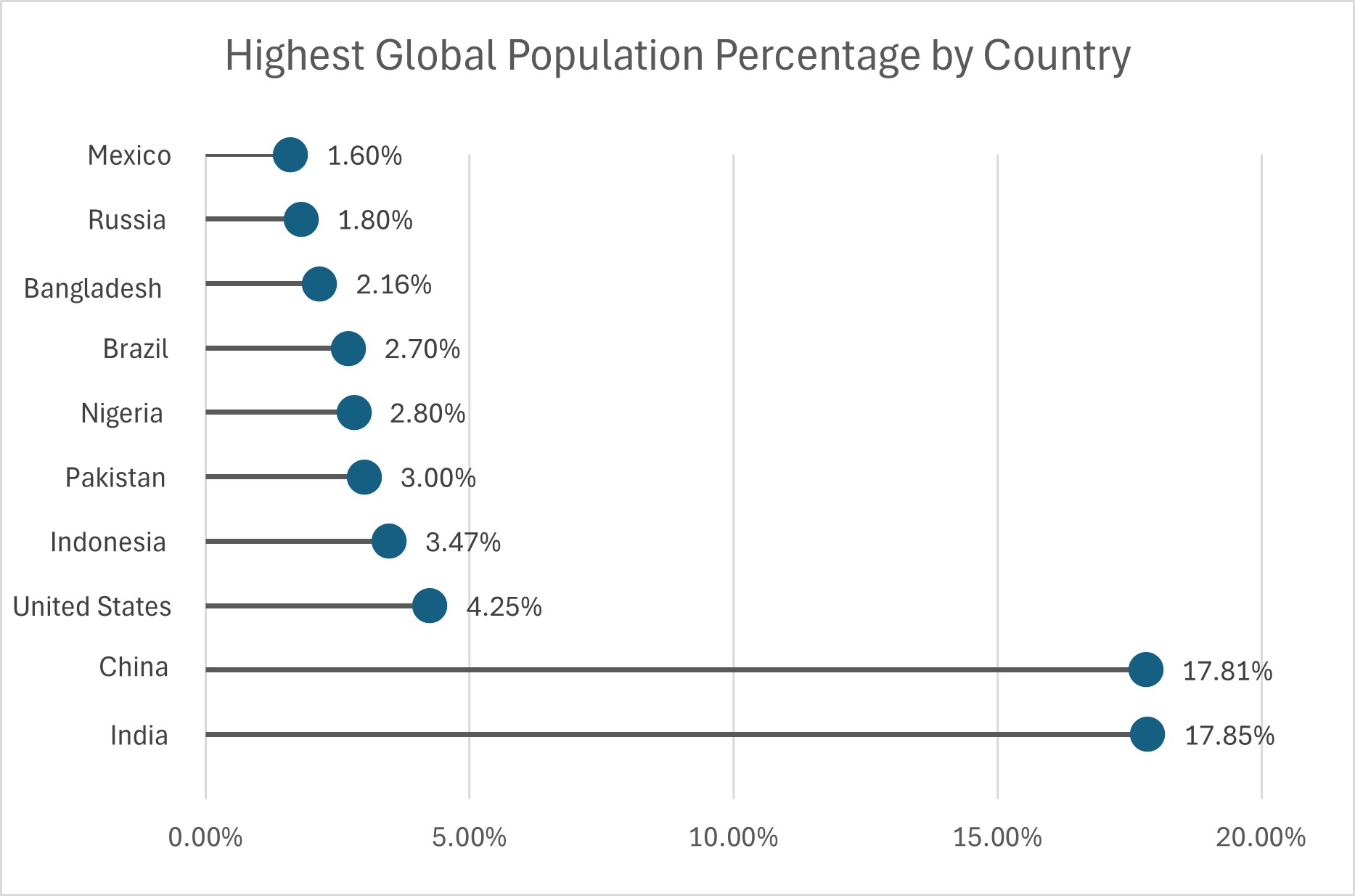
Lollipop charts are especially useful in scenarios where the audience may have to compare precise values between data points or observe trends without having to process the bulkiness of bars. For example, in the chart below a dataset of percentages of world populations is shown. The data is categorized by country and is shown in ascending order, displaying lower percentages first. Using a lollipop chart for this dataset emphasizes the relative differences in percentages without drawing the viewer’s eye to the “mass” of the data; rather, the data points themselves become the focal points. A lollipop chart is appropriate for complete datasets, but also for one such as this that is a focused subset of a larger amount of data.
Lollipop charts also have the benefit of versatility, as they can be oriented horizontally or vertically depending on the data context and the layout of the presentation. Horizontal lollipop charts are especially helpful when the category names are long, allowing them to be fully displayed without awkward rotations or abbreviated labels, as seen above. Additionally, their form makes lollipop charts adaptable to visual customization. The color and size of the circular markers, for instance, can represent additional variables or highlight specific data points for emphasis.
Ultimately, lollipop charts are well-suited for audiences that require clear, straightforward representations of categorical data with an emphasis on the individual value of each data point. They can be used for complete or partial data sets, and can be customized to best suit the presenter’s or viewer’s needs.
This is a great way to highlight the differences of very similar points while still calling out differences. The percentages help a lot as well with a smaller dataset. Great way to represent the data set!
Hi,
This data was a great example to use to display a lolipop chart. When bar charts are overly colorful and have comparable heights, lollipop graphs are frequently utilized. It displays the connection between a value and a category.