Lamar Miller
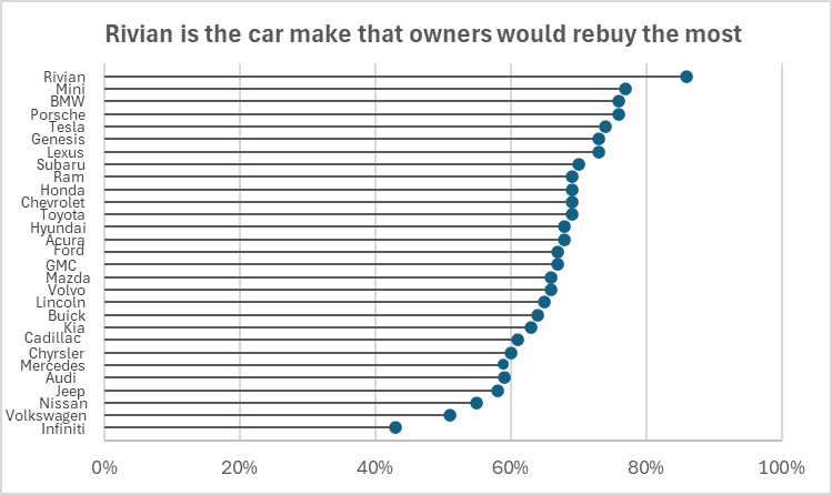
Here you will find data I used to construct my lollipop chart. The data is based on car makes that owners would rebuy. The source also goes on to show the customers satisfaction scores which was not used for my visualization. I chose this data set because I am a fan of cars and wished to get more data on what models most users prefer. I would recommend using this chart type when you wish to make a lengthy bar chart less visually overwhelming. With this type of chart, we can remove unnecessary marks, ticks and labels that could be seen as distracting. What is also good about this chart is the horizontal line helps the scatter plot relate better to the Y-axis. It draws a viewer’s eyes to the data label without having to search through the visual to determine the relationship.

I liked this dataset that you chose to use, the lollipop chart truly shows a difference for car models with very similar values.
Personally, I have a Mazda and I am sad to see it so low on the list, haha. Other than that this graph is perfect way to highlight the differences that can be very similar. Very cool to see this as a Horizontal graph rather than vertical.