Within my fictitious dataset that I created, I show a possible way to use a lollipop chart. These charts are most commonly found in place of a barplot, where you are comparing multiple data figures against one another. This technique can help to simplify the graph for the reader and make it easier to understand for the viewers. These charts typically work best when comparing a relationship, rather than a trend.
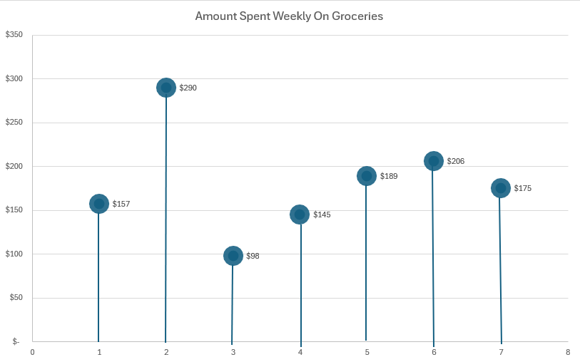
In this example, we can see the x-axis (the customer), and the average amount they spend weekly on groceries. While within this example there is no benchmark to measure against, the data figures still can be seen and measured against each other fairly easily. We can note that customer 2 has an exorbitantly high grocery bill, possibly due to a variety of factors. In contrast, customer 3 has the smallest grocery bill, maybe someone shopping solely for themselves compared to a parent shopping for 3. These scenarios are not the whole truth behind this fictitious dataset, but an interesting note to take away is the insights that these numbers are able to give us. By seeing the average across the chart, it can help us to identify outliers much quicker, and provide possible explanations as to why one customer’s grocery bill can be significantly less to greater than another.
I like that you decided to create your lollipop chart vertically instead of horizontally. Most people make their charts horizontally and it is very unique and easy to read since you made it vertical.