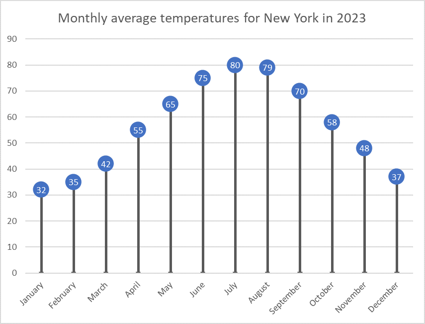
For this data visualization exercise, I created a lollipop chart using the average monthly temperatures in New York City. This chart type, though lesser-known, provides a clean and effective way to present data. It minimizes visual clutter while maintaining accuracy, focusing on the values at the endpoints of each data series, making it an ideal choice for certain data types.
Why Use a Lollipop Chart?
Lollipop charts are a variation of bar charts that simplify the visual representation of data by removing the bars and retaining just the “lollipop” shape, which consists of a dot at the end of a vertical line. This design emphasizes the most crucial part of the data: the endpoint, where the value is represented. By doing so, it eliminates excess “ink” from the chart (i.e., the visual elements that aren’t necessary), creating a minimalist yet effective graph. Lollipop charts are particularly useful when you have many categories to display but don’t want to overwhelm the viewer with dense visuals.
In this example, I used a dataset of New York’s monthly average temperatures for each month of the year. Lollipop charts are ideal for this type of sequential data because they clearly show fluctuations in temperature without the visual bulk of bars filling up the space. Each lollipop (dot) represents the average temperature for that month, while the connecting lines provide a reference for the range, making it easy to compare temperature changes across months.
The Process of Creating the Chart
To create the lollipop chart, I used Excel, which provided a straightforward way to manipulate the data and customize the chart format. I started by inputting the data for New York’s average monthly temperatures. After inserting a simple line chart, I removed the line connecting the points and increased the size of the markers at each data point to resemble lollipops. This method gave the chart a clean and modern look, perfect for drawing attention to the changes in temperature over the year without unnecessary visual noise.
When Should We Use Lollipop Charts?
Lollipop charts are most effective when you need to compare a single variable across categories or time periods, especially when your goal is to highlight the extremes or focus on specific values rather than trends. They are useful for visualizing survey results, ranking data, or time-series information like the monthly temperatures I used in this example. If you’re presenting a lot of data and want to simplify the display, a lollipop chart is a great alternative to the traditional bar chart.
In conclusion, lollipop charts offer a minimalist and efficient way to convey data while maintaining clarity. My visualization of New York’s monthly temperatures shows how this chart type can be both functional and aesthetically pleasing, helping viewers focus on the most important data points without distraction.
I think that you did a really good job of explaining lollipop charts and what they are meant to represent. I like that you broke your post down into different sections that cover when these charts should be used, why they should be used, and the process of creating them.
Your lollipop chart is really aesthetically pleasing! I know it was actual data and not intentional probably, but I like the fact that it goes up and then hits the climax temperature and then goes down. I also really like how you explained how you made this lollipop chart in Excel, super helpful! This was an easy read and informative, great blog!
We use the Data for caculate about the system and name to add in the processing temperature and increasing and decreasing and timeline of the Month
I agree that you did a really good job of explaining how you did the lollipop charts. It is very clear and precise and easy to understand. I also like how you explained why we use these charts because I have never seen this chart before and maybe instead of using a bar graph next time, I will use a lollipop chart instead. It gives a better visual or representation of the data for me.
This is great stuff.