Lollipop Charts are used to compare objects or groups the same way that bar or column charts do. So why not just use a bar chart? Lollipop charts are a great way to make longer bars less visually distracting by removing the ink from actual bars themselves and highlighting the key data being portrayed. That has been some research conducted (Blasio &Bisantz, 2002) that supports that ideology and that by making a more ink friendly design can impact readers ability to interpret the data and lead to faster response times.
Lollipop charts are derivates of more commonly known charts and can be created by modifying a scatter chart or line with marker charts. While this may be a little more complex and require you to have a better understanding of excel it is a great tool to add to the toolbelt. They are essentially a large dot with a tail attached to it which is adjusted based on the height of the bar.
It a normal everyday practical use like the chart below they can very easily highlight the end point data you are looking for without the other distractions. Below is a chart of the average points allowed per game by NFL teams so far this 2024 season. The NFL has 32 teams in it and to have a thick column or bar chart could lead to the bars being closer together and more difficult to read. By eliminating that we can clearly see the data that we are focused on looking at.
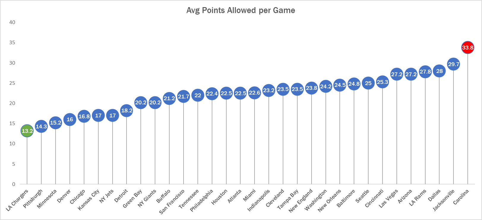
See! Super easy to read. Here we can clearly see that the Carolina Panthers are allowing the most points in the NFL while the LA Chargers are allowing the least. Simple but very effective.
I really liked that you made the Carolina Panthers lollipop icon red versus all the other ones being blue because it caught my attention and eye right away! It was clear to see that they were in the lead by being higher than the rest but only by a about 4 pts so by making it red it held its own statue of being the leaders as well! Great chart! Is this your favorite team by chance too?
Increasing from different states and increasing game score for adding points it
I love the customizability that comes with making a chart like this! Within your chart, you emphasized the Panthers icon because it helps to identify key figures of data that you want the viewer to focus on. I found that to be a very clever way of bringing the reader’s attention to what you want, without explicitly telling them where to redirect their attention to.
I love the NFL based data set I did something similar involving NFL wideouts. I was also wondering if this included pre season, which it probably doesn’t but I was just wondering because there is no way to tell. I suggest just specifying regular season or playoffs.
Very interesting