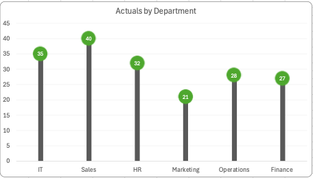
Lollipop charts are used to compare several objects or groups, similar to the purpose of bar graphs. They can be very useful in analyzing and visualizing trends. A lollipop chart can work well for comparing the values of different groups while accentuating individual data points, especially if some values are extremely high or low. They make it easier to identify deviations or substantial differences between data points. Lollipop charts should not be used for distribution or relationships in data. The Lollipop chart that I created in excel is shown below.
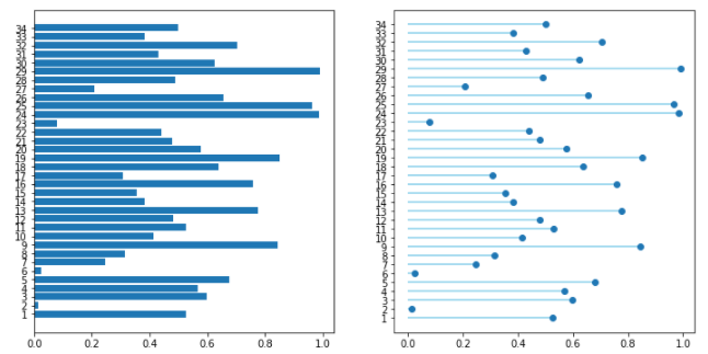
Lollipop charts are modified bar charts with dots representing points and thin lines for bars so that more data may fit in a smaller space. A lollipop chart is a good option for placing or focusing on specific values within a dataset because it minimizes visual clutter from crowded bars. The line helps guide the viewer’s eyes directly from the data labels on the x or y-axis straight to the data point value. The image shown below is a good example of how sometimes bar graphs can look cluttered with too much data. Using a lollipop chart takes some excess color off the screen making it easier to visualize the values of each data point for analysis or comparisons.
Different of the statics of the Marketing, HP, Finance are group are using the Data systems
I agree that using a lollipop chart is way better with more data than a bar graph. With too much information in a bar graph it could become confusing. But with a lollipop chart someone might be able to visualize it better. I like how you gave extra examples and a comparison between a bar graph and a lollipop chart. Makes it better if you can visualize the differences.