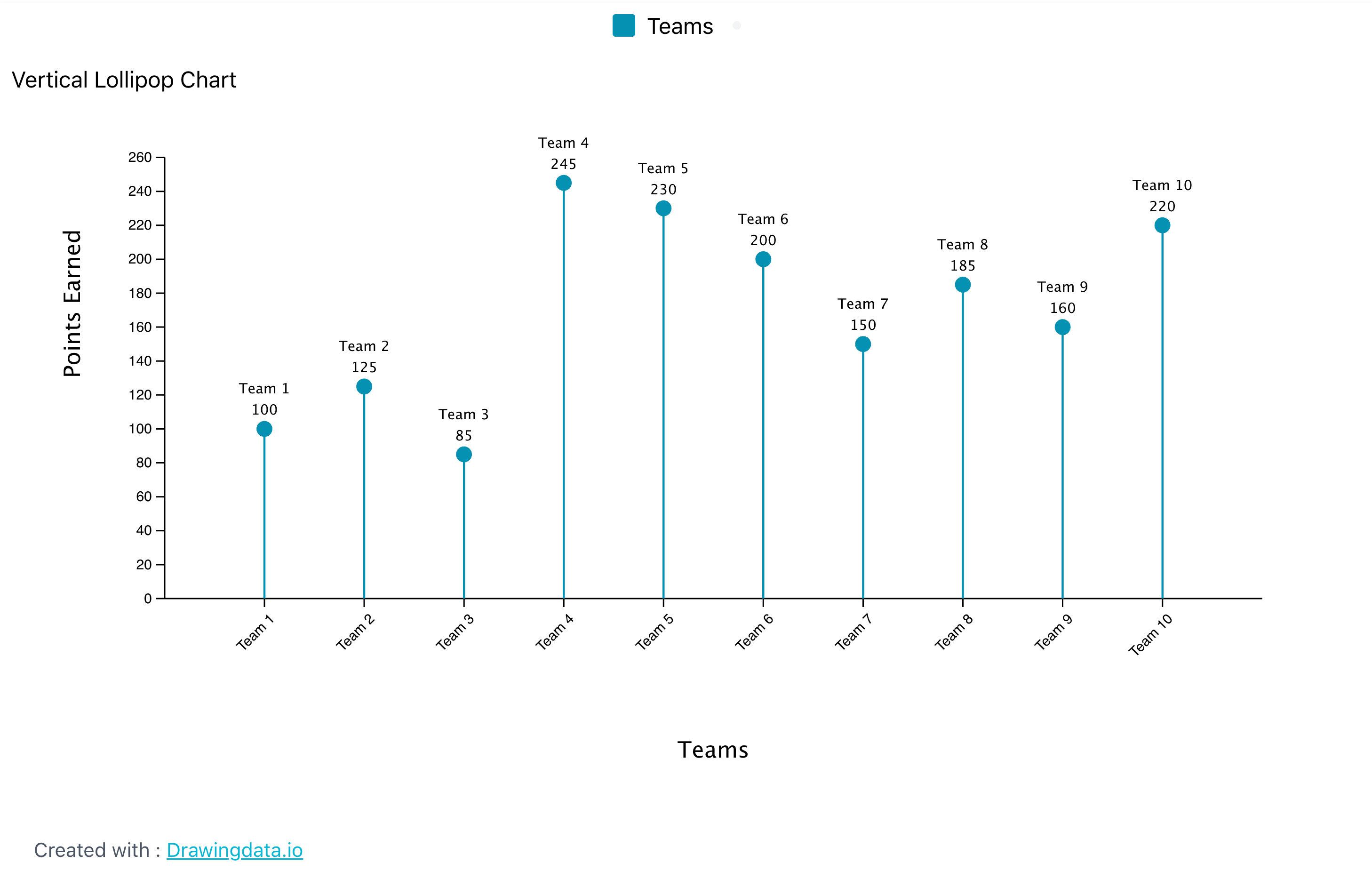
One of the primary advantages of using a lollipop chart is its ability to highlight specific values while maintaining a clean and straightforward visual presentation. This is particularly beneficial when dealing with a limited number of categories, as it enables the audience to focus on the key differences without being overwhelmed by excessive information. The visual simplicity of the lollipop chart helps to draw attention to the most important data, making it easier for viewers to interpret the results. Moreover, lollipop charts can enhance the aesthetic appeal of your data presentation. Their playful design can make your report or presentation more engaging, capturing the audience’s attention and encouraging them to interact with the data. This visual appeal is especially valuable in settings where you want to convey information effectively while also keeping the audience interested. Whether in business meetings, academic presentations, or public reports, a lollipop chart can serve as a powerful visual tool that aids in communication.
In addition to their visual charm, lollipop charts are also versatile. They can be used to represent various types of data, including categorical data, numerical comparisons, and even time series data when adapted appropriately. This flexibility allows you to tailor the chart to fit the specific needs of your analysis, making it a valuable addition to your data visualization toolkit. When considering the use of a lollipop chart, it is essential to ensure that the data being presented is suitable for this format. The chart works best when there are clear distinctions between categories and when the data points can be easily compared. By selecting the right context and data, you can leverage the strengths of the lollipop chart to convey your message effectively.
In summary, a lollipop chart is an engaging and visually appealing data visualization tool that combines the best features of bar charts and dot plots. It is particularly useful for highlighting specific values and making comparisons between a limited number of categories. By using a lollipop chart, you can enhance the clarity of your presentation, capture your audience’s attention, and facilitate a better understanding of the data being presented.
I think that you did a great job constructing your Lollipop Chart. These charts can be great to use when dealing with various types of data. Lollipop charts are visually appealing and simple which can help viewers focus on the most essential details. How did you find the data that you chose for your graph?
I have never taken a data visualization course before this class and so I am finding all the different types of ways to display data super interesting. I think lollipop charts might be my favorite so far. I agree with you that they are a great way of displaying large quantities of data in a structural and not overly confusing aspect.
I really enjoyed how you highlighted the versatility of lollipop charts. It’s interesting that you mentioned using them for time series data; I hadn’t thought about adapting them for that purpose! Have you found any specific examples of lollipop charts used in time series analysis? One suggestion might be to explore how the chart’s ‘playfulness’ could impact the perception of more serious datasets. Could this lighthearted design ever risk undermining the gravity of certain topics? Thanks for the insightful post!