The graph containing a benchmark that I wanted to look at was this one from the New York Times focusing on electric vehicle sales in the US, excluding Tesla. Tesla has been excluded from this graph since they are far and away in first place, with 140,187 vehicles sold in the first quarter of 2024. For comparison, this is seven times larger than Ford, who is in second place with 20,000 vehicles sold Q1 2024.
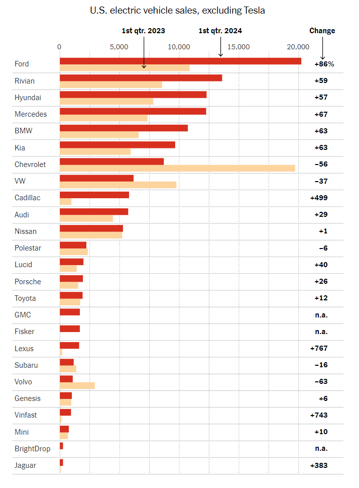
This visualization has a different benchmark for each company. The benchmark is their performance one year prior, in Q1 2023. Benchmarks are commonly represented as a line, but since each company is being compared to a different data value, they opted to represent the benchmarks as lighter colors that do not detract from the current year’s data. Using a dark red for current data catches the eye. It sticks out more than the old data, ensuring that there’s a clear distinction and the bars don’t fight with each other for clarity.
Overlapped bars could have been used as well, but I think I understand why the author opted not to. With 25 companies in this chart, overlapping the bars could lead to a lack of whitespace. All in all, this graph is a wonderful representation of its data. I’d also like to note the fact that this is a horizontal bar graph instead of a vertical one. With so many data points, it becomes hard to label the data in a way that preserves readability. Vertical bar charts such as this one help to alleviate that issue.
I think that this is a useful graph to show the purpose of benchmarks and the use that they have when displaying data. Although you did a good job of explaining this graph and what it is conveying, I think that it would have been helpful to have at least one more graph for a comparison of the different ways that benchmarks can be displayed.
I like this graph, a lot. I think it was very smart to take out an outlier such as Tesla, to accurately show the competing EV sales.
That being said, I like how clearly you defined a benchmark, as something to show comparisons, and I like how you clearly indicate the benchmark for each company and how the different colors show different quarters. Nice post!
I really enjoyed the usage of the sole amount of EVs that Tesla has sold. Rather than showing that within the graph, using it as a benchmark allows the viewers (us) to see the more minute details within the bar chart. Side note: I did not realize that Tesla had that much of a monopoly over the EV market!