An important element in any display of data is a benchmark– this can be a target, long-term goal, average, or standard. Oftentimes, benchmarks are written down in memos, but aren’t included in the actual data visualization. This can potentially help an audience visually the data in a more informed and efficient manner. The stories that can be told include:
“Our key indicators met the preestablished targets in three out of seven areas.”
“Regions A and B did not meet quarterly benchmarks”
“Here is how our groups compared to the national norm”
“Students in the Chemistry Department are above average on final exams this year.”
“We did not meet our fundraising goal, but we got very close.”
“Our click rate was 25.6%, while the industry standard is 4.3”
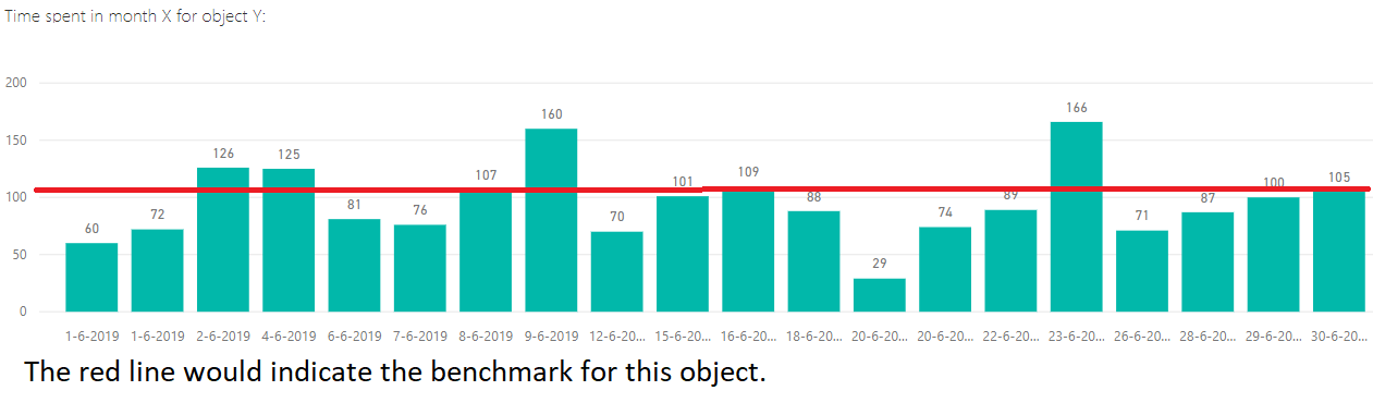
There are many different ways to include benchmarks in data presentations. The most common form is a simple line.
Another example is a bullet chart, which has gray shaded area of comparisons behind a bar of column.

Hello Donnel! I like how you clearly stated the definition and uses for a benchmark and identified them easily in your visuals. Do you think the simple line benchmark works better than the overlapping bar benchmark? The one stipulation I have with your article is that you should have defined “benchmark” as something to compare data to a target.