Lamar Miller
Here you will find a visual on phone phishing data. This visual uses the dashed line to indicate the benchmark for the industry. The visual goes on further to use stacked columns to indicate the different ways phishing can be delivered. The dashed line is a good way to show a benchmark because it is simple and stands out on a visual without a need for additional labels. Not using a solid line also allows a viewer to quickly interpret that it is intended to stand out and be different than the other lines in the visual.

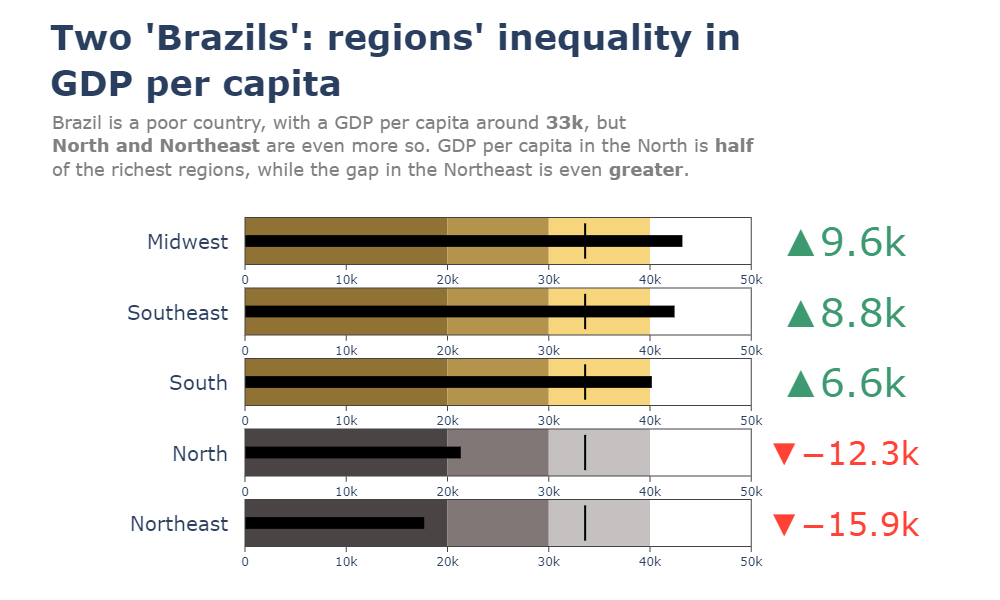
Here you will find a horizontal bullet chart depicting a comparison between North and Northeast Brazil GDP per capita while also indicating where the other regions stand. The benchmark is represented as a target line of 33k which can be easily interpreted. The visual goes on to show the gap in GDP by region.
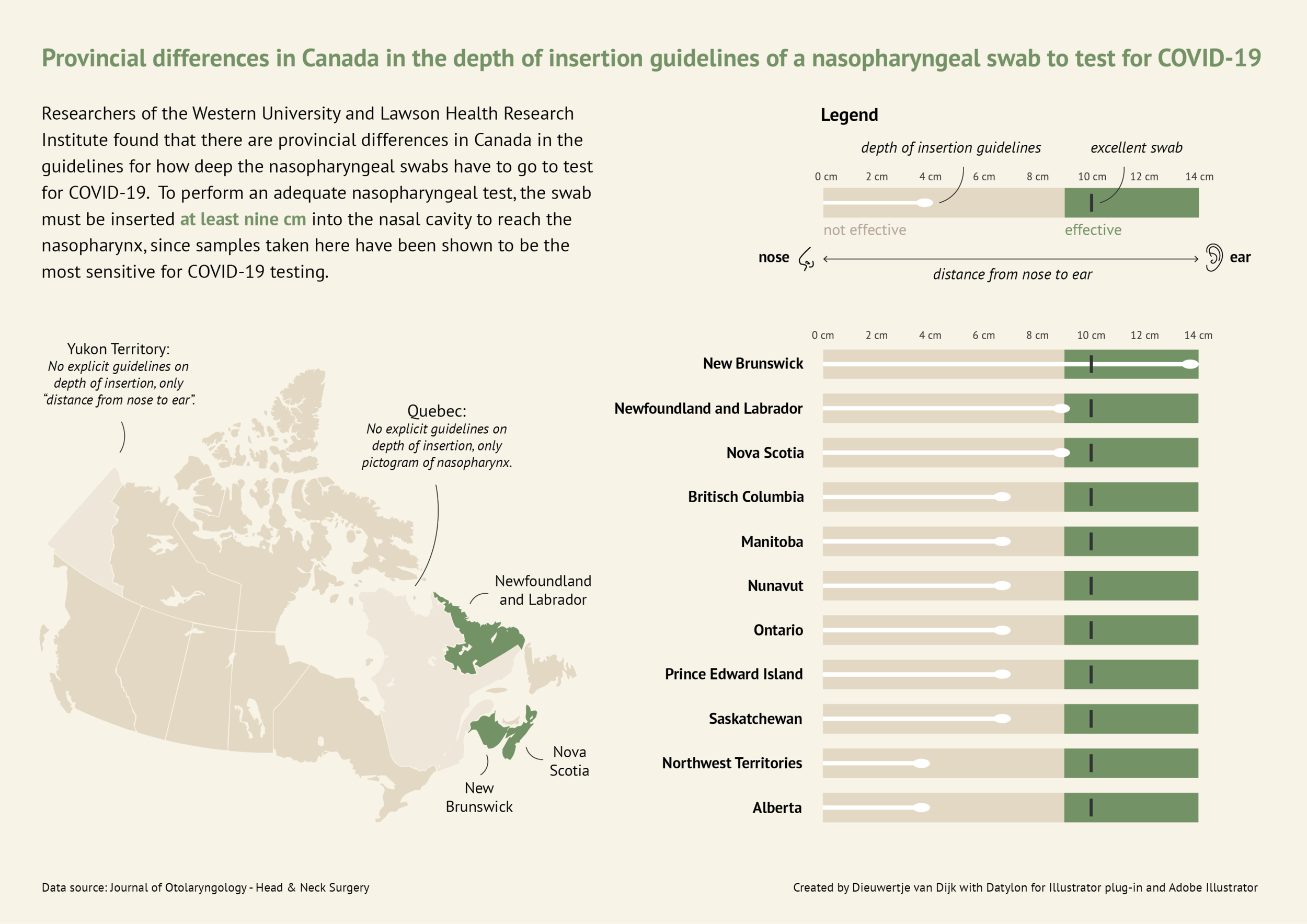
Here you will find a more in-depth horizontal bullet chart. I like this visual as it combines not only elements of a benchmark visual but incorporates other visual elements and really tells a story. This chart also uses target lines depicting the provincial differences in Canada regarding nasopharyngeal swab tests of Covid-19. The benchmark is indicated as 10cm in depth for the most effective swab.
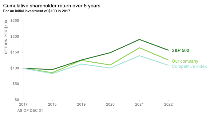
Here you will find a line graph with benchmark lines. The lines are represented as the competitive index and S&P 500 index versus their company. This chart incorporates two comparable benchmarks for a viewer to interpret against their trend. The visual shows the cumulative shareholder return over 5 years on an initial investment of $100 back in 2017. This chart is quick and to the point and provides an audience with just enough data to compare.
Lamar, I really enjoyed reading your breakdown of different visualisations incorporating benchmarks! The variety of charts you explored, from stacked columns to bullet charts and line graphs, shows how versatile benchmarks can be across different types of data. I found your point about using a dashed line as a benchmark especially insightful—it’s subtle yet effective in guiding the viewer’s attention. I’m curious, how do you think the use of multiple benchmarks (like in the S&P 500 index comparison) impacts the clarity of a visual? Do you think there’s a risk of overwhelming the viewer when too many benchmarks are present, or does it add useful layers of insight?
One suggestion would be to consider experimenting with interactivity in these visuals. For instance, in the line graph with cumulative shareholder return, adding a tooltip or hover function could allow users to get more detailed insights as they interact with the benchmarks. I’ve seen this technique used effectively in financial dashboards to help users compare against multiple benchmarks dynamically.