Benchmarks in graphs provide a reference point, allowing viewers to quickly assess how data compares to a standard goal or historical average. They help to contextualize values, which highlights trends or performance gaps. By including benchmarks in graphs, data visualizations become more informative, making it easier to interpret progress, identify outliers, and support information assessment at a glance.
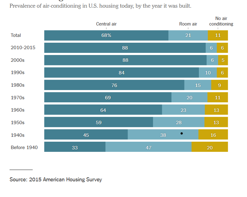
The graph below depicts the change over time of air conditioner use within residential buildings. By constructing this informative graphic using bars, the data can easily be assessed even by those who are not adept at data analysis. The topmost bar shows the benchmark for central air, room air, and no air conditioning while the bars below show a breakdown of each category in 10 year increments. The use of stacked row bars and a clearly separated benchmark lend to an organized, easy to read graphic that allows viewers to clearly determine the difference of each category over time. By visiting this article, you can read more about the changes in air conditioner use over time.
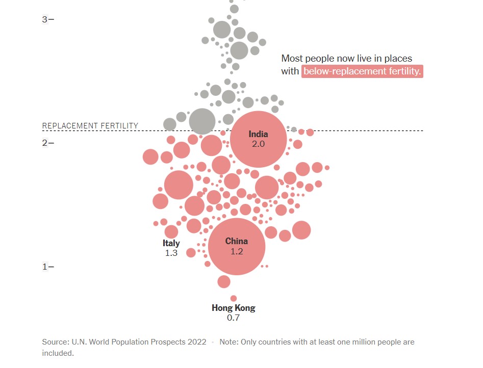
The next graph, found below, shows a comparison of countries (with populations over one million) and their replacement fertility rates. While there are only a few markers that have labels attached to them, population size is indicated by the size of the circle used to represent the country. This is not only a visually pleasing detail in this graph, but it is a simple and effective way to offer knowledge to the viewer without overcomplicating the graph. In this graph, the benchmark is displayed in the form of a dashed line with a label. This shows a clear indication of which countries fall above or below the benchmark for replacement fertility rate. Additionally, the coloration of the country markers help to indicate which countries are below the benchmark, even if it appears that they are touching it. To read more about population growth and decline, follow this link.
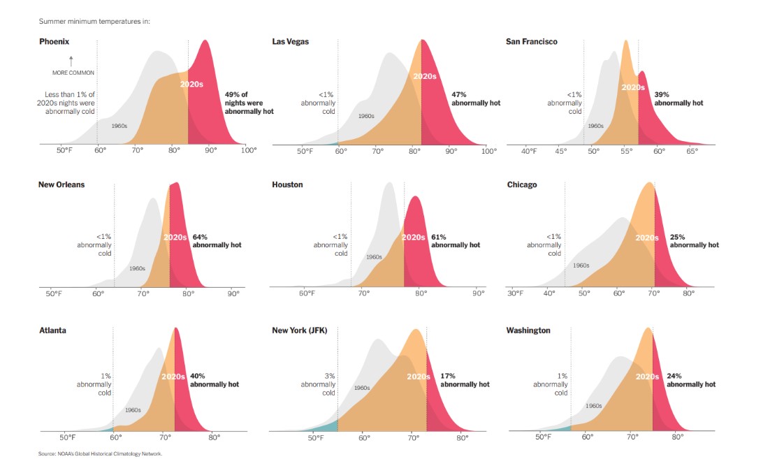
Another use of a line as a benchmark can be seen below in various graphs used to compare summer minimum temperatures in different cities across the United States. By utilizing vertical solid lines to show boundaries of where outlier temperatures are located, density plots are able to be used to properly display the temperature information for each city. Not only are solid vertical lines used, but temperature data from previous years are displayed as a benchmark to show the difference between summer temperatures in the 1960’s compared to 2020’s. There are additional graphs and information to compare climate change over time at this webpage.
Hello! The examples your provided for benchmarks are perfect, you did a great job of making sure to provide examples of different types of graphs with benchmarks so that the viewer gets a better understanding of different benchmarks in graphs. However I would suggest using a different graph rather than the circle marker graph you provided. I feel that the benchmark line on this graph is rather confusing. I do not have any questions for you being that I enjoyed the rest of your post and found it very informative!