What is a Benchmark and why does the World use them? Well, a Benchmark is a standard or point of reference used to measure the performance, quality, or value of something. To get literal, according to the Cambridge Dictionary, a benchmark is “a level of quality that can be used as a standard when comparing other things“. Therefore, a benchmark has endless opportunities to be used in the World. Some may use them for a finance report to compare performance or investments. Others may use a benchmark in technology comparing speed, efficiency, and capabilities of a program. For me I would be using it in the education world maybe to compare my students grade point averages, or how they have progressed or declined in performance. Overall, benchmarks help establish goals and measure progress or success in any aspect you use one.
In this case I am going to show you a few examples of how Benchmarks can compare in the benefits of using one to display data versus how they compare in the ways they were used.
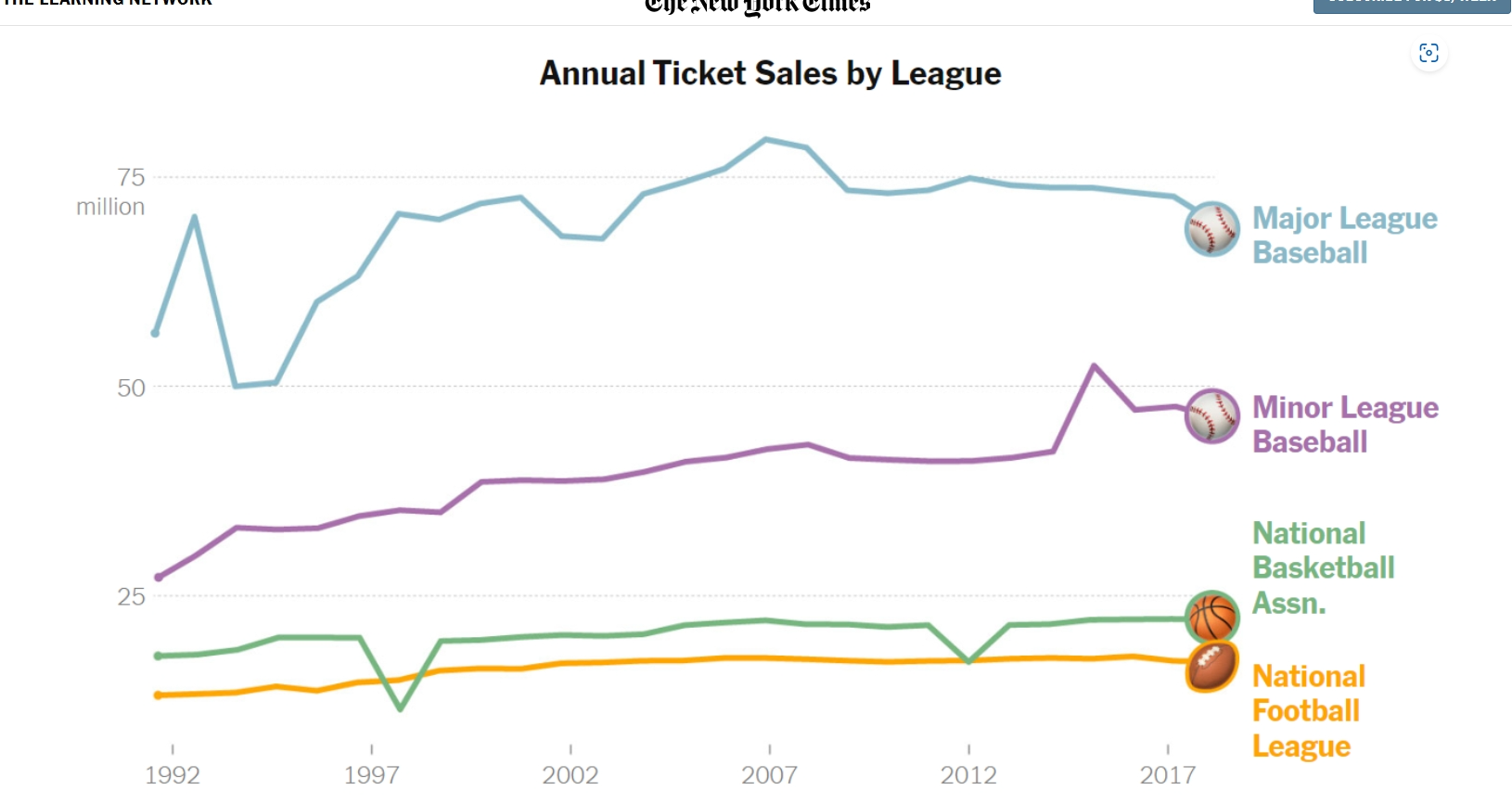
Below is a picture of a line graph used to compare Annual ticket sales by different Sport Leagues. The difference in color used for each specific league, as well as the icon attached at the end of the line to differentiate each benchmark really caught my eye. Clearly Major Leage baseball has the most consistently high sales. Perhaps that is because tickets prices compared to NFL prices are lower, or maybe America just likes their past time sport of baseball best. You would need to read this NYT article to get the details, but the benchmark is a great example of data visualization and the different ways to enhance them. https://www.nytimes.com/2019/10/24/learning/whats-going-on-in-this-graph-oct-30-2019.html
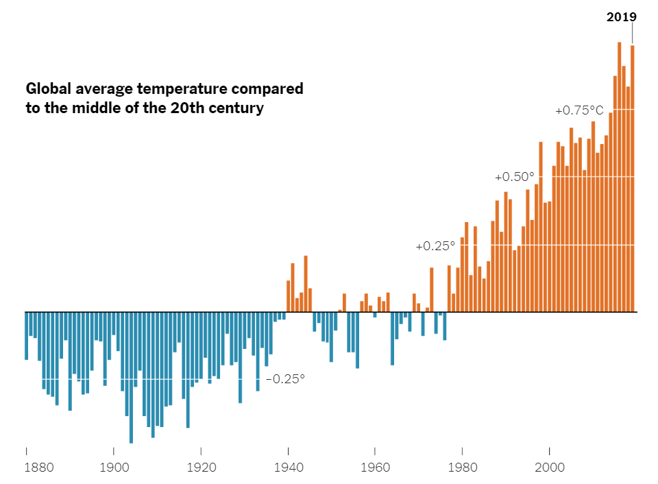
Now lets look at something compeltely differernt than Sports and ticket pricing. There was another article in the NYT digital genre that compared the Hottest and Coldest temperatures of the world on a timeline from 1880 to mid 2000’s. https://www.nytimes.com/2020/04/23/learning/whats-going-on-in-this-graph-global-temperature-change.htmlThis data visualization used the blue color for cold temps, and red for hot temps which the brain typically relates as one another as well. Also, the bars on the graphs go below the benchmark used in this graph to show freezing/cold temps while the bar go above the benchmark for hot temps. The benchmark is used for the comparing of data and was used really well here in my opinion. There is a lot of data being displayed but it doesn’t seems as congested or confusing in this delivery.
Benchmarks to circle back around are a great tool to use when comparing information or data. The means of them are endless and can be used in many different ways. I hope this Blog was helpful in explaining their purpose and giving some insight on how they have been used successfully.