By Kevin Barksdale, in Benchmarks on October 2024
Introduction
In the cutthroat Smartphone market, any major parameter such as performance score, battery backup or market share comparison gives the users or manufacturers an idea of how a particular device fares against the other. These visualizations can be in any form of bar graphs, line graphs or the radar graphs depending on how the various phones are placed in relation to the standards or competitors.
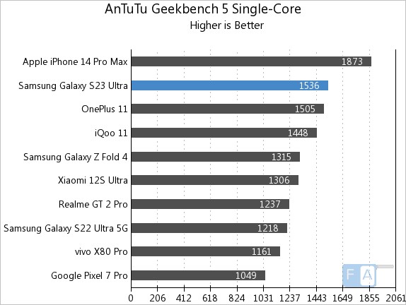
Smartphone Performance Benchmarks
One common way to compare phone performance is through benchmarking software scores such as those from Geekbench or AnTuTu. A bar chart is often used to compare models, with the benchmark score indicated as a horizontal bar across the chart. In the example below, phones like the iPhone 15 and Samsung Galaxy S23 are compared against an industry benchmark score.
Battery Life Comparison
In this line chart from Tom’s Guide, various smartphones are compared based on battery life measured during standard tests. The benchmark is the industry-standard average, indicated by a dotted line. Phones that exceed this benchmark, like the iPhone 14 Pro Max, are shown above the line, while those with below-average battery life fall below it. This visualization allows consumers to easily spot which devices perform better in terms of battery longevity.
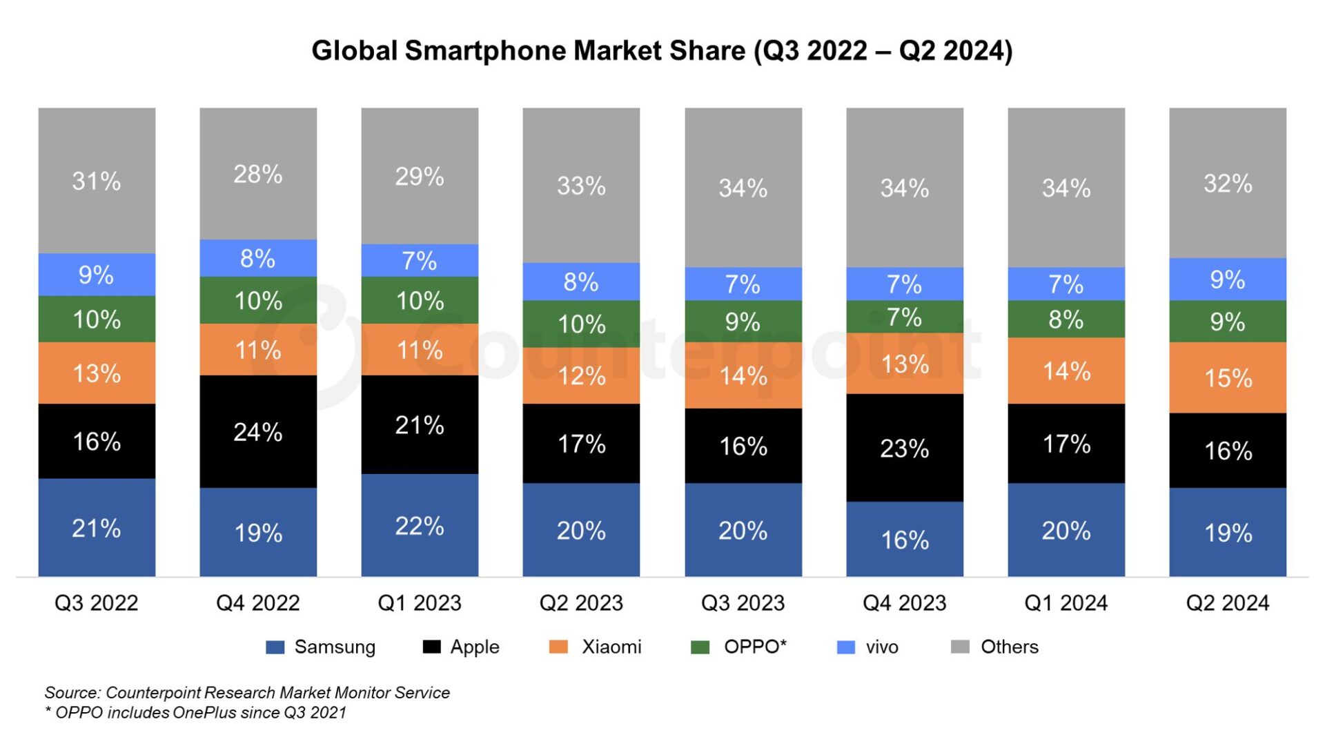
Market Share Comparison
In this stacked area chart, global smartphone market shares for different brands (Apple, Samsung, Xiaomi, etc.) are compared to the benchmark of global market trends. The visualization highlights how each brand’s market share has grown or shrunk over time. A consistent color represents the benchmark (overall market growth), while each company’s share is visually stacked, making it easy to compare how individual brands are performing relative to global trends.
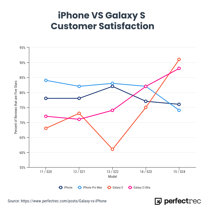
Customer Satisfaction
For the first time, the Samsung S24 line has surpassed the iPhone in customer satisfaction, according to a recent survey. Samsung’s latest flagship models received high praise for their superior battery life, advanced camera features, and customization options in the Android ecosystem, leading to a slight edge over the iPhone in overall user happiness. This marks a notable shift in the ongoing rivalry between the two tech giants, as the iPhone has traditionally dominated in customer satisfaction metrics. Samsung’s focus on user experience and performance appears to have resonated strongly with consumers, setting a new benchmark in the smartphone market.
Conclusion
Comparing smartphones to benchmarks helps consumers understand the strengths and weaknesses of a device, whether it’s performance, battery life, or camera quality. Using visualizations like bar charts, line graphs, and radar charts makes these comparisons clearer, offering valuable insights for buyers.
Hello Kevin, I enjoyed reading your blog post on Benchmark Comparisons for Phones. It was highly informative, and I liked how you went in depth explaining each graph. The first visual is an excellent example of a benchmark. I am unsure of what the benchmark is in the other two graphs though. I understand the data being presented, but I do not know what specific data is being compared to everything else. I would suggest creating a section in the beginning explaining what a benchmark is, and then dive into the data on smartphones. Also, a hyperlink providing more information on benchmarks or a link to where you found the data would be helpful to readers. Thank you for the informative post!