Lamar Miller
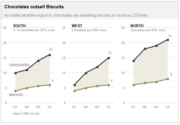
Here I found an informative article on making Small Multiples. This chart type stood out to me in Chapter 3 of our text not because of its design but the purpose behind the design. In our text, it explains the human psychology behind why the Small Multiple visual must be constructed in a way so it can be quickly interpreted with accuracy. It stated that eye-tracking studies show that people see a set of line graphs like the one depicting chocolate sales vs biscuits as one chunk. This style of visual is clearer than putting all lines in one graph which creates a confusing cluster of data points. This style also allows an illustrator to compare more than two pieces of data while maintaining visual cohesiveness. The key here is to ensure all lines along the X axis are symmetrical and that the Y axis numbers are mirrored within each subsequent data set so that an audience can see the comparison being made.
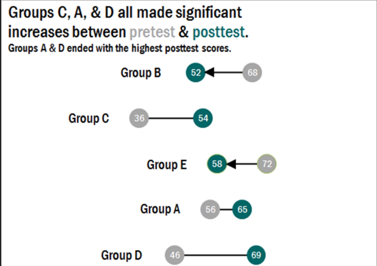
Here I found a step-by-step process on how dumbbell plots are constructed and a useful visual when comparing numbers. The main difference between the dumbbell plot and the standard dot plot is that the line connecting two data points emphasizes the distance between the data being compared. This helps an audience scan a graphic quickly and interpret the visuals intended purpose or story. This type of chart stood out to me because it’s a concise way of comparing two or more numbers across multiple groups or regions. The chart shows groups from A through E and their scores both pretest and posttest. This can be beneficial when segmenting groups of people to conduct case studies.