Data visualizations are powerful tools that help convey complex numerical information in a clear and accessible manner. Various types of visualizations can effectively compare numerical data, each serving different purposes and audiences.
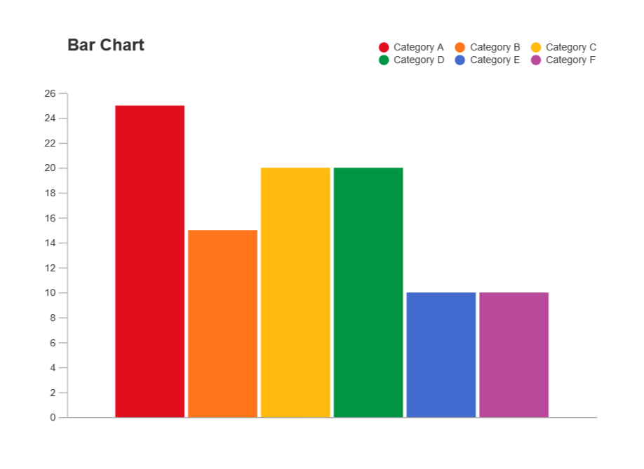
Bar charts are one of the most common forms of data visualization used to compare quantities across different categories. Each bar represents a category, and the length or height of the bar corresponds to the value it represents. This makes it easy to see which categories have higher or lower values at a glance.
Line graphs are particularly useful for comparing numerical data over time. By plotting data points on a graph and connecting them with lines, viewers can easily observe trends, patterns, and fluctuations in the data. This is especially effective for time series data, such as stock prices or temperature changes.
Scatter plots display values for two different variables for a set of data. Each point on the plot represents an observation, allowing viewers to see relationships, correlations, or clusters within the data. This type of visualization is particularly useful for identifying trends and outliers. A great video that goes in depth on how to make these plots can be found at https://www.youtube.com/watch?v=Vyg9qmBsgAc&t=2s.
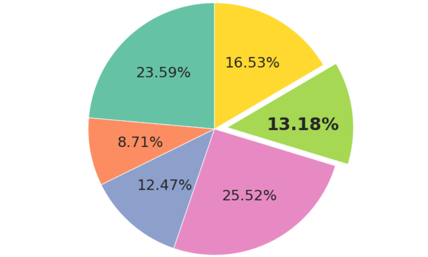
While often criticized for their limitations, pie charts can be effective for showing the proportion of a whole. Each slice of the pie represents a category’s contribution to the total, making it easy to compare relative sizes. However, they are best used when there are a limited number of categories.
In conclusion, the process of selecting the right data visualization is not merely a technical decision; it is a strategic one that requires careful consideration of the data type, the intended message, and the audience’s characteristics. By thoughtfully integrating these elements, you can create visualizations that are not only informative but also compelling and accessible.
Hey Hemingwc,
I like the visualization chosen for the pie chart here. It shows a highlighted segment if the pie away from the main graph. As discussed in our text, it can be different for the human eye to interpret area. This choice assists with the chart being more legible.
My question is, what are some other ways we can help make graphs easier to read?
My suggestion is the use of a nested graph as it gives good visibility regarding the various segments within the graph. This chart type is easy to read and various resources are available including our textbook.