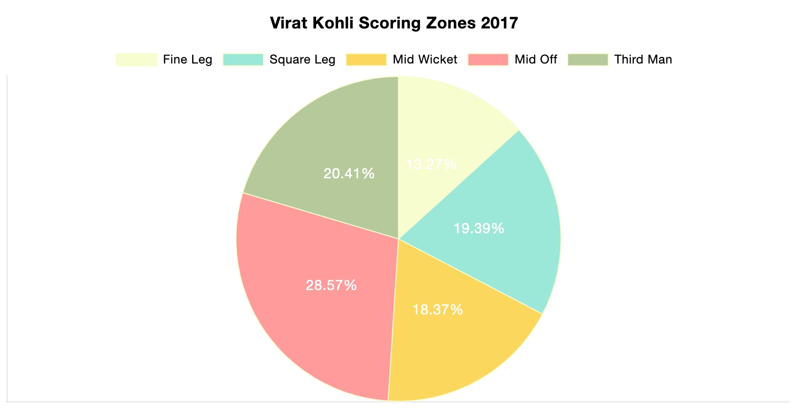
The photo above is included in the linked article of this post. The article demonstrates the importance of using the correct infographic when comparing different data sets. It discusses the importance of making comparison charts, the best types of data comparison charts, and when to use each type of chart. One of the most commonly used comparison charts is the pie chart which is shown above. Pie charts are most effectively used when comparing sizes or percentages of numbers within a single data set.


Podcast: Play in new window | Download