In today’s age data is generated and shared at an unprecedented rate, making the transformation of raw numbers into meaningful (and shareable) displays to be crucial. One of the most effective ways in which this can be achieved is through the use of data visualization. By representing data visually, viewers are more easily able to unlock patterns or trends that may be hidden within spreadsheets or datasets.
Especially when comparing datasets, or different facets of the same dataset, data visualization enables clearer interpretation and analysis of complex information. By utilizing charts, graphs, and other infographics, complex information can be simplified which encourages informed decision making by presenting insights in an easily digestible format. The infographic below compares the different status classifications for endangered species with the percentage at which they make up the amount of vertebrates that are internationally traded.
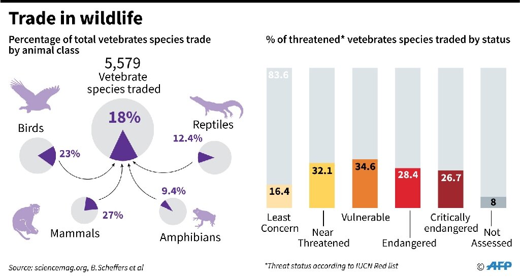
Visualizations such as the one seen above help to enhance cognitive understanding by capitalizing on some individual’s ability to process images more quickly than they do text.
They can also be used to display simple comparisons that are effective when displayed in simple ways. The graph below shows a comparison of the E-Commerce sales between different states around the contiguous US.
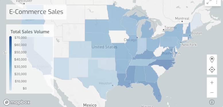
Although this graph is less complicated than the previous visualization, it is concise and includes a legend which allows the comparison that is being shown to be clearly evident to the viewer. While the subject matter that this graph covers may not be a perplexing one, the visualization that is provided gives the viewer an additional resource other than text with which they can assess the data.