Data visualization plays a powerful role in helping us understand and compare numbers. Whether we are examining trends over time, differences across countries, or correlations between variables, visualizations offer a clear and compelling way to interpret complex datasets. One of the most insightful examples of comparing numbers is Hans Rosling’s World Health Chart, which visualizes the relationship between wealth and health across different countries.
Rosling’s World Health Chart is a groundbreaking data visualization that compares average lifespans and incomes of countries over the last 200 years. The chart uses bubble sizes to represent countries, where the horizontal axis (east-west) shows income and the vertical axis (north-south) shows life expectancy. This visualization allows us to easily see patterns and outliers.
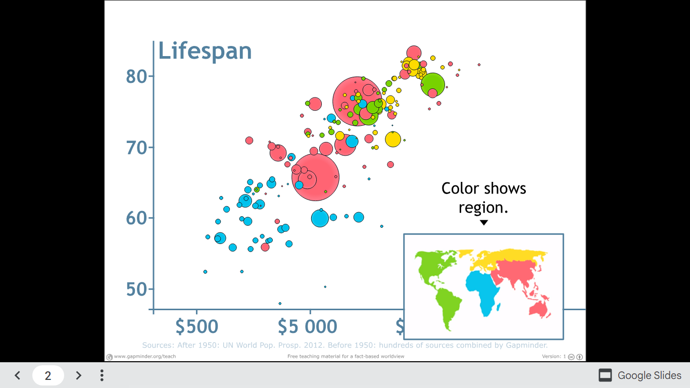
One striking insight is how health and wealth have moved hand in hand over time, with wealthier nations generally enjoying longer life expectancies. This visualization helps us not only compare countries in a specific year but also observe global shifts as we play the animation across centuries.
Watch Hans Rosling explain the chart and explore the full visualization.