Perfect Use Case for a Pie Chart
Introduction
Pie charts are an ideal way to display parts of a whole, especially when showing proportional data. In this post, I’ll illustrate why the pie chart is a perfect fit for visualizing the global market share of mobile vendors, where each segment represents a clear percentage of the total market. With clear, distinct categories, a pie chart effectively communicates the dominance of each vendor relative to its competitors.
Visual: Mobile Vendor Market Share Worldwide – September 2024
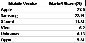
For this data, I’ve created a pie chart that clearly shows Apple, Samsung, and Xiaomi as the top three competitors, with other vendors representing smaller segments. This format enables viewers to quickly assess the relative size of each brand’s market share.
Argument for Using a Pie Chart
The pie chart works well here because:
- Distinct Categories: Each vendor represents a distinct, easily identifiable part of the mobile market.
- Relative Comparison: With Apple leading at 27.6%, the chart’s circular form highlights the gap between top competitors like Samsung (22.91%) and others.
- At-a-Glance Readability: For readers looking to grasp key takeaways on market share distribution quickly, the pie chart’s simplicity and proportional representation make it an excellent choice.
Alternative Visualisations
Though the pie chart serves this data well, a bar chart could be used to show exact values more precisely. However, in this context, the pie chart’s layout emphasises the proportions without requiring precise numeric comparison, which is sufficient for understanding general market dominance.
Design Tips for Effective Pie Charts
Here are some design tips that helped me make an effective pie chart:
- Limit the Number of Slices: Too many slices make pie charts hard to read. Keeping it to significant players (Apple, Samsung, Xiaomi, etc.) helps maintain clarity.
- Use Contrasting Colors: Each segment should stand out visually without overwhelming the chart. For this chart, I used distinct, brand-associated colors for the top brands.
- Label Percentages Directly on the Chart: Avoiding a legend makes it easier for readers to associate values with segments directly.
Pie Charts
Pie charts are a popular, but often misused, tool for displaying data. They are best used when illustrating proportions or parts of a whole. Typically, they are divided into slices to represent numerical values as percentages with each slice corresponding to a category. These characteristics make pie charts ideal for comparing the relative size of different components.
Displaying proportions, categorical data, and non-complex comparisons are all instances in which pie charts are a proper choice for graphical visualization. Pie charts also offer visual simplicity for the audience and can easily be displayed in presentations or reports because of their simple and straightforward appearance.
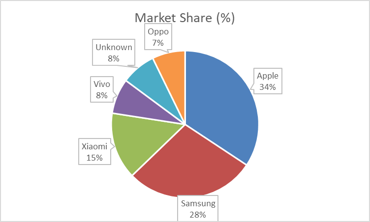
The pie chart below displays the proportion of streamed Spotify songs for a survey group, organized by decade.
The data in this pie chart, showing the distribution of most played Spotify songs by decade, is a good choice for pie chart representation because it effectively illustrates proportions and highlights significant contrasts.
One of the key strengths of this data set is that a significant majority (91.14%) of the most streamed songs for this survey group were released between 2013 and 2023. The pie chart visually emphasizes this dominance with a large, unmistakable slice. The overwhelming size of the 2013 – 2023 segment makes the dominant trend immediately clear, which is exactly what pie charts are designed to do — highlight proportions.
Although there are several other decades included in the survey, their contributions are relatively small. The remailing decades, such as 2003 – 2012 (4.00%) and 1993 – 2002 (2.27%), have much smaller slices. A pie chart allows for quick, visual comparisons between these smaller values without having to actually read through numbers. For instance, it’s easy to see that the 2003 – 2012 period represents about double the share of 1993 – 2002, but both are much smaller compared to the dominant period shown.
I believe that visualizing data such as this is important because it allows artists and producers to quickly assess whether they should be making new music or if older music should be re-worked and released. If the data showed that Spotify users were more consistently streaming songs from 1983 – 1992, then artists and producers may want to use songs from that time period in their own work in an effort to boost streaming numbers.
Pie Charts
Pie Charts are a great way to show different pieces of a whole. In other words, as long as your data can be represented as 100% it can be represented as a Pie Graph. Pie Graphs are the easiest to understand at a glance and require little to no in depth explanation. When your data can be represented as 100% as a whole, the only reason where you wouldn’t use a pie graph is when most of the separate values are so similar that they can not be differentiated at a glance. In those cases the best graph to use would be a bar graph.
Pie Chart
When your data is in percentages, think about pie charts. Pie charts make more sense when your raw data is in percentages, unless you have too many observations that clog the pie, in which case you’ll go back to a bar or column chart. Pie charts that display the proportion of the pie consumed as opposed to the quantity left are the most useful. Pie charts are vibrant and appear to display a lot of information, but they are typically employed in a way that does not improve understanding over a stacked bar chart, for example. It is only useful for displaying the relative contributions to a sum of several components when there aren’t many components and the relative amounts aren’t particularly high.
Pie charts have a somewhat limited range of applications, which is best summarized by its definition. You need some sort of full quantity that is separated into several different portions in order to utilize a pie chart. Instead of comparing groups to one another, the main goal of a pie chart should be to compare each group’s contribution to the total. A different plot type should be used in place of the pie chart if the aforementioned requirements are not met. Here is a pie chart I made for the most popular sodas in the US. And here is where you can get that data.

Pie Chart Uses!
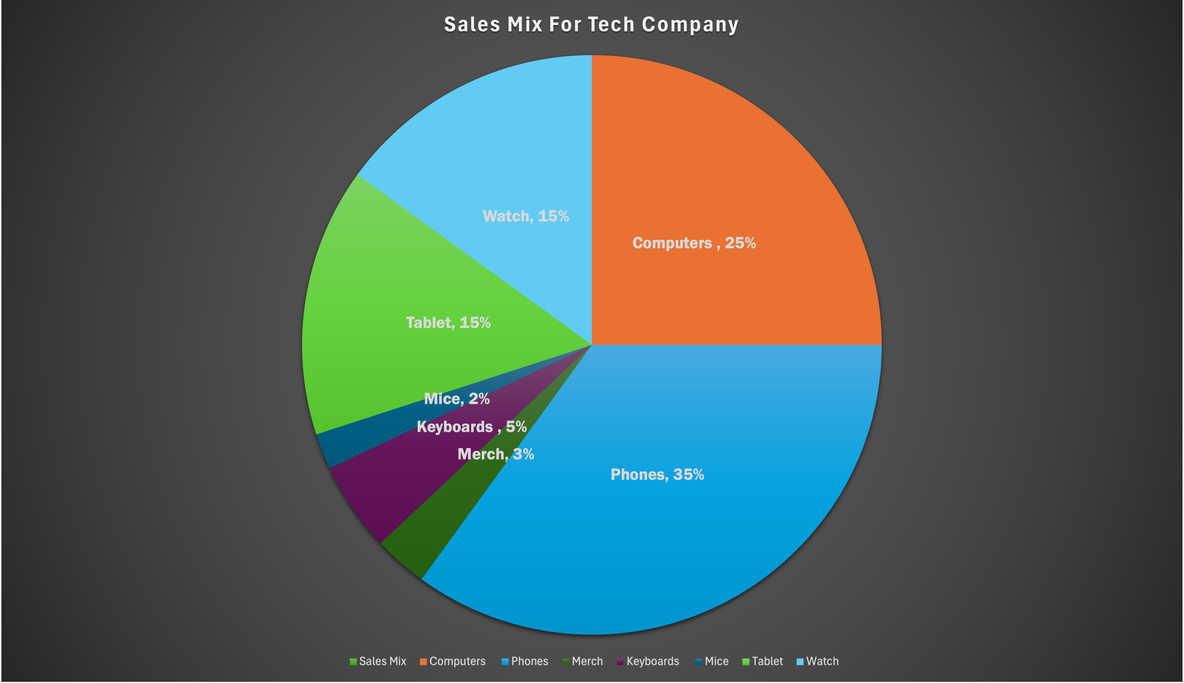
A perfect use case for a pie chart is total sales mix for a company. Pie charts are most useful when there is a part to whole relationship. When discussing the total sales mix for a company, each product sold for the company is a percentage of the total, 100%, of sales. For example, I made a pie chart for a fictional tech company whose sales mix are made up from computers, phones, tablets, watches, and so on. I made my chart in a way where you can efficiently differentiate the products from one another by using different colors and labeling them in the legend. I also added data labels and the percentage inside of the slice, for easy accessibility and to accurately show the percentage. Could you use other charts for this data? Yes! However, other charts would not be able to show the part to whole relationship as this pie chart. If you used a bar graph you could see the same data, but you would not be able to visualize that each part is made up of a total 100% of the companies sales mix. This is why using a pie chart for this data is so great!
The Usage of Pie Charts
A pie chart can effectively illustrate the distribution of various racial groups in America by visually representing the percentage of each demographic. This graphical representation allows for a clear understanding of the diversity within the population, highlighting the proportions of different races in a manner that is easily digestible for the audience. Utilizing a pie chart not only enhances comprehension but also emphasizes the significance of each group in the broader societal context.
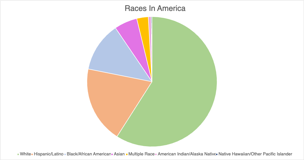
When constructing a pie chart to depict racial demographics, it is crucial to ensure that the data is accurate and sourced from reputable studies or census data. For instance, the U.S. Census Bureau provides comprehensive statistics that can be utilized to create a reliable chart. Additionally, incorporating color coding for each racial category can enhance the visual appeal and clarity of the chart, making it easier for the audience to differentiate between the various groups. It is also beneficial to include a legend that clearly labels each segment, as this aids in the immediate recognition of the data being presented.
In terms of design tips for creating an effective pie chart, simplicity is key. Avoid cluttering the chart with excessive text or overly complex designs that may distract from the data itself. Instead, focus on using contrasting colors that are visually distinct to represent each racial group, ensuring that the chart remains accessible to all viewers, including those with color vision deficiencies. Furthermore, consider incorporating a brief narrative or context alongside the chart to provide additional insights into the significance of the data, thereby enriching the viewer’s understanding and engagement with the information presented.
When deciding between a bar graph and a pie chart for data representation, one must consider the nature of the data and the specific insights one aims to convey. A bar graph is particularly advantageous when comparing discrete categories or groups, as it allows for a clear visual comparison of the values associated with each category. The length of the bars provides an immediate visual cue regarding the magnitude of each category, making it easier for the audience to discern differences in size and to identify trends across the data set. In contrast, pie charts are often less effective for this purpose, especially when there are numerous categories or when the differences between the values are subtle. The human eye is generally better at comparing lengths than angles or areas, which can lead to misinterpretation when using pie charts. Furthermore, bar graphs can accommodate a wider range of data types, including negative values, which pie charts cannot represent. This versatility makes bar graphs a more suitable choice for comprehensive data analysis. Despite using a pie chart for this data, I feel that a bar graph would better show the smaller values.
Pie Charts

Shown above is a pie chart I created based on the percentages of total energy use. Knowing when to use a pie chart can be a difficult skill to master. The following link including provides evidence as to why this type of chart is best for this data. The given data set represents different parts of whole adding the percentages of each data variable adds up to 100% as a whole. Additionally, a pie chart shouldn’t be used when you have too many different data points. This infographic only uses 5 which means a pie chart is a perfect fit for this data set. This pie chart has the appropriate amount of data points and data labels to make it effective at relaying this information to the reader.


Podcast: Play in new window | Download
Pie Charts
Probably one of the first charts we learned at a young age was a pie chart. I can remember learning percentages in elementary school and seeing pie charts used to help us visual what a percentage represented. According to story story telling with data (https://www.storytellingwithdata.com/blog/2020/5/14/what-is-a-pie-chart) “pie charts are probably better than any other visual for expressing part to a whole relationship.” There are two primary uses for a pie chart and when they make the most amount of sense. First, if you want an audience to have a sense of a part to whole relationship and the size of the slices is less important. This leads us into our second best use is to convey a piece of something that is small or large. This is beneficial when emphasizing how small or large a percentage is in reference to the whole thing. When piece of the pie are similar in size it makes it difficult for us to understand the significance of those pieces.
I made a pie chart comparing two items with data that i completely made up for educational purposes. This helps show parts of a whole in large and small proportions in order to convey a message. I do not think that displaying this data would be done in a better way and believe to be the best possible option for these scenarios.
Pie Charts
The ideal uses for pie charts are to illustrate the corresponding ratios of components to a whole and to demonstrate how a whole is divided into its individual pieces. When properly sized categories are present pie charts can be used for straightforward, equal comparison. For more in-depth comparisons a bar graph would work better than a pie chart. Labeling, ordering, and limiting slices are some tips when creating a pie chart. When labeling, verify that the appropriate number or percentage is written on the label of each slice. To keep a pie chart organized slices can be arranged from largest to smallest or smallest to largest. Use a different chart type if the chart includes more than five slices to limit clutter. There are certain cases where pie charts are not the ideal option. When there are too many categories in the data or the data values are too similar a pie chart would not be the best fit. If the data contains any values that are not positive integers, a pie chart is not the right choice.
Below I have included a good example of a pie chart that is properly labeled, ordered, and contains limited data.
Pie charts provide a clear visual representation of percentages and proportions, which makes it easier to understand data distribution. Making judgments based on data representation is simple with the use of pie chart analysis. Pie charts offer an immediately comprehensible visual depiction. Pie charts make it simple to compare different areas and provide information about those with the greatest impact. Pie charts are very helpful in the business world. They can guide investments and have an impact on plans for advertising and the creation of products. Decision-making based on data can be substantially improved by the use of pie charts and their interpretations.
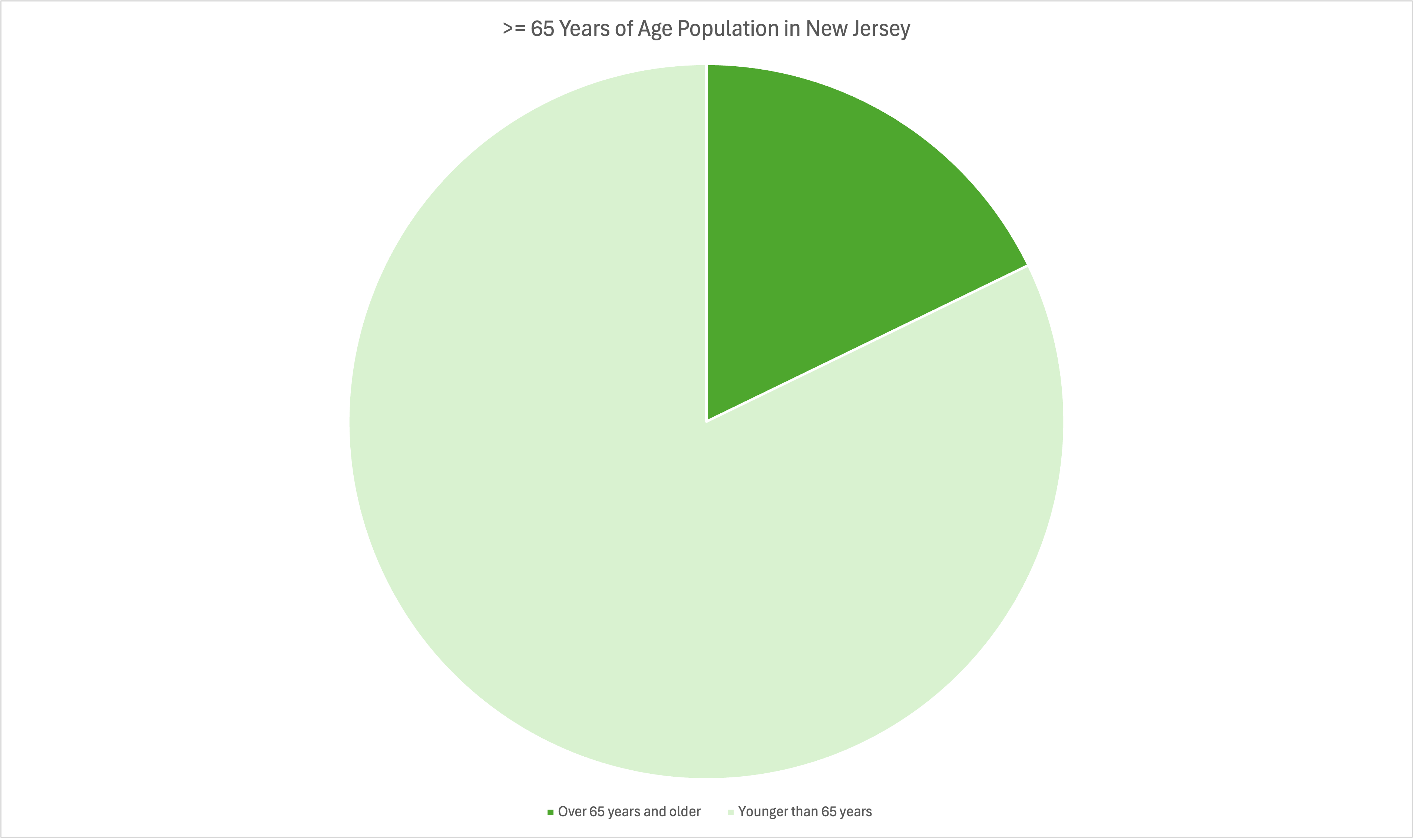
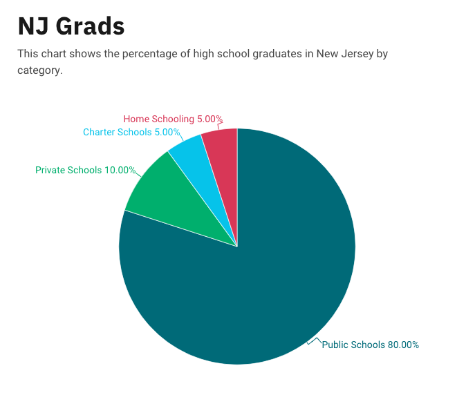
Below is a pie chart that I created in excel. It represents college graduates in New Jersey by fields.

Pie Chart

Pie charts are traditionally used to compare numbers and data sets within the chart. This is easily done by comparing the numbers provided by the creator of the chart, or simply by comparing the area of each portion of the pie. This can be highly effective when comparing few data sets against each other, allowing the reader to easily visualize each portion of ‘pie’ a data set may represent.
In my example, I created a pie chart out of the data found through multiple sources on the internet, which display the monopoly held in the smartphone market. In it, we can note that Samsung is the largest individual slice of the global market. The ‘Others’ portion is represented by small companies looking to make a name for themselves. The beauty of simplifying all the small companies into one slice and representing them as a group is that it allows me, the creator of the pie chart, to represent an accurate representation of the global smartphone market, while emphasizing the major stakeholders.
I find that this method of displaying my data is the most effective, given that my goal is to make the viewer compare each companies share in the marketplace. I feel that there is the possibility of there being a better method to display this data, but as to my current knowledge, this is the best method.
By creating a pie chart, there are a variety of ways to demonstrate the data you choose. I found this way to be the most effective at providing a quick and easy understanding of what the viewer will be looking at, while given a small amount of context.