When trying to disseminate information to a group that doesn’t share the same level of expertise you or others may have, it may be difficult to get them to understand the severity of some statistics. For example, if you do not know anything about hockey, but I told you that Wayne Gretzky scored 92 goals within one season, you may think that sounds great, rather than amazing. But, if I prefaced that information with the fact that many hockey players would be considered of an ‘above-average’ or even ‘great’ skill level if they score above 20 goals in a season, you would begin to realize just how different of a player Wayne Gretzky was from the average superstar. The same concept applies to creating data visualization charts when comparing numbers of significance.
Read More about Gretzky’s Career: Westport Library: Using Data Visualizations to Compare Numbers of Significance!
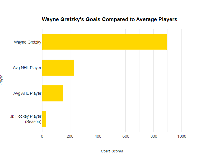
Within this bar chart, we can see the goals scored throughout someone’s career compared to Wayne Gretzky. By translating this information into a visual object, it is much easier for someone to grasp the magnitude of just how good Wayne Gretzky truly was as a hockey player. While my example revolves around just this hockey player, the concept of translating complex numbers and data statistics into data visualizations is the same everywhere!
Something unbeknownst to most people in New Jersey is that our state was responsible for growing 849 acres of eggplant in 2015, which has grown every year! Going off of a data point from 2015, this is what our eggplant production was like compared to the rest of the world at that time:

As you can tell, New Jersey was at one point responsible for well over two-thirds of the world’s eggplant production! Of course, this was taken at a point in time where our state was primarily responsible for supplying the world with the vegetable everyone loves. But, when comparing these two monumental figures side-by-side, the reader can better understand how the numbers fare up against each other. By New Jersey planting 849 acres, we produced an insane amount of eggplant which equated to roughly one million metric tonnes!
I had no idea New Jersey produced that much eggplant. What makes this even better is when you see the chart comparing NJ to the rest of the world it really does a great job showing how much more eggplant we were producing.
The connection you make between raw data and real life interests is a great way to draw your reader in to your post. Although not everyone may be interested in sports, the way that you explain what the data means and then support your text with a graph is an effective way to help your reader understand the information you are giving them, even if they are not knowledgeable about the subject matter.
This is a really effective way to engage or help the reader understand the data or information you are giving to them. I am one of those readers. I do not know anything about hockey, but the way you explained it made me understand it and with the graph/visual, I got a better understanding.
Eggplants must be big business lol
The eggplant example is indeed a great way of showcasing how data visualizations effectively represent numbers of significance. Having a visual representation of just how much eggplant New Jersey actually produced definitely made the point impact me more than textual information alone could.