The website titled “Visualizing Health” is a scientifically vetted tool created by the University of Michigan in order to help healthcare professionals and others alike to communicate data about health. It contains graphic displays of health data through different types of visuals and imaging. It’s goal is to assist audiences in making informed decisions about their health, and also helps aid healthcare professionals in their efforts to seamlessly communicate health risk information to the public.
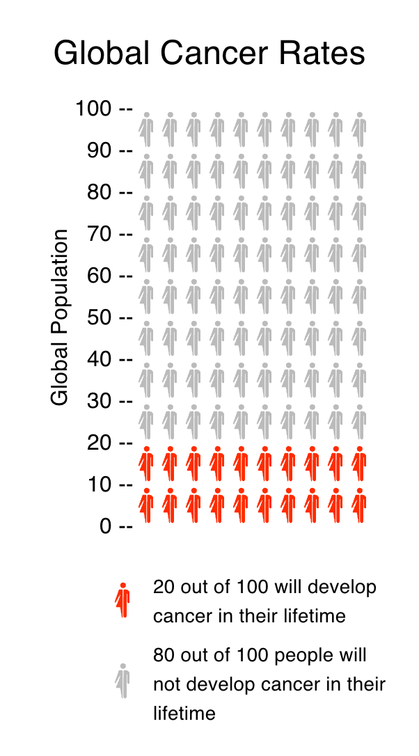
The website makes it accessible and shares an easy-to-use guide on how to create data visualizations. Below, I have made one as an example based on information from the World Health Organization. This is one of the many ways these tools can be used to communicate data to an audience.
