Home » 2023 (Page 4)
Yearly Archives: 2023
Pie Charts
Pie charts are commonly used to visualize data that can be divided into distinct categories. Pie charts are used for showing the composition or distribution of a dataset. Using different colors, labels, and percentages, pie charts allow viewers to quickly understand the relative sizes of the categories and compare them visually. In a pie chart, the colors assigned to each slice play a crucial role in conveying information and making the chart easily interpretable. The choice of colors should be made carefully to ensure readability and accessibility. Pie charts are effective for displaying data with a small number of categories or when the differences in proportions are significant. Sometimes, it becomes less effective when too many slicers are created, and hard to understand for the reader. Here are examples of pie charts and how it used in data.
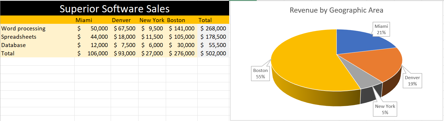
In this pie, I created data on superior software sales based on the top cities in the USA. The pie chart differentiate cities with different color giving the percentage values that Boston is getting 55% which highest and the lowest is New York which is 5%. Looking at the table feels like little complicated to understand but the pie chart attracts at first sight without any complication.
In conclusion, pie charts provide a clear and concise representation of categorical data and can be valuable tool for data visualization and communication.
Pie Charts
The perfect time to use a pie chart is to differentiate parts of a whole. A pie chart is easy to understand because slices of a pie are just a percentage of the whole thing. Bigger slices are bigger percentages for that variable. Pie charts need to be used sparingly because when they are used wrong they can be very confusing especially if portions of the graph are similar in size. When pie charts are used in the right scenarios they can be one of the most recognizable forms of data visualization.
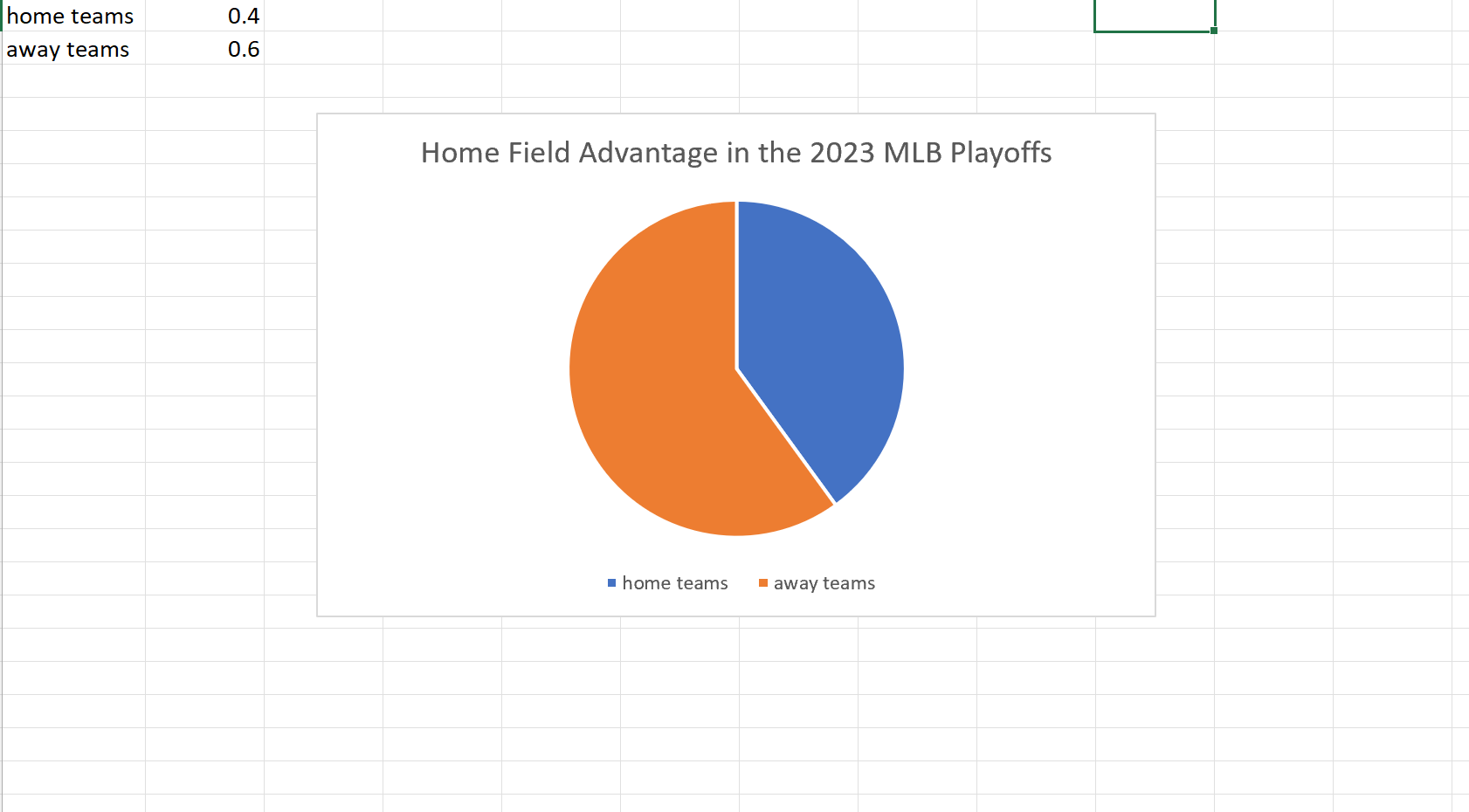
My example of a pie chart takes two variables. The win percentage for the home teams versus that of the away teams in this years MLB Championship Series. Although we usually see home field advantage in sports here we can clearly see a slight edge for the away teams. I found these results surprising but it is a small sample size so that may be why the results could be skewed one way or another.
Pie Charts
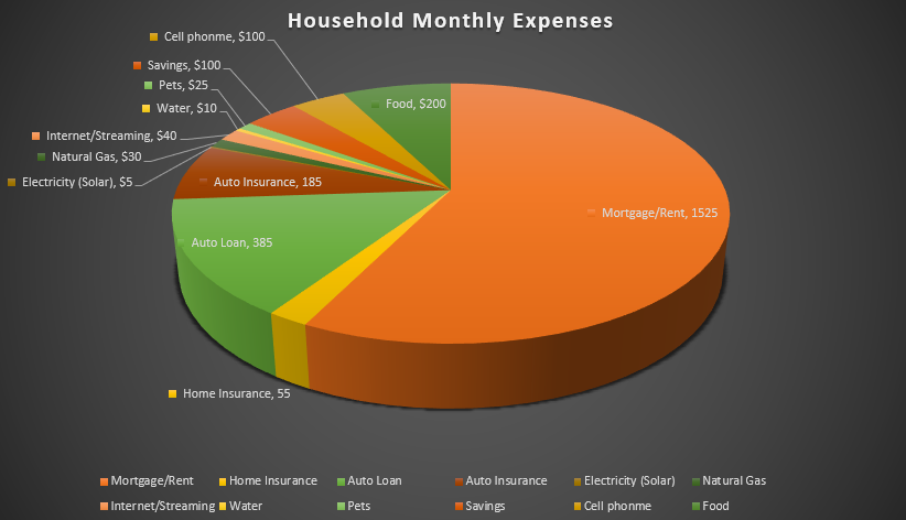
I felt a pie chart was an ideal choice to show monthly household expenses. It provides a clear and visually appealing way to represent various expense categories within a budget in proportion. Viewers can quickly identify the larger and smaller slices, thus providing immediate understanding where the money is going. You are able to make comparisons and it helps with seeing where spending is a priority and make informed decisions. I referred to From data to Viz | Find the graphic you need (data-to-viz.com) which helps you choosing an appropriate graph for your data and excel itself had tutorials that walked you through choosing correct pie chart. I also think a bar chart could work in this example as well.
Pie Charts and When to Use Them
Pie charts are a form of data visualization that can be used to compare part-to-whole relationships. They are circular graphs illustrated through different proportions of categories within a whole. It is commonly and best used for percentages because it all adds up to 100%. It makes it easier to understand this way because each segment in the pie chart represents the percentage of the whole that each category represents. However, not all data is best represented through a pie chart.
Pie charts work best with minimal components due to the risk of overcrowding. So, if the data has too many points, it becomes challenging to read. In this case, bar charts might be a better fit. Pie charts are also not made to compare more than one data set and do not work well when comparing small differences. Anything that can not be broken down into minimal slices and easy to distinguish, is not meant to be represented by a pie chart.
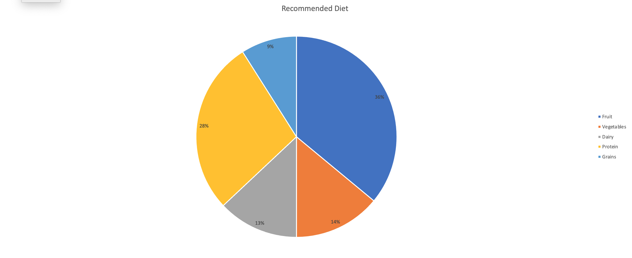
An example of a good data set to be represented by a pie chart would be a recommended diet plan divided into sections. I made myself a diet plan to balance out what food groups should be ingested more than others. In the chart, you can clearly see that fruits, vegetables, and protein are the main components that I need to have compared to dairy and grains. All percentages create a whole and each slice is representative of the whole.
Unveiling the Power of Pie Charts in Data Visualization
The Strength of Pie Charts
Pie charts are like the unsung heroes of data visualization. They might appear humble, but their ability to convey the composition of a whole is unmatched. They shine when you need to represent percentages and proportions, making it easy to grasp the distribution of elements. For instance, in a recent project, I employed a pie chart to showcase a company’s revenue breakdown by product category. The result was a clear and accessible snapshot of each category’s contribution to the total revenue.
When to Use Alternatives
While pie charts have their merits, it’s crucial to recognize when to opt for an alternative chart type. Bar charts are more effective when comparing many categories, and line charts excel at illustrating time-series data. In cases with numerous subcategories, stacked bar charts or treemaps might be the better choice.
Designing a Winning Pie Chart
To create an impactful pie chart, follow a few design principles. Use labels to identify each segment, explode important segments for emphasis, limit your color palette, avoid 3D effects, and add a legend if needed. These tweaks ensure clarity and readability, making your pie chart an engaging and comprehensible tool for data presentation.
In a world where data speaks volumes, mastering the art of pie chart design is a valuable skill for college students and aspiring data analysts. It’s simplicity combined with its versatility makes it a go-to choice for visually representing data. By understanding when to use a pie chart, and by adhering to these design principles, we can present data effectively and be well-prepared for the data-driven challenges of tomorrow.
Example
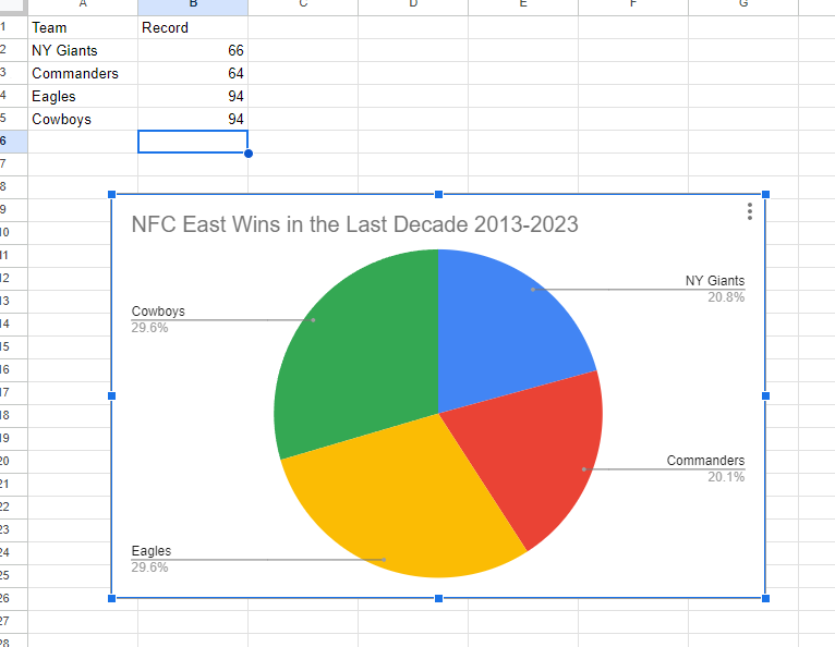
I made a pie chart on the NFC East in the NFL of choice to visualize the data. The chart effectively conveys the distribution of wins among the four teams in the division: the NY Giants, Washington Commanders, Philadelphia Eagles, and the Dallas Cowboys. This choice is compelling because it simplifies the complex data by visually showcasing how each team’s wins contribute to the whole, which, in this case, is the total wins in the division over the specified timeframe.
The pie chart excels when there’s a limited number of categories, which aligns perfectly with our scenario of only four teams. This ensures a clear and straightforward representation, making it easy to understand the proportions of wins each team has contributed. For viewers, this pie chart serves as a quick and intuitive way to gauge the performance of each team in the NFC East during the past decade.
By Shaun Sneddon
Pie Charts
We can use Pie Charts in a variety of ways, and they are one of the most common visual representations of data. The pie chart, according to storytellingwithdata, can display a part-to-whole relationship, in which each slice represents one component of the whole, and all slices taken together equal the whole.
When To Use A Pie Chart
There are two primary uses for a pie chart in this situation:
- An understanding of the whole-part relationship in your data
- A relatively small or large segment of the pie is being represented
When To Not Use A Pie Chart
When analyzing categories, and comparing data across pies, Pie Charts should not be considered.
Share of Children in Primary School Who are in School Pie

I compared the percent of children who attend primary school in four countries using data from ourworldindata: Afghanistan, Belgium, the United Stated, and Africa. It is clear from the chart that the Belgium had the highest percentage of children attending school, with 98.80%, and Afghanistan had the lowest, with 26.80%. It was very interesting to see this visual because even without the numbers and simply displaying the names of the countries you can see how Afghanistan’s share of the pie is much smaller than the other countries.
Using Pie Charts
By Ryan Metch
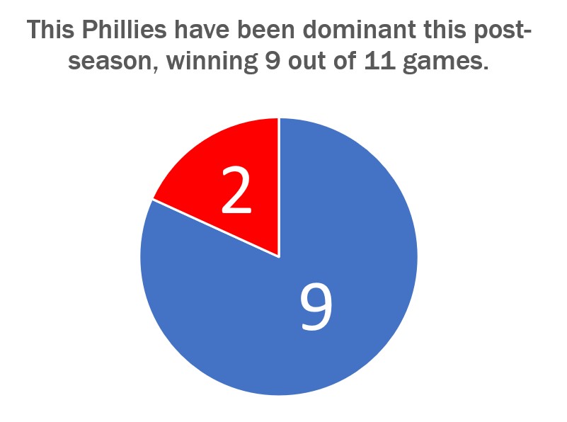
There are many ways to use a pie chart, but also many ways to misused one. The pie chart is a staple in data visualizations and is one of the most popular graphics used. To use a pie chart successfully there a few key pillars to go by; first, make sure that the pieces of the pie add up to a whole number which is already presented to a reader. For example most pie charts have pieces that add up to 100% the number 100% does not need to be displayed to the reader as it is already assumed that the pieces will add up to that number. Only present the number the pieces are adding up to when it is something other than 100, for example the pie chart shown above adds up to 11, and this number is clearly listed above. Second is that the pieces are clearly labeled with a number or image. This ensures that the pieces can easily be identified. Third is that the slices are color assigned to their value to show differences in the data. Fourth and final is that the legends clearly explain the data so the graph is easy to read.
Pie Charts
A perfect use case for a pie chart that I could think of right of my head is one for a academic performance breakdown. This type of chart is good to use for if you are an educator, and you want to provide a clear visualization of how students in a class have performed on their recent final exam, other assignments, and overall grade. It can the class’s collective progress. Additionally, it helps in identifying trends in academic performance over time, highlighting areas of strength and areas that may require additional attention within the classroom. Furthermore, this chart aids in fostering a transparent and data-driven approach to education, making it an essential resource for educators dedicated to enhancing their teaching methodologies and student outcomes.
If a professor takes a 100 of there students and compairs all there grades it would look like this, ( I used a random number generater for students grades on a exam)
When you look at the resulting pie chart, you can quickly see the distribution of student grades in the class. In this case:
- The largest slice of the pie represents the “C” grade, indicating that 34% of students achieved this grade.
- The “B” and “A” categories follow, with 13% and 8% of students.
- The “D” and “F” categories follow, with 17% and 28% of students.
Usefulness:
- Communication: This pie chart is a powerful communication tool, especially during parent-teacher conferences or academic meetings, to visually and intuitively convey the distribution of student performance.
- Decision-Making: Educators and administrators can use this chart to assess the effectiveness of teaching methods or the difficulty of the exam. If a significant portion of students received a low grade, it may trigger a review of the curriculum.
- Goal Setting: Students can use this chart to set goals for improvement. If a student received a “C” and wants to aim for an “A,” they can see that they are in the 34% of students who achieved that grade.
- Motivation: It can also motivate students to see the distribution and strive to achieve higher grades, as they can visually see their progress relative to their peers.
Now, a teacher can look at this chart and quickly see that their students are struggling to understand the material. This may prompt them to change how they teach to help students learn better.
sources
https://ourworldindata.org/global-education
https://www.researchgate.net/figure/The-Chart-of-the-Students-Performance-Result_fig1_283696801
https://educlimber.illuminateed.com/hc/en-us/articles/1260802416249-Understanding-Academic-Charts
Lollipop Chart
A lollipop chart is basically a combination of a bar chart and a dot plot or scatterplot. It can be used anywhere that a bar/column chart would be appropriate. Lollipop charts are great for reducing visual clutter and making use of white space, which can make important data stand out more and make the differences between data points more apparent. Numpy Ninja makes the point that one strength of lollipop charts are that they are highly customizable. One of the weaknesses is that the circular markers can create some ambiguity in where the actual datapoint lies, making it more difficult to discern scale. This type of chart actually works best when there is a large discrepancy between datapoints such as in the below. The second chart I made has much less deviation between data points so the chart overall is less impactful. This is one of those things that you have to see for yourself to understand that there really is a best chart for different types of datasets.
I was recently at Disney and got the sales pitch for DVC timeshares. I thought a fun lollipop chart would be to show how many one bedroom villas each different resort has. This can be important information for a family looking into which resort to purchase if they need a specific room type. This chart clearly shows that a family that requires a one bedroom villa to be comfortable should stay away from purchasing at certain resorts or they may not be able to book the room they desire due to low availability. This lollipop chart was created in Excel.
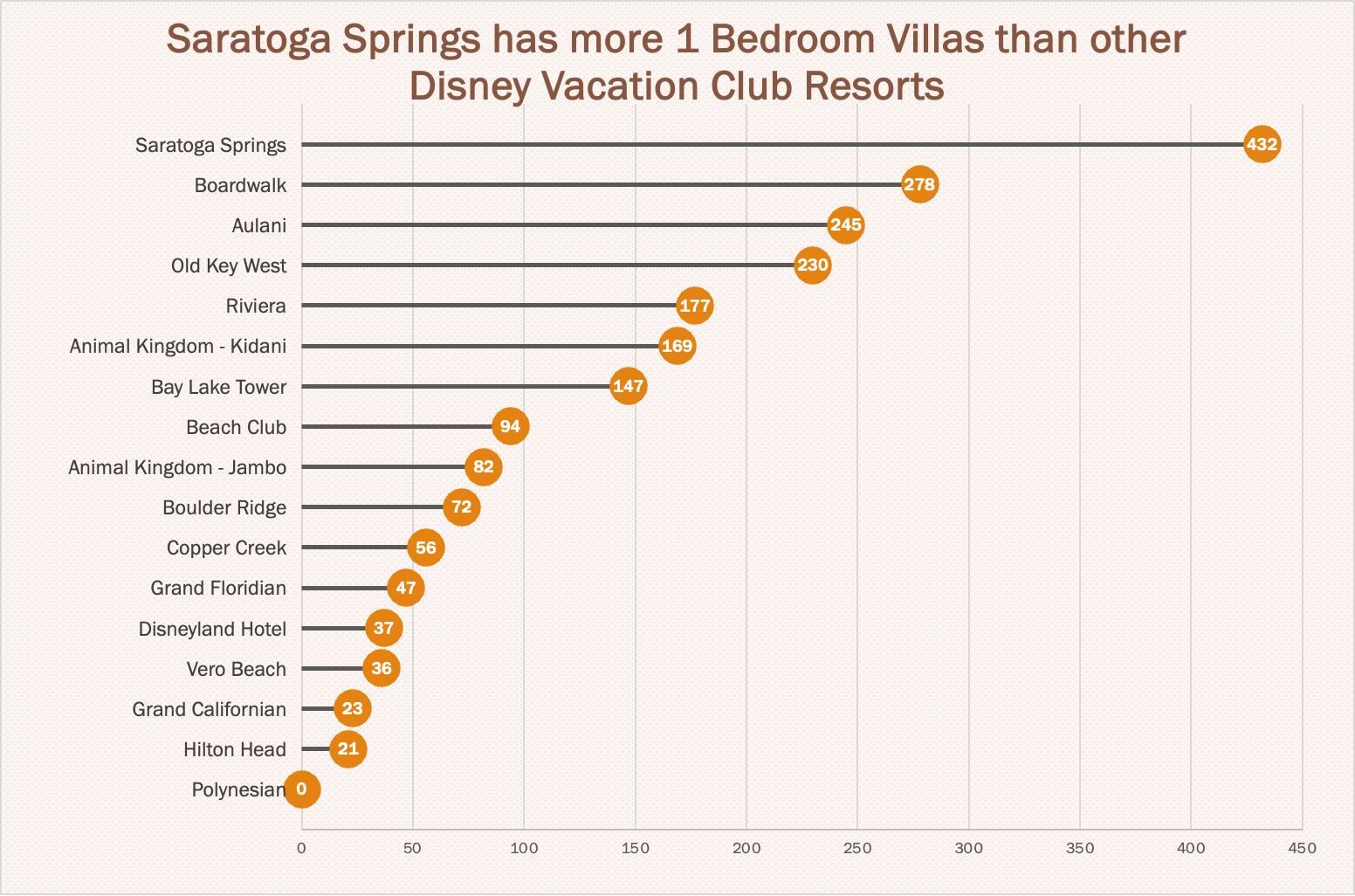
https://www.dvcfieldguide.com/blog/disney-vacation-club-1-bedrooms
I tried to create a lollipop chart in Tableau using data on consumer spending. I found some information on what categories of purchases consumers intend to splurge on in 2023. This application can be tricky to figure out, but I love that I can export my charts with tooltips for readers to interact with. 37 percent of consumers intend to splurge on something in 2023 and this chart breaks it down into categories. We can see that most people intend to splurge on restaurants and groceries and the fewest people intend to splurge on fitness and household essentials.
Lollipop Charts
A lollipop chart is a novel spin on the classic and universally appreciated bar chart. Applicable in the same situations as the illustrious bar chart, lollipops serve the same purpose but have the added benefit of cutting back on unnecessary clutter. When your data has a large number of data points being compared or you’re just aiming for a simpler visualization (that saves on ink!) a lollipop chart stands out as a strong alternative.
Some research (Blasio & Bisantz, 2002) even shows that lollipop design can lead to faster response times and greater accuracy (Gillan & Richman, 1994). Some other studies have shown (Inbar, Tractinsky & Meyer, 2007) that lollipop charts are not viewed as visually appealing as the timeless bar chart. As time goes on and these new minimalists styles of data visualization command more mainstream use, who knows what the future holds?
Below is a chart showing the percent of National GDP each of the top ten states makes up:

A simple, no-frills method that shows the single important value for each data point clearly and quickly, that is the strength of the lollipop chart.