A pivot table is a useful way to sum up large amounts of categorized data into a shorter and simpler table. It does this by taking each group or category and summing it up to get the totals per group rather than the every little piece of information. By using a pivot table, the information is presented in a much neater and efficient way. Pivot tables also allow you to sort and analyze the data much quicker and spot any outliers, or other sums that may need addressing.
The image below shows a sample of some data that could be best presented in a pivot table. The example uses resellers with different types of fruit over a three-month period to see how many sales and overall income each reseller brings in for each type of fruit.
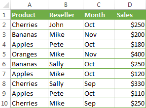
If we were to turn this charted data into a pivot table, we could easily see totals per fruit, per reseller, and per month in order to more easily analyze the data and get the results we need. The chart below shows the pivot table of this data.

As you can see, there are several different ways to display the data in a pivot table, depending on which type of information you want highlighted. Each of these examples gives the results and totals more quickly than if you were to just stare at the initial table and figure this out. While this example is just a sample with random fruits and resellers, it could also be applied to major corporations who are trying to figure out which of their chains needs more help or which is the most successful. Once again, pivot tables can really be used for a variety of data and ultimately make a person’s life a lot easier when it comes to analyzing and summarizing big sets of data.
https://www.ablebits.com/office-addins-blog/excel-pivot-table-tutorial/