Pivot Tables
When it comes to analyzing data it is often found that there are large sets of data that are hard to distinguish and compare at once. This can be made simple by inserting a pivot table into excel. A pivot table summarizes thousands of rows at a time in Excel workbook. Using your dataset, Excel creates a report of each table in which you can edit the layout. Below are a few examples of pivot tables being used to help interpret data.

This pivot table displays sample data of office supplies. In this table you can see it provides information on
- Order Date: first column shows when the order was placed,
- Region: geographical area in which the sale was made
- Rep: sales representative’s name
- Item: name of the item sold
- Units: number of units sold
- UnitCost: cost of one unit
- Total: total cost of the order – Units x UnitCost
I then used the data set in Excel where I inserted this into the pivot table option and received the following report.
Another example of a pivot table is one of the most simple ones you can do. I imported this table from the website https://exceljet.net/pivot-tables/pivot-table-basic-count

This data did not have that many rows because the repeating values were removed ahead of time. However, the color tables were not unique. Instead of having to count up each person for each color, you can create a pivot table that can tell you the same data in seconds. Pivot tables provide a flexible way to rearrange and filter data interactively.
Pivot Tables
A pivot table is a data analysis tool that can be used to organize and summarize large data sets. Large data sets can be cumbersome and include extraneous data that does not pertain to the use case. A pivot table can create an organized chart that functions to create a subset of data that can be explored in a more dynamic way.
Pivot tables are great for interactive dashboards that aid in data analysis. They can simplify very large and complex data sets. Pivot tables can be simple or more advanced using techniques like slicers and calculated fields. Slicers are great for dashboards because they allow users to select different groups of data to view. Users have a more granular view of the dataset that is relevant to specific information they may be looking for. Slicers also allow users to navigate dashboards like the example in the textbook. I’ve tried creating pivot tables multiple software and have found that Excel is the best application and Numbers is also easy to use.
Myexcelonline.com has a great tutorial to create a pivot table. They also have a picture of the final table showing the different elements of a pivot table.
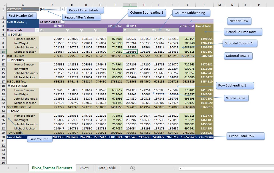
https://www.myexcelonline.com/blog/customising-pivot-table-styles/
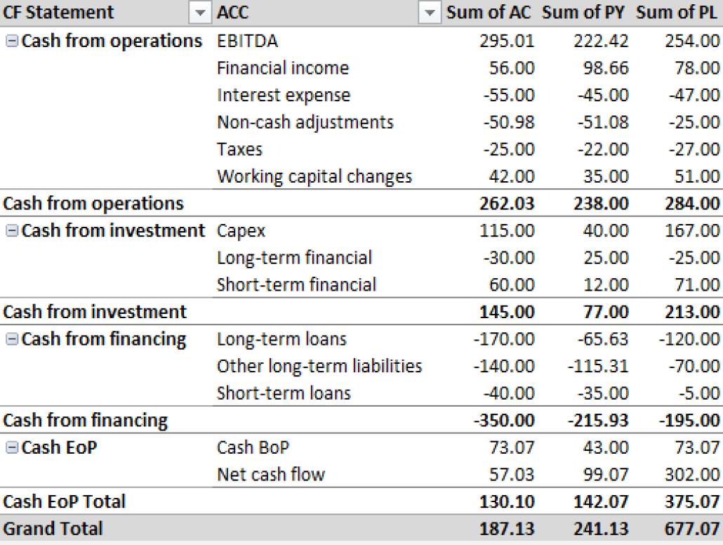
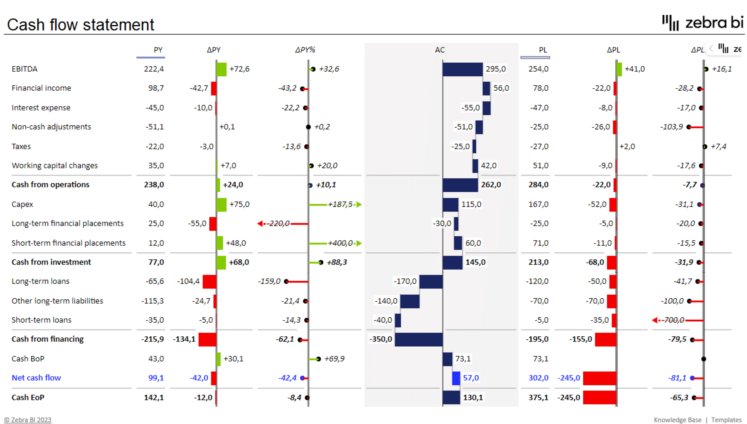
I would actually like to master pivot tables because I know that they are ideal for use in financial reporting. Financial datasets tend to be overwhelmingly large and difficult to summarize. Zebrabi.com suggests using a tabular hierarchy pivot table as shown below along with visuals for financial reporting.
Demystifying Pivot Tables: A College Student’s Guide to Data Analysis
Introduction:
Just a little bit of interest and a desire to try something new will do; coding is not anything to be concerned about. We’ll dispel common misconceptions about pivot tables, go over their applicability, and demonstrate how to utilize them to make an impression on potential employers and teachers in this blog post.
What Makes Pivot Tables So Special?
“How on earth do I make sense of all this?” is undoubtedly on your mind as you look at this enormous spreadsheet filled with figures. Presenting pivot tables, your newfound ally in the data analysis space. You can organize and summarize your data using these useful tools without having to be a Ph.D. spreadsheet expert.
How Do They Work?
Think of pivot tables as virtual LEGO blocks for your data. You can drag and drop your columns into different areas to create a customized table that highlights the trends and insights you’re looking for. It’s like magic, but for data geeks like us.
Cool Features You Need to Know:
Summarize Like a Pro: Want to know the average, sum, or count of your data? Pivot tables have got you covered.
Filtering Magic: Zoom in on the stuff that matters by using filters to focus on specific data points.
Grouping Goodness: Let pivot tables do the heavy lifting by automatically grouping your data by date, category, or any other field you fancy.
Make it Pretty: Customize the look of your data with formatting options. Impress your friends with a sleek and professional-looking report.
Real-Life Applications for College Life:
Grade Analysis: Wondering which classes are your strong suits? Pivot tables can help you break down your grades by subject or semester.
Budget Crunching: Keep track of your spending habits by categorizing expenses and creating a budget overview.
Extracurricular Excellence: Use pivot tables to analyze your involvement in clubs, sports, or other activities. Spot trends and areas where you can level up.
Conclusion:
Pivot tables might sound a bit intimidating at first, but trust us, they’re a game-changer for anyone dealing with data – and that includes you, college student! As you navigate through your academic and personal life, having these skills in your toolkit will make you stand out. So, grab that spreadsheet, give pivot tables a spin, and get ready to conquer the world of data analysis with confidence!
Pivot Tables
A pivot table is a useful way to sum up large amounts of categorized data into a shorter and simpler table. It does this by taking each group or category and summing it up to get the totals per group rather than the every little piece of information. By using a pivot table, the information is presented in a much neater and efficient way. Pivot tables also allow you to sort and analyze the data much quicker and spot any outliers, or other sums that may need addressing.
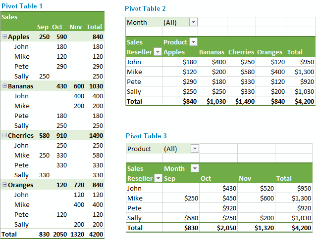
The image below shows a sample of some data that could be best presented in a pivot table. The example uses resellers with different types of fruit over a three-month period to see how many sales and overall income each reseller brings in for each type of fruit.
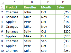
If we were to turn this charted data into a pivot table, we could easily see totals per fruit, per reseller, and per month in order to more easily analyze the data and get the results we need. The chart below shows the pivot table of this data.

As you can see, there are several different ways to display the data in a pivot table, depending on which type of information you want highlighted. Each of these examples gives the results and totals more quickly than if you were to just stare at the initial table and figure this out. While this example is just a sample with random fruits and resellers, it could also be applied to major corporations who are trying to figure out which of their chains needs more help or which is the most successful. Once again, pivot tables can really be used for a variety of data and ultimately make a person’s life a lot easier when it comes to analyzing and summarizing big sets of data.
https://www.ablebits.com/office-addins-blog/excel-pivot-table-tutorial/
Pivot Tables
Pivot tables are a powerful excel features that allows users to organize their data with the click of a button. Useful for quickly analyzing large sets of data, pivot tables allow you to quickly find the measures of central tendency, frequency of data entries, as well as sums, products, and more. To dig into an example, check out the pivot table below:
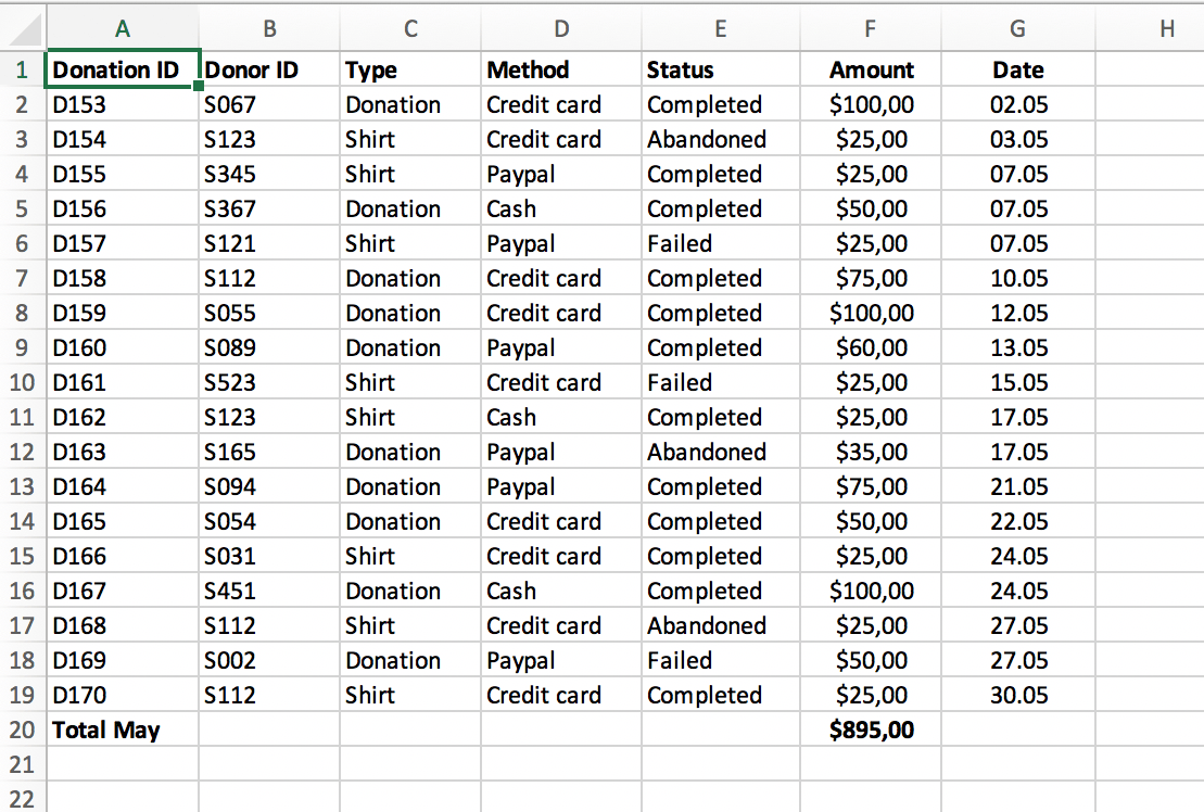
To highlight some useful functions, imagine a business that has a system of keeping track of client transactions. The table above contains information regarding the donorID, which is a unique identifier for each donor. If a business owner was interested in keeping track of their most frequent and largest donors, trending dates in which donations are more likely, or the average donation, all of this information would be available at the click of a button.
Source: https://www.perfectxl.com/excel-glossary/how-to-use-pivot-table-excel/
Pivot Tables
https://exceljet.net/articles/excel-pivot-tables
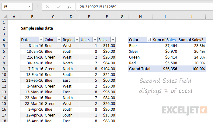
A pivot table can be used for a variety of reasons to portray data. A pivot tables usefulness truly comes to light when one has to summarize large amounts of qualitative/quantitative data. It can provide a flexible and efficient way to not only separate the data into individual rows and columns, but also make it easier to identify patterns, and trends that may not have been noticed. As shown by the data provided above by Exceljet, the pivot table ran automatic calculations on the summed/counted values and the data was segmented by date, color and other variables. Furthermore, with the information provided, the user can now calculate the percentage values of each calculation if desired. Lastly a pivot table is also very easy to create as well as understand. There is no need to learn complex formulas and one simply has to enter the data and insert the table or use drag and drop tool depending on what visualization tool they are using. All in all, pivot tables are a great way to organize data into rows/columns and simplify data.
Pivot Tables
Using Microsoft Pivot Tables, you can estimate, and interpret data to identify relationships, occurrences, and comparative data. Depending on the tools that you use in your construction process, the building process can differ. Various occupations can benefit from Pivot Tables, but I will be discussing how they are utilized in Health Care.
Pivot Tables: Health Care
According to HealthCare Training Leader , Pivot Tables are of great value in medical practices. They can create a summary table based on a set of data that can be altered and assessed. Medical billing offices are able to use these interactive charts to simplify billing information by breaking it down so that it is easier to understand. They are also interactive
They Offer Different Tools Such As:
- Switch the row/column layout of data sets in order to invert them
- There are endless number of ways to arrange the table
- To reveal or hide details, enlarge or minimize the table
- You can drill down into any value in the able using the “drill-down” feature
Analyzing Multiple Occupational Requirements By Using Pivot Tables
The U.S Bureau of Labor Statistics provides a step-by-step guide for viewing and interpreting a spreadsheet of multiple occupational requirements, a link for downloading this set of information, and instructions for creating a Pivot Table. In truth, for a general overview of how to set up the Pivot Table, I prefer this site over the one we created ours with. This site gave detailed instructions on creating the table as well as step-by-step explanation of how the information is created and manipulated.
AS. Pivot Table: Use Scenario
Several weeks ago, I utilized a pivot table to better visualize and organize data for a project. Our group examined the broad effects of the covid-19 pandemic, and I was responsible for analyzing medical information. The World Health Organization has some extremely reliable and relevant information, so I drew my data from here; however, the datasets can quite extensive and difficult to interpret.
As this data contained case and death rates of various countries and territories around the world, I created a pivot table that organized these values based upon a larger group. This larger group is the 6 global regions recognized by the World Health Organization. Therefore, the pivot table collected the data from each country and organized it by sum, based upon its respective global region.
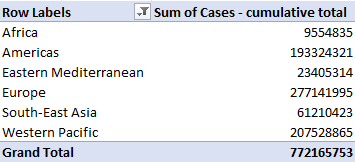
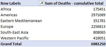
As a result, I often find that pivot tables best suit a large and/or extensive dataset in which several specific values or metrics want to be observed. These tables offer a significantly extensive amount of customization within the particular variable, value, or unit being displayed. An example of this would be column customization to determine dataset groupings sum, count, average, maximum, minimum, or product value.
Sources
World Health Organization. (2021). WHO Coronavirus (COVID-19) Dashboard. Who.int. https://covid19.who.int/data
Pivot Table
Pivot tables are the best features in Excel. A pivot table is a powerful tool to calculate, summarize, and analyze data that lets one see comparisons, patterns, and trends in your data. Last semester I took a class in which I learned about pivot tables so I know how it’s work. A pivot table allows us to transform columns into rows and rows into columns. It allows grouping by any field and using advanced calculations on them.
In the real world, you are working in a company and your boss gives the big data to analyze and do organization in an order. A pivot table is the key to that problem. I am going to present my example of the pivot table. Here is an example of the pivot table in which salespersons are in different countries for sales. Now, I want to organize the salesperson’s name based on their country with the order amount. With the help of the pivot table, it will be very easy.
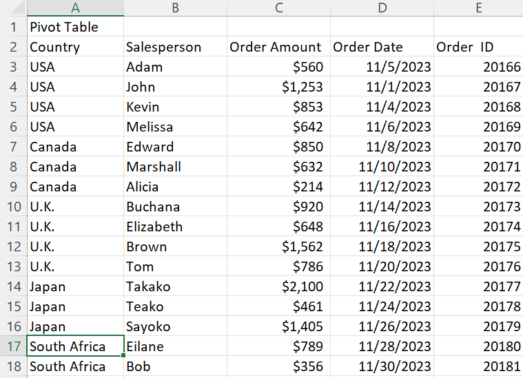
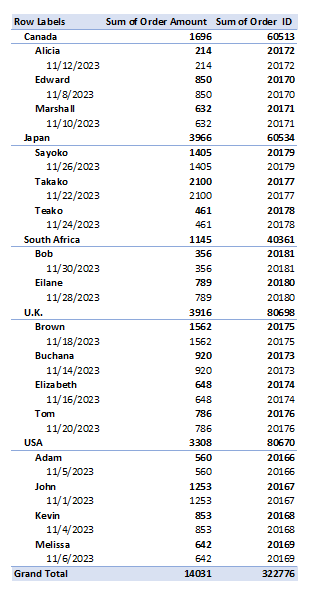
In conclusion, a pivot table is the most interactive way to quickly summarize large amounts of data. The pivot table summarizes complex datasets into a table that allows us to easily find patterns or solutions to any questions we might have about the datasets.
Pivot Table
So, the election date is coming up soon and I want to have an interesting topic that can be use with a Pivot Table. From what I understand is Pivot Table is used to summarize a long data set with multiple repeat data. What can be repeated multiple times and also related to the election date is the party and religious affiliation of U.S. presidents.
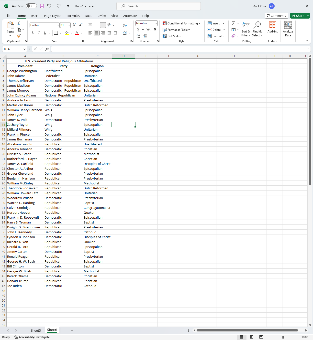
Here I written out a set of which president belongs to which party and which religion that said president affiliated with. It is useful in the case of “How many presidents is in this party?” or “How many presidents is following this religion?” because we have seen so many Democratic and Republican presidents from the past that we can’t easily summarize it by imagining it.
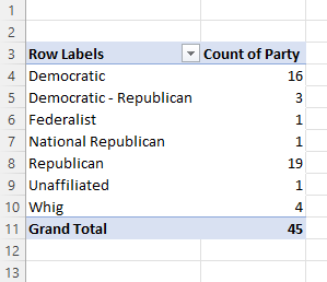
Using the Pivot Table helped sort out the total number of presidents belonged to any of the party and it can be vice versa to see how many presidents following what religion as well.
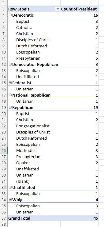
As you can see here is another interesting take on the Pivot Table. You can create a sub-topic and see which party is affiliated with which religion. It is entirely based on your need for what you can do with Excel, but another problem is how you create your table as well because I have not yet find a way to split party and religious affiliation into separate data set.