After examining the website on our Energy System by the National Academies of Science, Engineering, and Medicine, there is one main conclusion to be drawn: the energy system is very complex and there is a lot of data to unpack from it. The website attempts to do its best to explain energy usage and statistics through the use of a Sankey visualization, however without actually clicking on any data or the specifics, it appears very overwhelming to even look at. For instance, when you look at the section/visualization that focuses strictly on the MD, OH, PA, WV Region and do not click on the energy type (solar, nuclear, hydro, etc…) the visualization shows hardly any data that is clearly understandable and interpretable. The image shown below is what this visualization looks like without using the interactive feature.
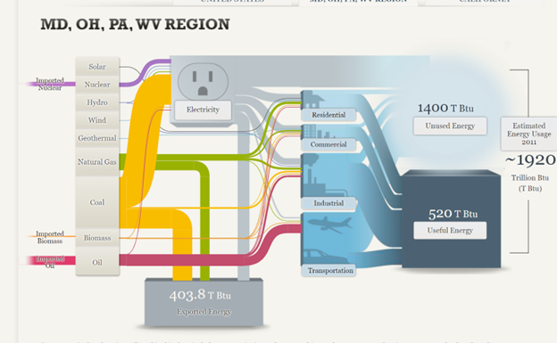
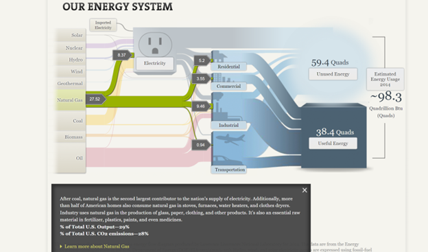
As you can see, the numbers are all over the place and hard to follow due to all of the “lines” and colors surrounding it. When you actually click on an energy source, however, the numbers, color, and “line” are singled out with more data and information that is more understandable. The image below is taken from the National energy system but is clicked to focus on the natural gas section of it. Here, the numbers are more directly highlighted, and an explanation is given and broken down in a way that is easier to understand. You can tell that 27.52 is the total energy in natural gas and the smaller numbers are where the energy is actually broken down.
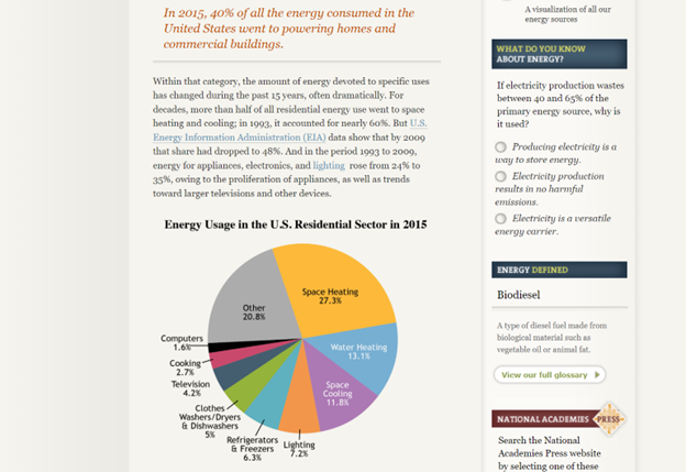
Despite this being a more clarified version of the Sankey visualization, I am not entirely sure that this was the best way to display the information. I feel that the website has too much information that they want to share and not enough innovative ways to share it, that the information becomes too overwhelming to look at in any section, not just the Sankey visualization. The entire website is very text heavy with a few visualizations thrown in between (including the Sankey visualization) and the visualizations end up having too much data because there are so few of them. For instance, even the pie chart featured below looks very overwhelming due to the amount of information and colors being packed into it. To add to this, there is also too much going on in the side legends of the website with the quizzes, polls, links, etc.. that your eyes are not truly able to focus on everything and take it all in.
In all, the Sankey visualization is a unique way to display information when done correctly. While this website tried its best to make it interactive and comprehensive, there was simply too much data and information in each that it became a little overwhelming until a specific part was highlighted. A simple flow chart may have been easier to read, but then again there was just too much information and text to fully know and understand.