A Sankey diagram is a type of data visualization that represents the flow of resources or information between multiple entities. This database is for visually representing our energy system and how it works. It is very useful in information as well as visually pleasing. After using the site I found that it was quite easy to navigate through and believe it would be helpful for beginners. The first thing I enjoyed was the way that the website is interactive.
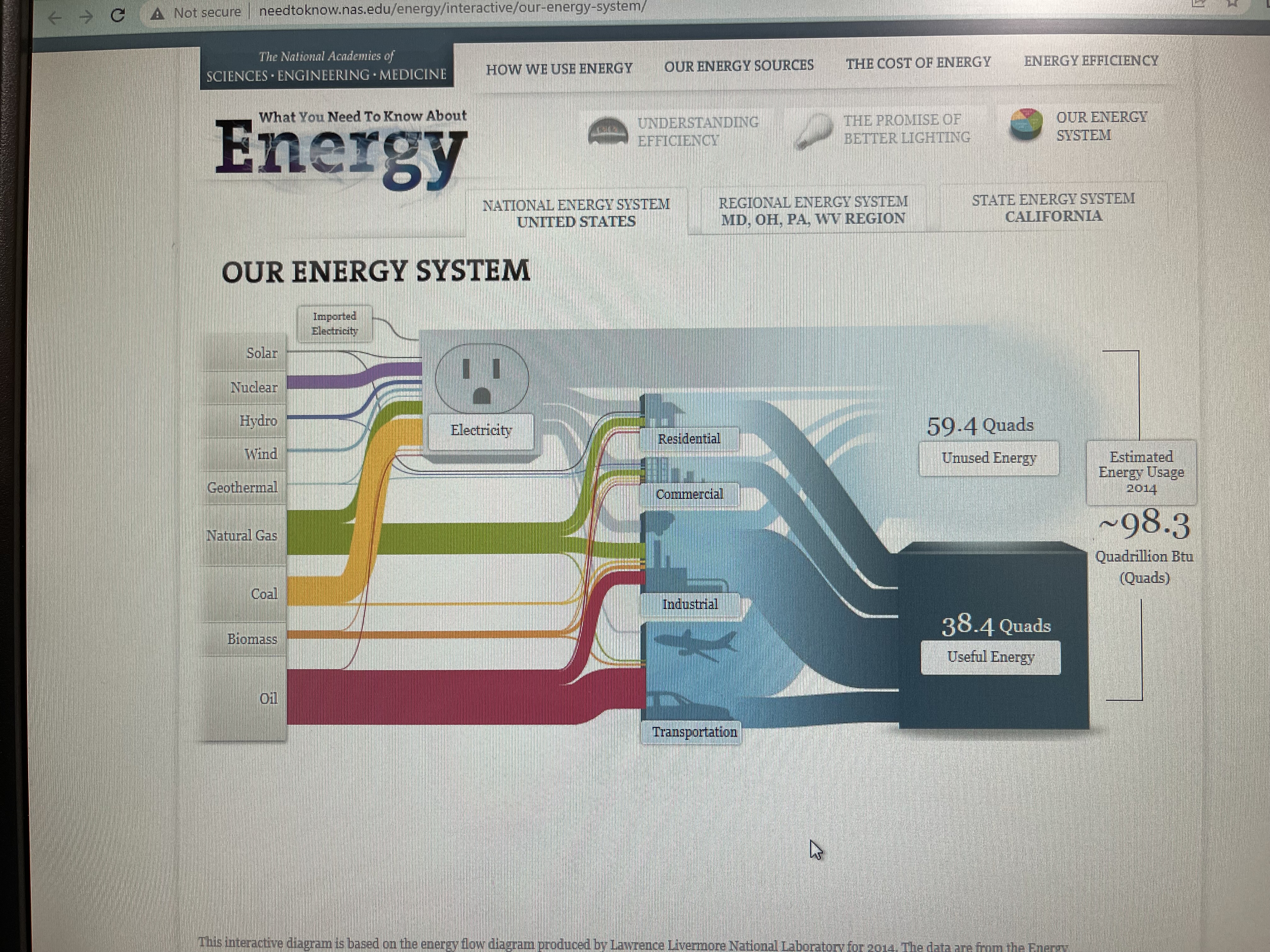
This interactive map helps break up different parts of our energy system and provides information on each section when you click on it. I appreciate the graphics included as well and the captions are simple to understand. This representation is a lot better than just reading paragraphs of text. The side panels are meant to show how it is related and connected to energy. Each one has a different percentage of total U.S. Output and percentage of total U.S. CO2 emissions.
The page above, however, I found to be a bit overwhelming due to the crowding of text. The font, size, and colors do not to a great job of breaking up the information. It is so much data to analyze it over complicates the main idea. To improve this I would add more visuals in between texts and emphasize the most important parts of the text with bigger lettering or a change of font/color. The side panels also are a lot to navigate through in one page.
Lastly, what I would have liked to see in this website would be a comparison of each tab displayed through charts or graphs. In order to analyze the information provided you must search through the text and read what the data says. It would make it easier for the viewer if it was already displayed in a more obvious manner. I would recommend a histogram chart for this kind of data as well. Over all, this website does a great representation of SANKEY and I would recommend it for future projects.