Our Energy System explained: Our Energy System — The National Academies (nas.edu)
This website is an excellent source for anyone looking to get a quick and better understanding of the flow of energy on different levels of operation, such as nationally, regionally, or state-wide.
The first thing I noticed and liked about this section, is the transition of clicking this block to view the flow of energy within our National Energy System. The subtle splitting of the block opening up into the unused and useful energy divisions was a clever way of guiding our attention to the pertinent topics in the right order.
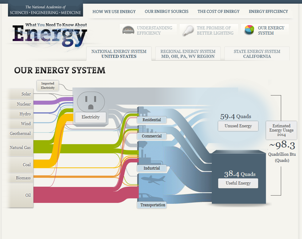
This graphic effectively illustrates a story within this visualization, with very little taking away from this process. The first thing I noticed that stands out to me with my ability to help digest this seemingly congested web of energy flow, is the little graphics next to the different sectors where energy is utilized or directed to (transportation, industrial, commercial, residential.) Even the opaque to semitransparent blue lines of varying size attached to these distribution networks helps to estimate how much of this supply is being used, or unused respectively. It is unclear whether or not there is intention with the sizes of the wires from different energy sources, however if not the case, I felt that this section created an unnecessary distraction and clutter. If these wires aren’t scaled to their relative unit distribution, this distraction takes away from the overall ease of understanding. This strategy of size manipulation is an excellent one, however as some of the lines get extremely minimal and hard to track, perhaps this strategy would have been better executed on a larger canvas. Overall, the flow of energy from left to right from production to distribution is organized very effectively, all the way to the used, unused, and estimated future energy usage. A final visualization I felt to be particularly effective, (as most individuals reading this information are doing so using electricity), is the electricity outlet graphic. This graphic helps to demonstrate generally how much more reliant the residential, commercial, and industrial sectors are than the transportation sector.
Source
Our Energy System — The National Academies. (n.d.). Needtoknow.nas.edu. http://needtoknow.nas.edu/energy/interactive/our-energy-system/