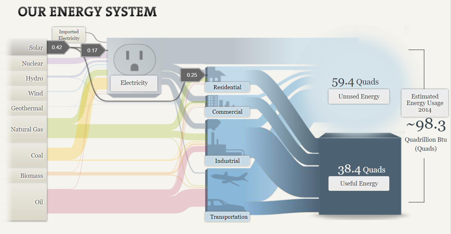
A Sankey energy flow chart is a specific type of diagram that visualizes the flow of energy within a system. It is generally used to analyze and display energy balances, showing how energy is generated, consumed, and lost within a given system. The first screenshot is about the solar energy consumed in the USA. Solar energy is the lowest energy consumed in the USA. I was shocked since solar energy is only used in residential areas. Solar energy is less harmful to the environment and it is renewable energy.
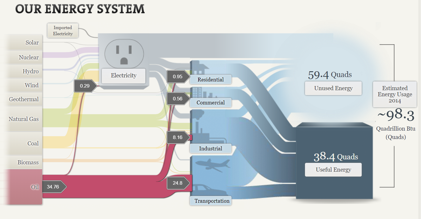
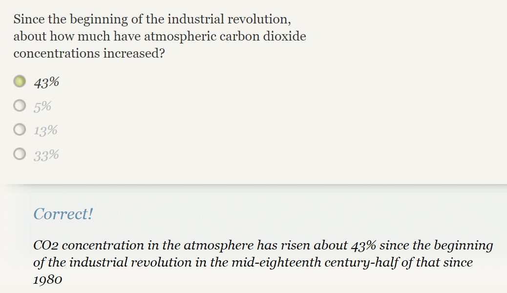
The second screenshot is about oil consumption in the USA. It is the highest among all. With the help of Sankey, it helps to determine how the usage of oil is classified into each sector. Transportation is the highest number in consumption of oil. Now here is the reason why our globe is impacted by climate change and global warming. Since the beginning of the Industrial Revolution, 43% of carbon dioxide concentrations increased. Carbon emissions come from human activities like the burning of fossil fuels such as coal, oils, and natural gas. In this SANKEY oil is the highest consumption for energy which was 34.76. The coal was 17.96 and natural gas was 27.52 which is quite enough for climate change and global warming.
To sum up, this website provides a good example of the energy system in the USA with different ways we utilize sources of energy. The website is really cool with the visualization it is clear and attractive By visualizing the energy flow in a clear and intuitive manner, SANKEY energy flow charts provide valuable insight into energy consumption patterns, helping to inform decision-making and improve energy efficiency.