by joseph12
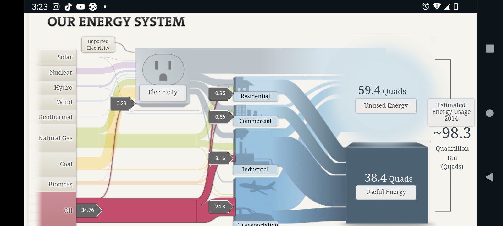
My first impression of Sankey was that it looked like a very detailed and easy to understand visualization tool that accurately portrayed the amount of used/unused energy in the United States. Perhaps to no one’s surprise, Oil was the most abundant and used energy in the U.S with the majority of it being used for transportation and industrial purposes. Natural gas was second and was followed by coal in terms of energy usage. Solar and wind were far lower than I was expecting, as there are major companies that generate billions of dollars yearly using wind/solar energy.
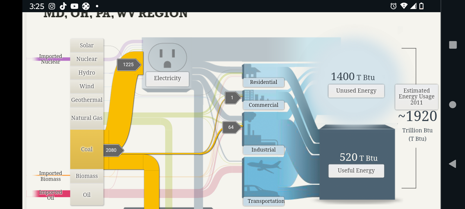
For areas such as Maryland and Ohio, the most used form of energy was coal, and it was mainly used for electrical and even some industrial purposes. Although the top 3 sources of energy (i.e. Coal, Oil, and Natural Gas) remained the same as the rest of the United States, unlike most of the other other states, Maryland and a few other states most used source of energy seemed to be coal, followed by oil and Natural Gas.
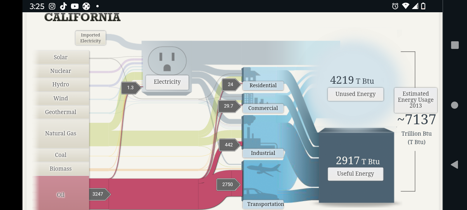
The first thing I noticed about California’s energy expenditure compared to other states was that it was far greater than the rest. As a matter of fact, when comparing the results, it appears that California alone uses more energy than a combination of multiple states from the previous screenshot. Furthermore, like most other states, oil was its main source of energy, and natural gas was close second.
All in all I do believe that Sankey was a very good and efficient tool to portray energy used and energy lost. It is incredible detailed and all the while manages to somehow retain a simplistic aspect to it. The visualizations are very easy to understand. So much so that one would be able to understand what is being portrayed even without the numerical values being shown. The only criticism that I would personally give would be the fact that the data used may have been a little bit outdated as there were estimated energy usages going back as far as 2011.