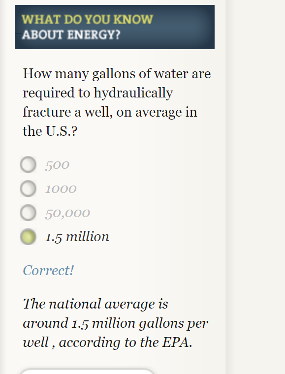
This website has a very immersive interactive display of the way energy is used in society. I spent a lot of my time clicking through and answering questions. That was probably my favorite part of the website, the option to answer questions along with the reading made it more interactive and entertaining. It also helped focus myself on to key facts I should take away. An example of one of these questions is pictured below.

This website provides a very clear and detailed description of different ways we use sources of energy. As a society we use water, wind, solar and other things to generate electricity and some of the statistics provided were very staggering. They used many different types of useful visuals to display increases in energy usage over time. My favorite were probable the simple line graphs because they were effective and clear.
My only problem with the websites layout is that it was often hard to get back to where I was once I clicked a new tab. There were so many links bringing me deeper into the website but I often forgot what I clicked to get back to that information. So some of this information needs to be more easily available with less searching.