Sankey Visualization
After examining the website on our Energy System by the National Academies of Science, Engineering, and Medicine, there is one main conclusion to be drawn: the energy system is very complex and there is a lot of data to unpack from it. The website attempts to do its best to explain energy usage and statistics through the use of a Sankey visualization, however without actually clicking on any data or the specifics, it appears very overwhelming to even look at. For instance, when you look at the section/visualization that focuses strictly on the MD, OH, PA, WV Region and do not click on the energy type (solar, nuclear, hydro, etc…) the visualization shows hardly any data that is clearly understandable and interpretable. The image shown below is what this visualization looks like without using the interactive feature.
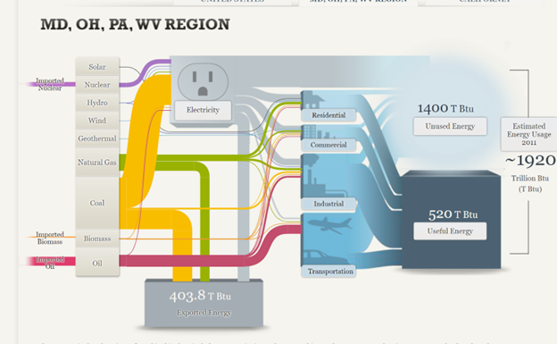
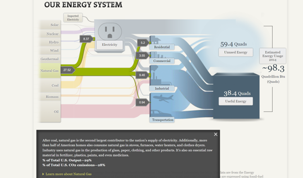
As you can see, the numbers are all over the place and hard to follow due to all of the “lines” and colors surrounding it. When you actually click on an energy source, however, the numbers, color, and “line” are singled out with more data and information that is more understandable. The image below is taken from the National energy system but is clicked to focus on the natural gas section of it. Here, the numbers are more directly highlighted, and an explanation is given and broken down in a way that is easier to understand. You can tell that 27.52 is the total energy in natural gas and the smaller numbers are where the energy is actually broken down.
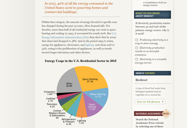
Despite this being a more clarified version of the Sankey visualization, I am not entirely sure that this was the best way to display the information. I feel that the website has too much information that they want to share and not enough innovative ways to share it, that the information becomes too overwhelming to look at in any section, not just the Sankey visualization. The entire website is very text heavy with a few visualizations thrown in between (including the Sankey visualization) and the visualizations end up having too much data because there are so few of them. For instance, even the pie chart featured below looks very overwhelming due to the amount of information and colors being packed into it. To add to this, there is also too much going on in the side legends of the website with the quizzes, polls, links, etc.. that your eyes are not truly able to focus on everything and take it all in.
In all, the Sankey visualization is a unique way to display information when done correctly. While this website tried its best to make it interactive and comprehensive, there was simply too much data and information in each that it became a little overwhelming until a specific part was highlighted. A simple flow chart may have been easier to read, but then again there was just too much information and text to fully know and understand.
Sankey Visualizations
By Ryan Metch
A Sankey visualization is a very unique way to display data. Sankey visualizations are a type of flow chart that can also be interactive, allowing the reader to click on certain areas of the chart to unlock more information on that topic.
In this screenshot I wanted to show just how much information there is in a Sankey visualization, because looks can be deceiving. All of the labels on this chart are actually links to more information on each topic. When you click on them it will further immerse you in that topic, this is something that a lot of charts cannot replicate making Sankey visualizations a very powerful tool.
SANKEY Data Visualization Review
A Sankey diagram is a type of data visualization that represents the flow of resources or information between multiple entities. This database is for visually representing our energy system and how it works. It is very useful in information as well as visually pleasing. After using the site I found that it was quite easy to navigate through and believe it would be helpful for beginners. The first thing I enjoyed was the way that the website is interactive.
This interactive map helps break up different parts of our energy system and provides information on each section when you click on it. I appreciate the graphics included as well and the captions are simple to understand. This representation is a lot better than just reading paragraphs of text. The side panels are meant to show how it is related and connected to energy. Each one has a different percentage of total U.S. Output and percentage of total U.S. CO2 emissions.
The page above, however, I found to be a bit overwhelming due to the crowding of text. The font, size, and colors do not to a great job of breaking up the information. It is so much data to analyze it over complicates the main idea. To improve this I would add more visuals in between texts and emphasize the most important parts of the text with bigger lettering or a change of font/color. The side panels also are a lot to navigate through in one page.
Lastly, what I would have liked to see in this website would be a comparison of each tab displayed through charts or graphs. In order to analyze the information provided you must search through the text and read what the data says. It would make it easier for the viewer if it was already displayed in a more obvious manner. I would recommend a histogram chart for this kind of data as well. Over all, this website does a great representation of SANKEY and I would recommend it for future projects.
Sankey. AS
Our Energy System explained: Our Energy System — The National Academies (nas.edu)
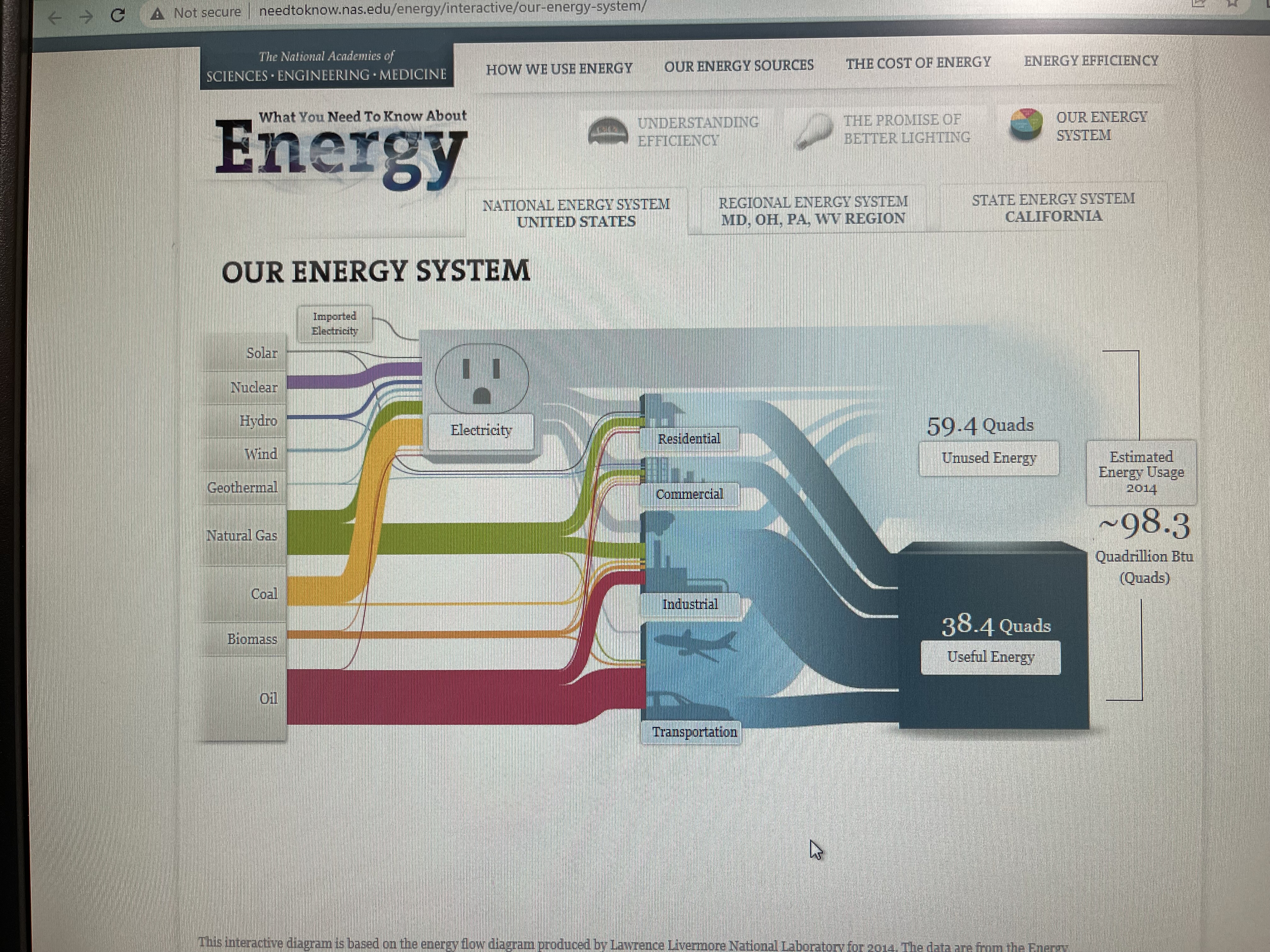
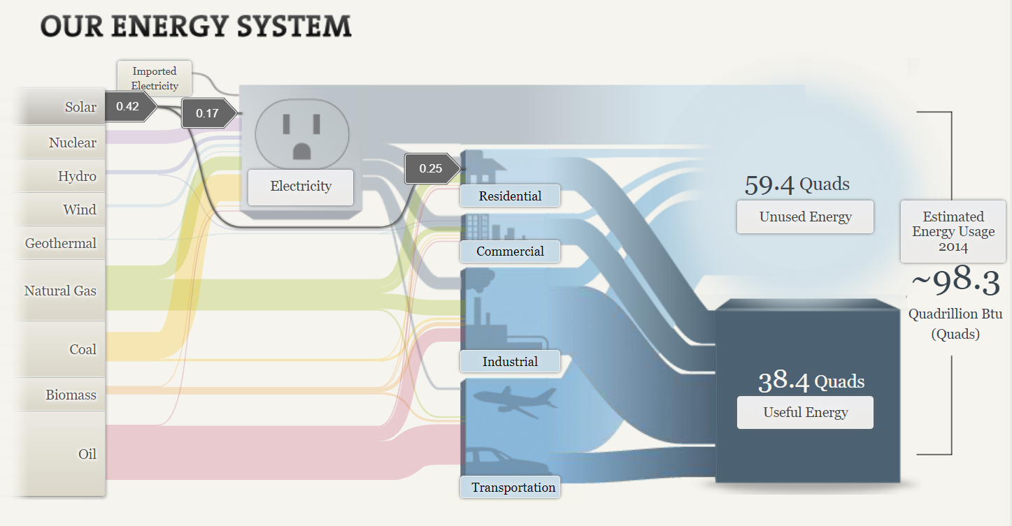
This website is an excellent source for anyone looking to get a quick and better understanding of the flow of energy on different levels of operation, such as nationally, regionally, or state-wide.
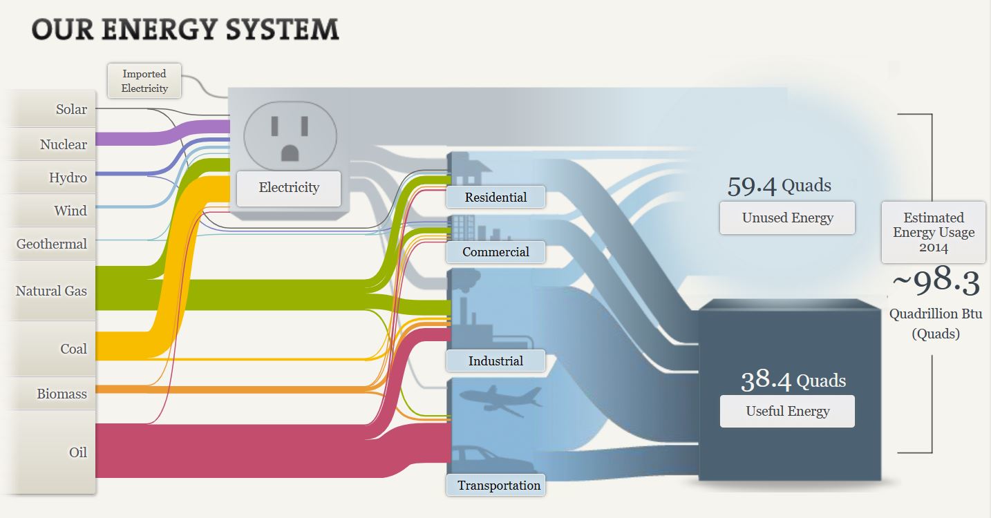
The first thing I noticed and liked about this section, is the transition of clicking this block to view the flow of energy within our National Energy System. The subtle splitting of the block opening up into the unused and useful energy divisions was a clever way of guiding our attention to the pertinent topics in the right order.
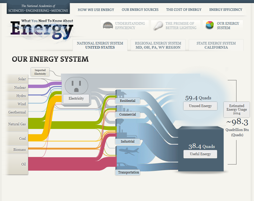
This graphic effectively illustrates a story within this visualization, with very little taking away from this process. The first thing I noticed that stands out to me with my ability to help digest this seemingly congested web of energy flow, is the little graphics next to the different sectors where energy is utilized or directed to (transportation, industrial, commercial, residential.) Even the opaque to semitransparent blue lines of varying size attached to these distribution networks helps to estimate how much of this supply is being used, or unused respectively. It is unclear whether or not there is intention with the sizes of the wires from different energy sources, however if not the case, I felt that this section created an unnecessary distraction and clutter. If these wires aren’t scaled to their relative unit distribution, this distraction takes away from the overall ease of understanding. This strategy of size manipulation is an excellent one, however as some of the lines get extremely minimal and hard to track, perhaps this strategy would have been better executed on a larger canvas. Overall, the flow of energy from left to right from production to distribution is organized very effectively, all the way to the used, unused, and estimated future energy usage. A final visualization I felt to be particularly effective, (as most individuals reading this information are doing so using electricity), is the electricity outlet graphic. This graphic helps to demonstrate generally how much more reliant the residential, commercial, and industrial sectors are than the transportation sector.
Source
Our Energy System — The National Academies. (n.d.). Needtoknow.nas.edu. http://needtoknow.nas.edu/energy/interactive/our-energy-system/
SANKEY
A Sankey energy flow chart is a specific type of diagram that visualizes the flow of energy within a system. It is generally used to analyze and display energy balances, showing how energy is generated, consumed, and lost within a given system. The first screenshot is about the solar energy consumed in the USA. Solar energy is the lowest energy consumed in the USA. I was shocked since solar energy is only used in residential areas. Solar energy is less harmful to the environment and it is renewable energy.
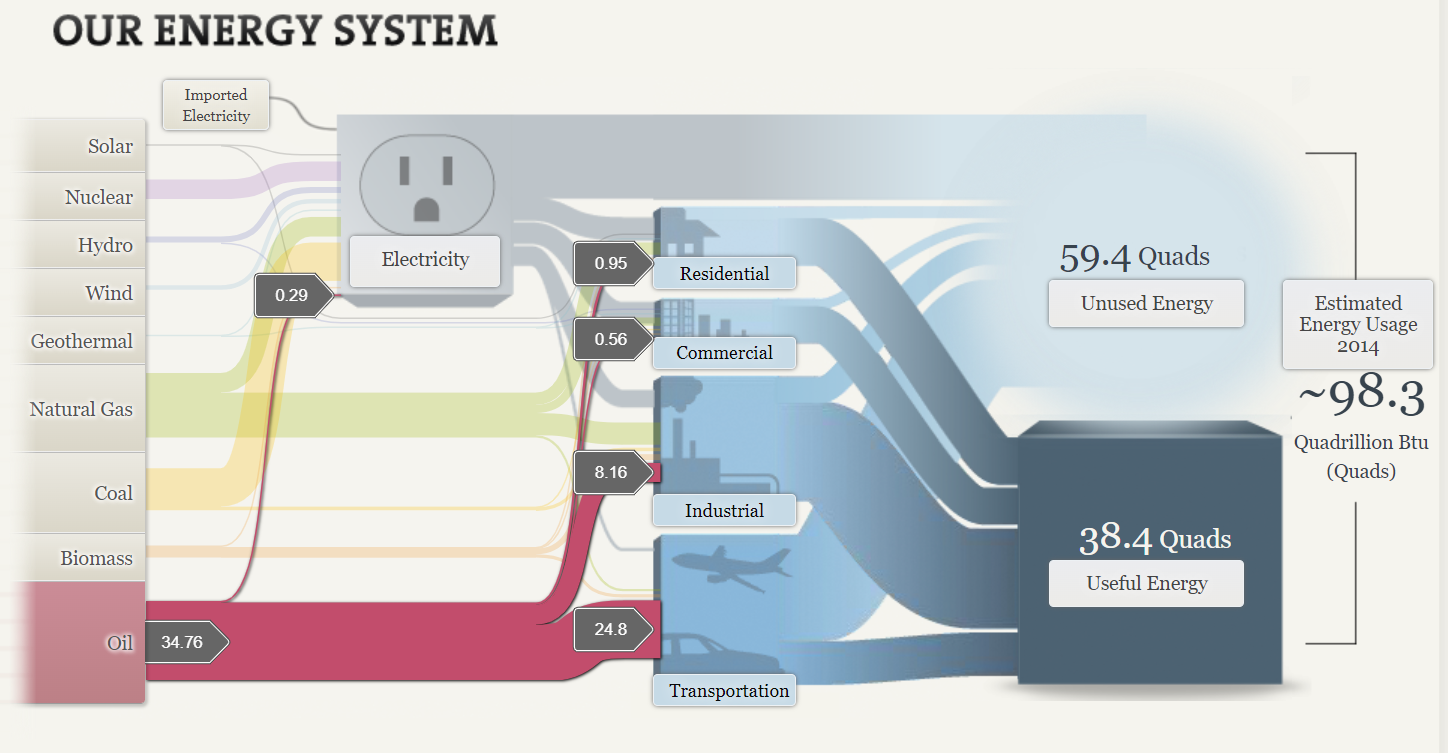
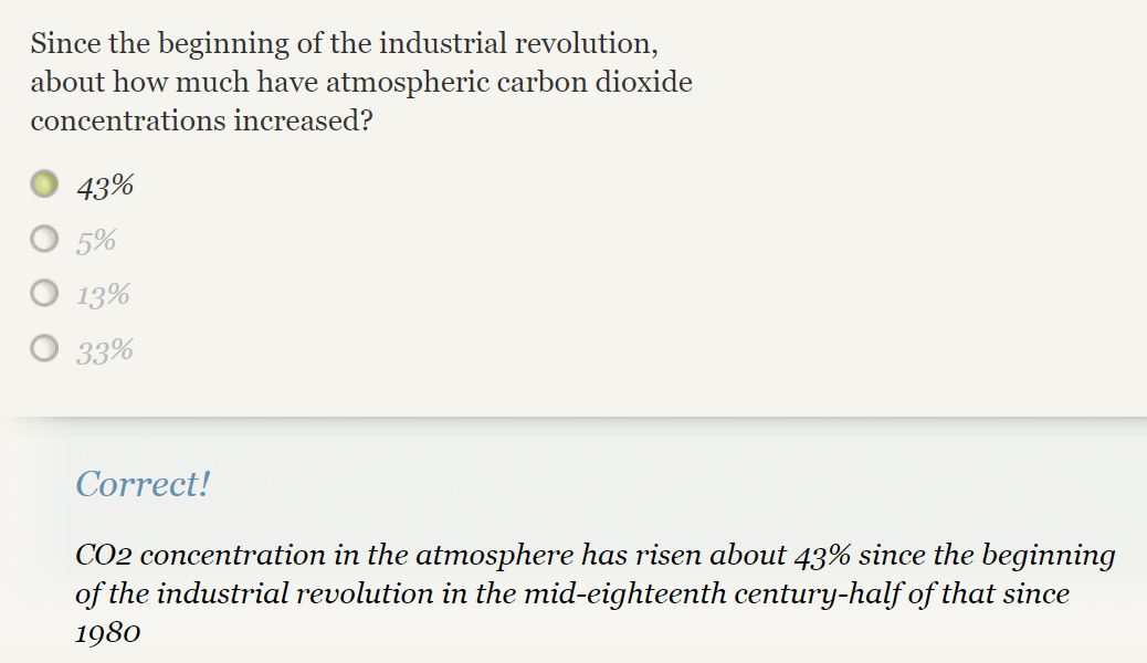
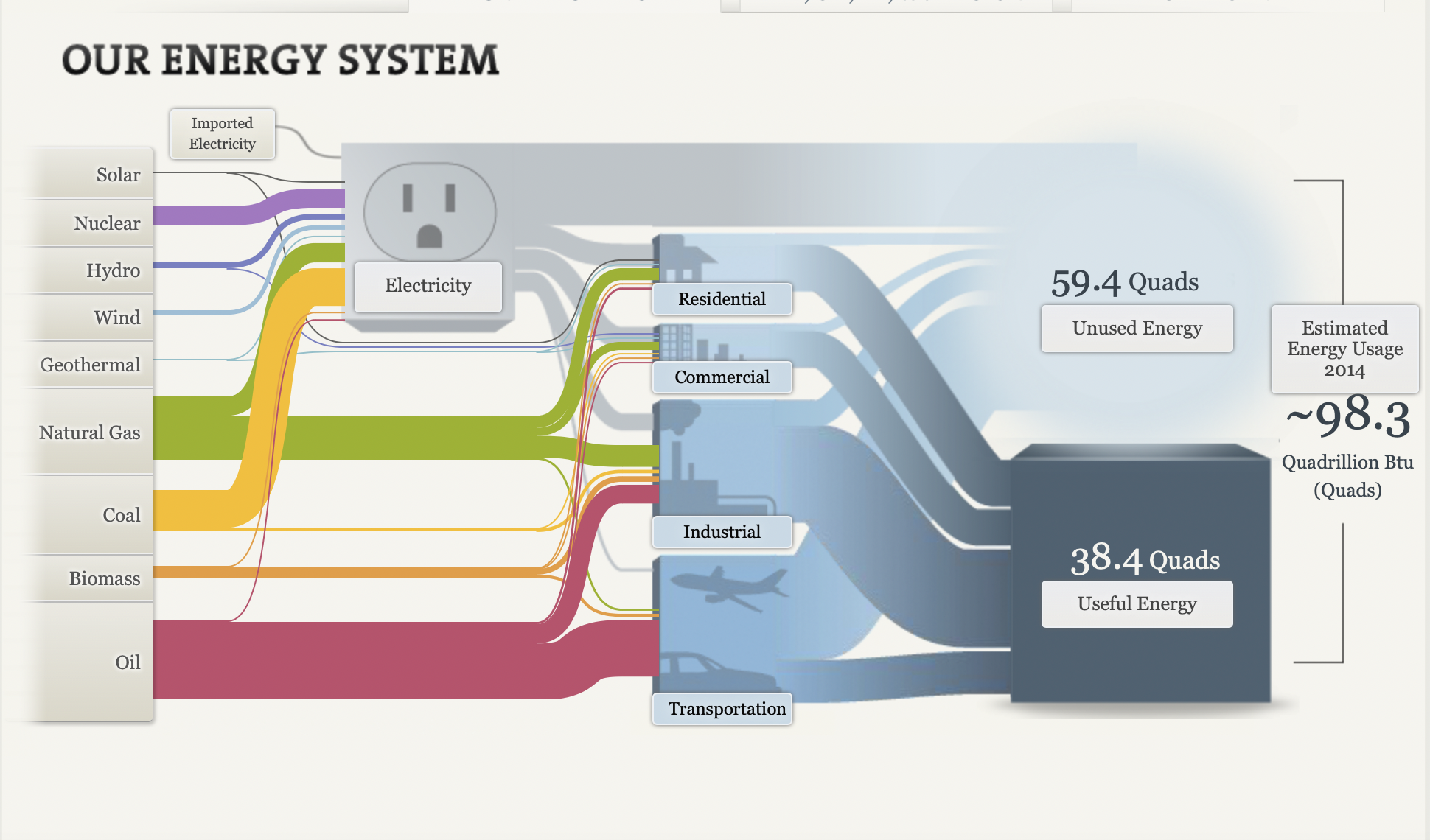
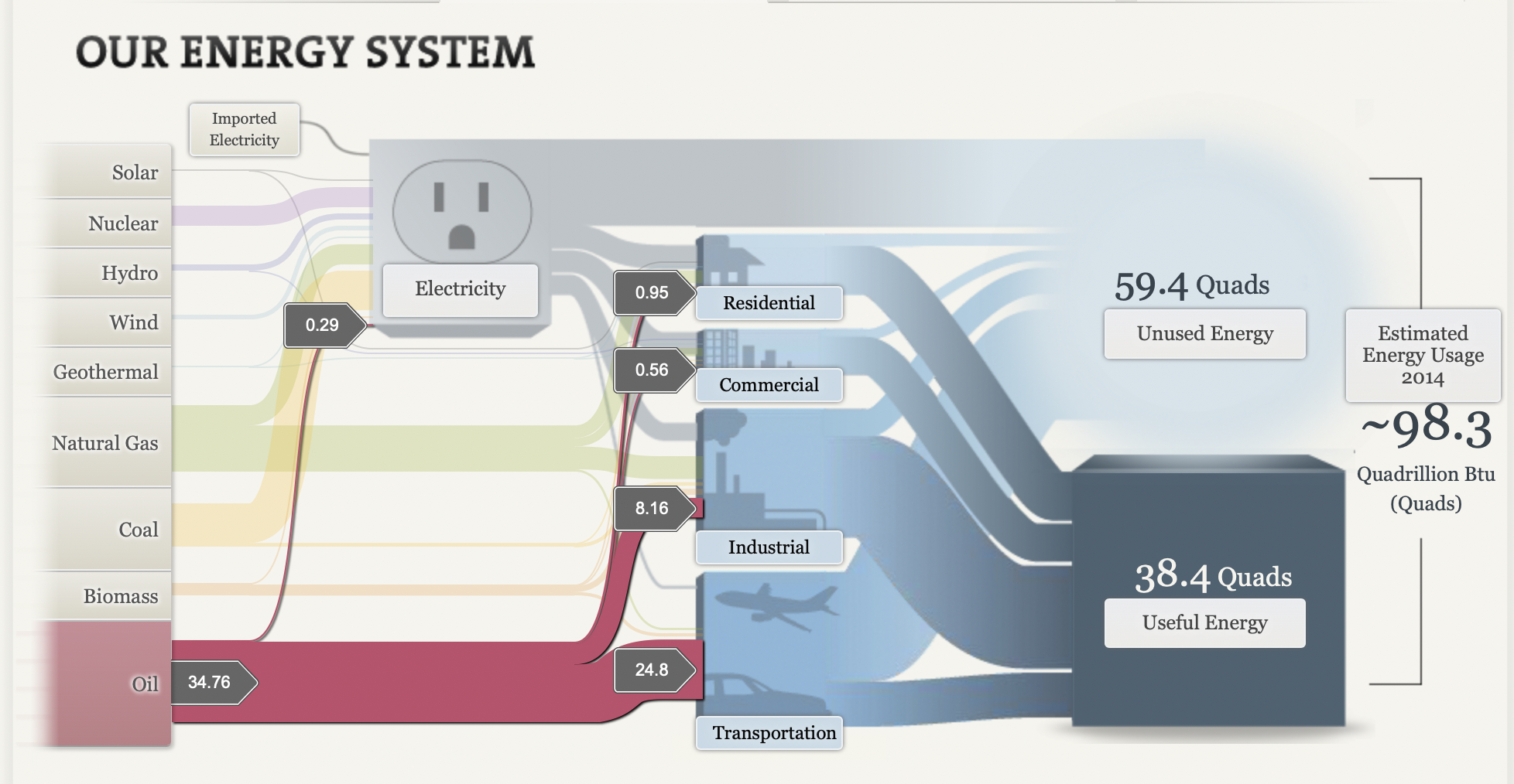
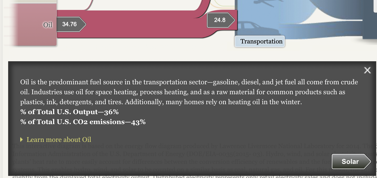
The second screenshot is about oil consumption in the USA. It is the highest among all. With the help of Sankey, it helps to determine how the usage of oil is classified into each sector. Transportation is the highest number in consumption of oil. Now here is the reason why our globe is impacted by climate change and global warming. Since the beginning of the Industrial Revolution, 43% of carbon dioxide concentrations increased. Carbon emissions come from human activities like the burning of fossil fuels such as coal, oils, and natural gas. In this SANKEY oil is the highest consumption for energy which was 34.76. The coal was 17.96 and natural gas was 27.52 which is quite enough for climate change and global warming.
To sum up, this website provides a good example of the energy system in the USA with different ways we utilize sources of energy. The website is really cool with the visualization it is clear and attractive By visualizing the energy flow in a clear and intuitive manner, SANKEY energy flow charts provide valuable insight into energy consumption patterns, helping to inform decision-making and improve energy efficiency.
SANKEY
by joseph12
My first impression of Sankey was that it looked like a very detailed and easy to understand visualization tool that accurately portrayed the amount of used/unused energy in the United States. Perhaps to no one’s surprise, Oil was the most abundant and used energy in the U.S with the majority of it being used for transportation and industrial purposes. Natural gas was second and was followed by coal in terms of energy usage. Solar and wind were far lower than I was expecting, as there are major companies that generate billions of dollars yearly using wind/solar energy.
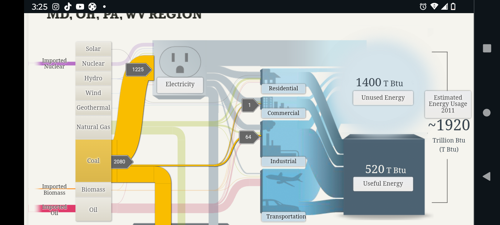
For areas such as Maryland and Ohio, the most used form of energy was coal, and it was mainly used for electrical and even some industrial purposes. Although the top 3 sources of energy (i.e. Coal, Oil, and Natural Gas) remained the same as the rest of the United States, unlike most of the other other states, Maryland and a few other states most used source of energy seemed to be coal, followed by oil and Natural Gas.
The first thing I noticed about California’s energy expenditure compared to other states was that it was far greater than the rest. As a matter of fact, when comparing the results, it appears that California alone uses more energy than a combination of multiple states from the previous screenshot. Furthermore, like most other states, oil was its main source of energy, and natural gas was close second.
All in all I do believe that Sankey was a very good and efficient tool to portray energy used and energy lost. It is incredible detailed and all the while manages to somehow retain a simplistic aspect to it. The visualizations are very easy to understand. So much so that one would be able to understand what is being portrayed even without the numerical values being shown. The only criticism that I would personally give would be the fact that the data used may have been a little bit outdated as there were estimated energy usages going back as far as 2011.
Sankey Flowcharts
Overview
Sankey flowcharts are a type of chart the describes what constitutes a whole, not dissimilar to a pie graph. Sankey however can provide subcategories for the values displayed.
Pitfalls-
With all the minutiae that the Sankey provides to viewers the big picture is in danger of being drowned out. In this example if the goal was to highlight the amount of energy being wasted by the transportation industry for instance, readers might not be able to interpret it without looking for it. Pie charts are definitely a better chart for bringing attention to large discrepancies in parts of a whole.
Interactivity-
Although some of the finer details present in the data are hard to read at first glance, the dynamic nature of Sankey charts allows dedicated creators to capitalize on this by providing awesome in-depth features like the NAS does here.
If you know your audience is interested in really digging deep into the data, implementing features like those shown here are a surefire way to make your chart into a showstopper.
Sankey Visualizations
It is true that Sankey Visualizations is an educational site (.edu), which usually indicates that the sources and information are reliable. Despite the interactive visual being well-designed, it contains a great deal of information meaning that while it may be visually appealing, it also contains a lot of text and is difficult to follow if you do not have prior knowledge of the situation.

The Transportation tab, as well as all the other tabs that lead to more information, are heavy on wording and low on visuals in my opinion, which makes it difficult to access reliable information. Using less words and more visuals to simplify this information might be the best soultion. Perhaps taking How We Use Energy and creating an infographic with subtitles such as Transportation, Industry, and Home & Work and discussing the information in less detail and more graphs and data would be a better approach.

This visual contains less graphs and more words which makes it boring and visually unappealing to read all of that information just to get to what it’s trying to explain. By redesigning this information with additional aesthetics, such as graphs, charts, picures, and data, it will become more engaging to read and interact with. I feel that I’m doing something that requires extensive research and is more of an article format. It would be more appealing if it included the following listed above and some infographics or pictographs to give more of an appeal than all the wording since it makes it difficult to be able to sift through all of that information.
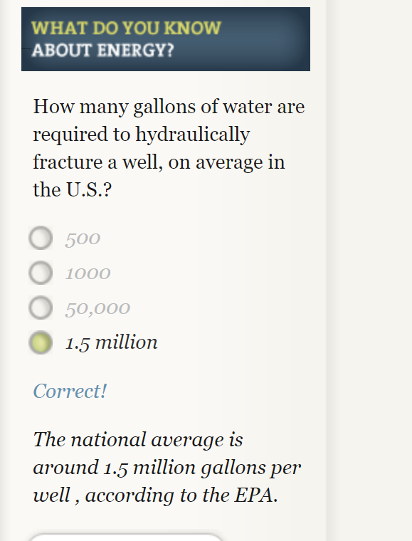
The Cost of Energy
This website has a very immersive interactive display of the way energy is used in society. I spent a lot of my time clicking through and answering questions. That was probably my favorite part of the website, the option to answer questions along with the reading made it more interactive and entertaining. It also helped focus myself on to key facts I should take away. An example of one of these questions is pictured below.
This website provides a very clear and detailed description of different ways we use sources of energy. As a society we use water, wind, solar and other things to generate electricity and some of the statistics provided were very staggering. They used many different types of useful visuals to display increases in energy usage over time. My favorite were probable the simple line graphs because they were effective and clear.
My only problem with the websites layout is that it was often hard to get back to where I was once I clicked a new tab. There were so many links bringing me deeper into the website but I often forgot what I clicked to get back to that information. So some of this information needs to be more easily available with less searching.
Sankey Diagram
The Sankey Diagram originated in 1898 to show the energy efficiency of a steam engine. This makes it the perfect choice of visualization to depict the efficiency and usage of our energy systems in the United States. I appreciate that the diagrams show how different states aggregate their energy to show that the United States is not a monolith in energy production and consumption. Our energy use is nuanced and these diagrams show that our energy production and usage is very inefficient. This first screenshot shows the amount of energy that solar contributes to our total power usage. It is very low at 0.23%. I was actually shocked that less than ¼ of a percent of our energy is produced by solar. When you click on solar it also shows that most of our solar usage is going directly to residential homes and very little is going into the grid.

The second screenshot shows the MD/OH/PA/WV region, who are major exporters of coal energy. The diagram shows that the region has much lower energy efficiency than the nation due to the use of coal. 73% of energy is unused in this region because the region is heavily reliant on the coal, biomass, and oil.

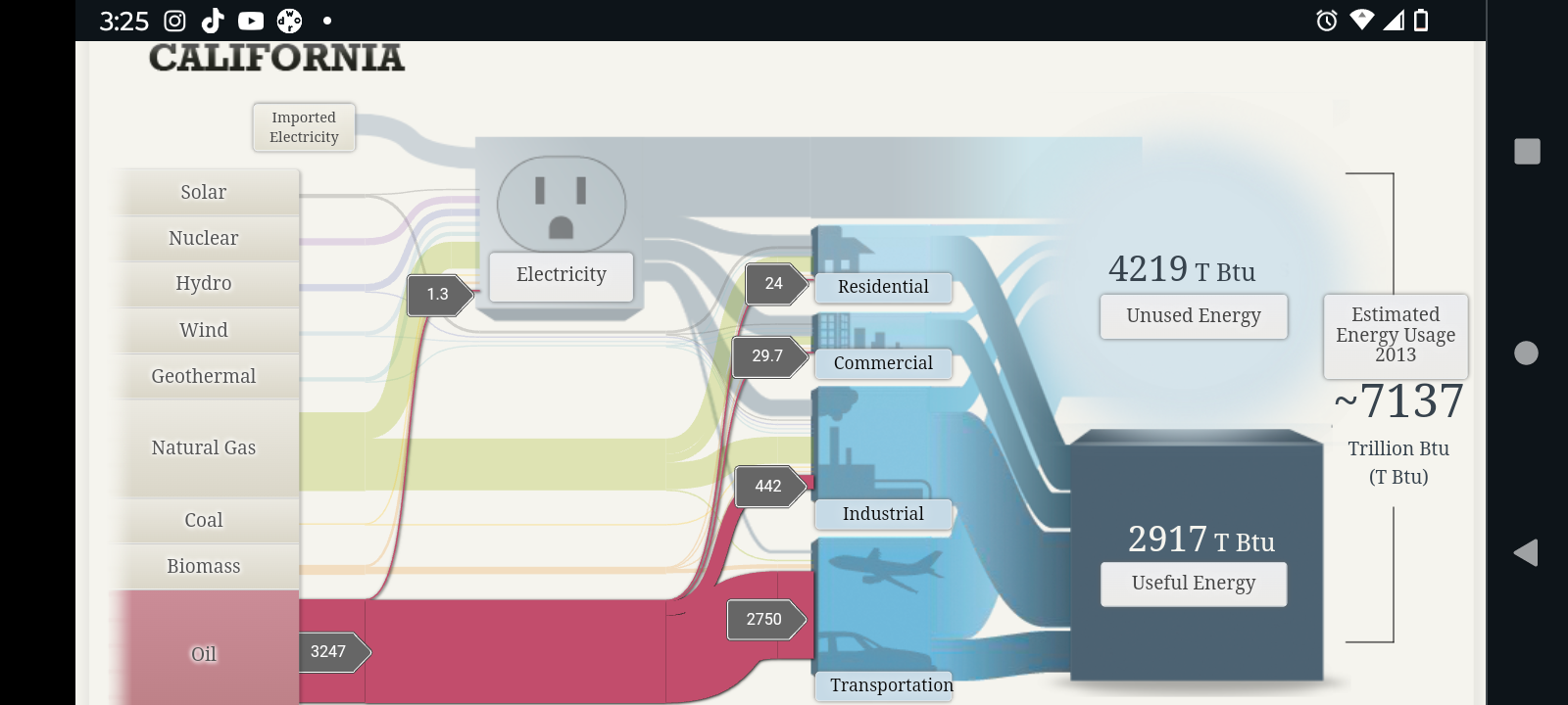
The last slide shows energy production and import in California. California is one of the most energy efficient states in the country and this diagram shows why. The top 6 sources of energy listed: solar, nuclear, hydro, wind, geothermal, and natural gas are much more efficient than the bottom three. This results in 41% of California’s energy produced being usable.

I would say that this is one of the best use cases for a Sankey Diagram. It allows the user to easily follow the flow of information (energy) and understand more about the topic than many other types of charts. All of the relevant information was able to captured in three different versions of the same diagram, so when users move on to the second and third charts they are expert users and it makes analysis more streamlined. This was a great way to show inefficiencies and areas of opportunity in a simple and easy to understand way. My mind works in percentages so the only thing I would have done differently is include percentages in the useful and unused energy labels or tooltips. Lastly, the only thing that I don’t really like about this Sankey Diagram is that all of the numbers are not visible without clicking around. Many people prefer to be able to see all of the information and just be able to explore visually without interaction.