Benchmark Comparisons
Benchmarks are an incredibly fast and effective way to provide a significant amount of context to a graphical display of information. This can be done in many ways, such as with a line or single symbol indicator. Benchmarks are most often used in financial matters; however, they still may prove useful for other purposes. In financial context, evaluating benchmarks may allow for insight into shifts in business over time. Whereas establishing benchmarks can allow businesses to more accurately gauge the performance of their employees as well as provide some motivation for progress.
In a New York Times article written by Clifford Krauss, he covers the significance of the dropping fuel demand in relation to how this affects oil suppliers.
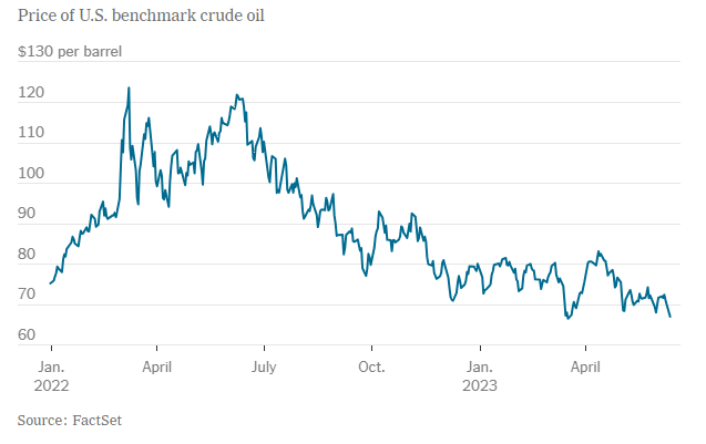
In the graph above, there is a clear trend of a dip in crude oil prices in the U.S. over the course of a little over a year. The benchmark of concern that was mentioned in the article, is $80 per barrel of crude oil. In a bold attempt to increase oil prices by cutting production, Saudia Arabia may have inadvertently caused the opposite effect to occur. Allies of the OPEC Plus cartel (Saudia Arabia included) have shown concern over this value remaining at or below $80 per barrel of crude oil. I feel as if the significance of this value may be better illustrated by highlighting this lines value differently than the others.
Benchmark Comparisons
Infographic as a whole usually display information such as sales on year by year comparison. However, these type of graphics can come in handy when looking at a benchmark. I am taking an example from National Oceanic and Atmospheric Administration’s website and few other regarding the global temperature
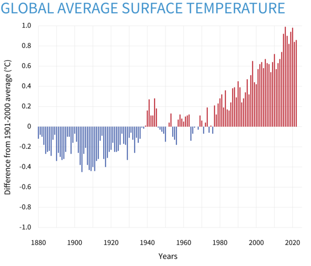
This first graph here is a “Yearly surface temperature compared to the 20th-century average from 1880–2022” and blue bars indicate cooler-than-average years; red bars show warmer-than-average years. One thing can be seen from this type of graph is how you can easily see how much of a difference between years. The graph only listed from -1.0 to 1.0 Celcius (30.8 to 33.8 Fahrenheit) but the short distance between the maximum and the minimum y-axis makes a small difference much more exaggerated. At first, I would have like to know the actual average temperature on a yearly basis but this would not fit in this type of graph due to the amount of spaces needed for additional data.
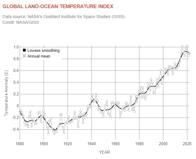
This graph is a similar graph comparing temperature from NASA’s website. This offer one more variable to look at is the LOWESS smoothing. By definition from NOAA’s website, LOWESS or LOESS is a nonparametric method for smoothing a series of data in which no assumptions are made about the underlying structure of the data and is effective when there are outliers in the data. However it is difficult to understand any of the scientific terms but overall just another example on how current temperature can be shown on a graph.
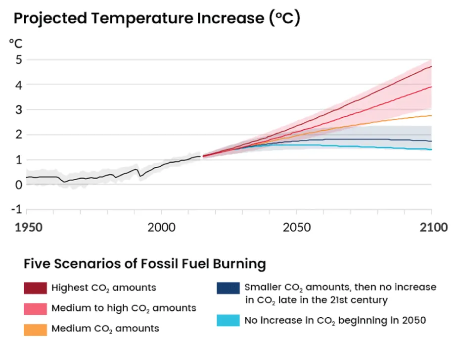
This graph here is “Projected Temperature Increase (°C)” from Center for Science Education. This graph is benchmarking the future temperature on a few different scenarios as listed within the graph itself. Black line and grey area perhaps are the accepted temperature change by many scientists. This graph is definitely great in comparison and it shows the temperature entirely depends on the decisions of humans. However what is missing here that makes me wonder is what is the different between CO2 amount from each scenarios such as would the highest CO2 be somewhat for an example 10 million and medium to high would be somewhere 3 million to 5 million and so on. Overall, it may seem that the actual number of CO2 because it is not the main focus of this graph.
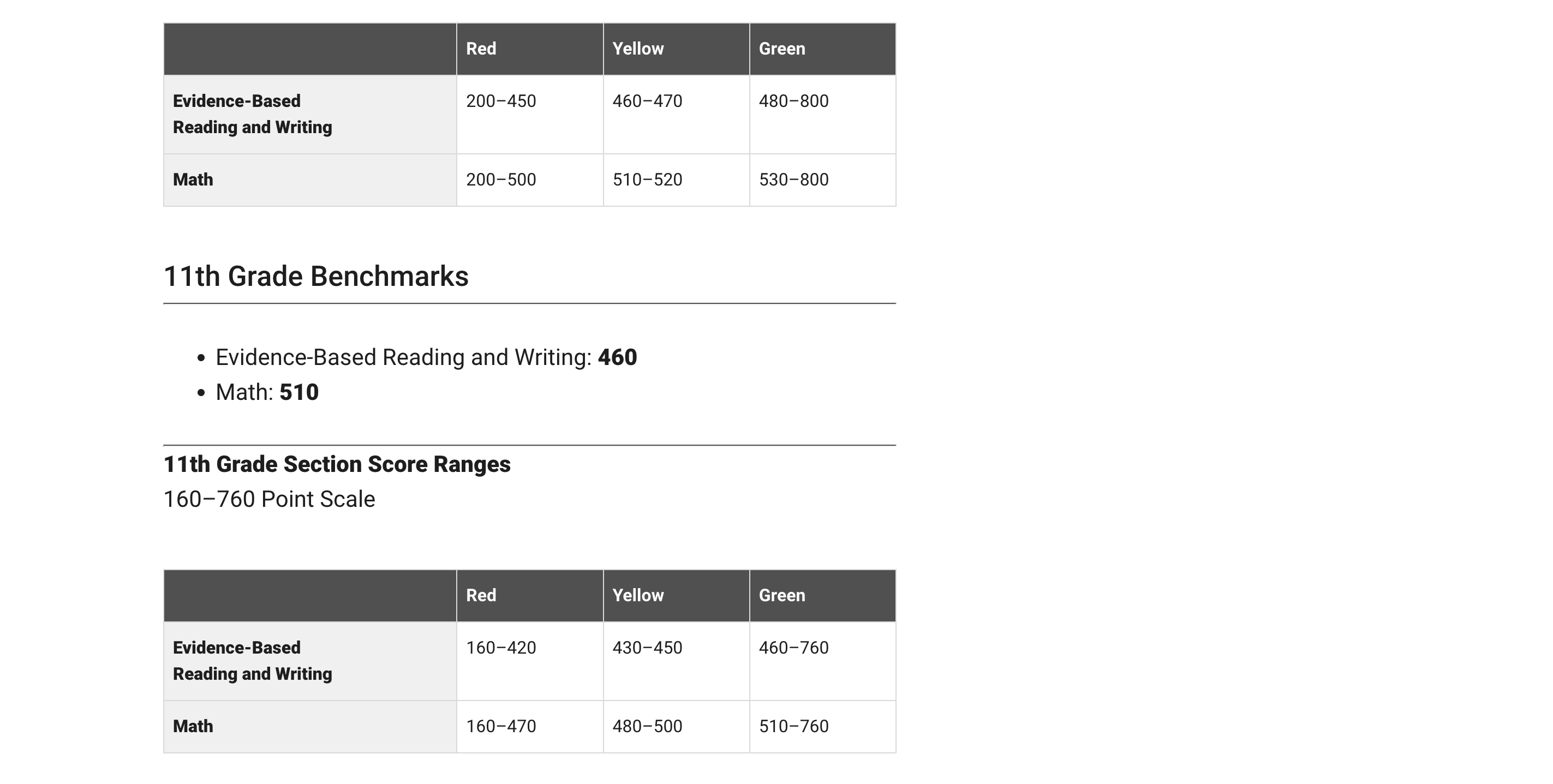
Benchmarks: Standardized Testing
Today we will be deep diving into how different people show comparisons to the benchmark. A benchmark is a standard or point of reference in which things can be compare. A great example is when benchmark testing was taken place during schooling. This data was used to see where you compare against students the same age as you.
I will be using the college board SAT testing as an example. The college board uses benchmarking in order to determine where your test score should land based on your grade level. In the example below, they state that the benchmark is 430 for reading and 480 for math. These scores are based on if you were a 10th grader. They then breakdown the score into three categories: Red, Yellow, and Green. These sections represent how below or how above you are the benchmark.
In the article, How Perceptions Can Skew Reality: A Data Visualization Approach How NYC schools’ academic performance differs from public perception, they use benchmarking to determine where each borough of NYC lands with regards to SAT testing. In this article they take into consideration things such as poverty level.
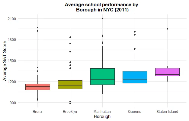
Schools in the Bronx performed worse due to the fact that the poverty rate is much higher. I feel as if data visualizations are very important especially with regards to benchmarking. It allows for an individual to compare themselves to the norm and make adjustments where needed. Everyone has grown up with benchmarking especially with regards to academic performance on things such as standardized testing. its interesting to put this into perspective.
Benchmark Comparisons
By Marc Joseph
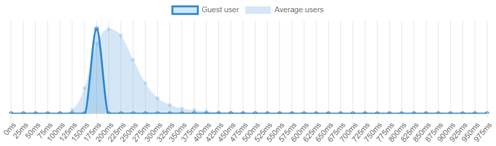
Source https://humanbenchmark.com/users/6523996c62704b00084820c5/reactiontime
Reaction Time Charts
There are many different ways one can use benchmarks in order to determine whether a measurable value is over or under an expected value. As shown by the reaction time benchmark from Humanbenchmark.com where I scored an average of 191 m/s which put me in the top 74.46% percentile. The graph that is darker represents my value while the lighter colors represent the standard of comparison, or the average of all the other users. As shown, my values are slightly skewed to the left which means that my reaction time is above average when compared to the values of the lighter blue.
Investing Charts
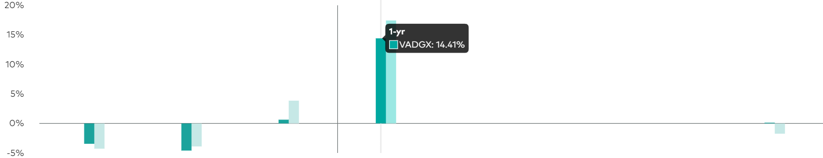
https://investor.vanguard.com/investment-products/mutual-funds/profile/vadgx#performance-fees
Another application of benchmark comparisons would be an investment or stock that generates a projected profit after a certain period of time. As portrayed by investorvanguard.com, they have a bar graph that shows the amount of returns and projected returns within a year. The darker green color represents the current value while the light green represents the expected goal. They used a darker color to bring attention to the value that they want the reader to see the most and a lighter color in order for the other value to be less distracting.
All in all, there are many different ways to shows benchmarks and simplify information. One can use bar graphs, line graphs, bell curve, and many more options in order to accurately portray data. Using the data, the audience can then make a more informed decision on their topic of interest (i.e. stocks, investing etc.). Hopefully this article gave you a good idea of the effectiveness of benchmarks and their many uses.
Benchmark Comparisons
Benchmarks are a commonly used feature in many data visualization charts, as they help to compare data in a comprehensive and easy way for viewers of all sorts. More frequently, we see benchmarks used to show things such as a budgeted/projected amount or numbers compared to the actual numbers for a specific data set, whether it be for a school, company, test, or experiment.
The unique thing about benchmarks is that they can be shown on graphs in a multitude of ways, from dotted lines and solid lines to different bars and solid colors on charts. Another notable feature about benchmarks is that there is no specific category that they have to be used for, meaning they could be used in/represent important statistical data or even smaller, less important information.
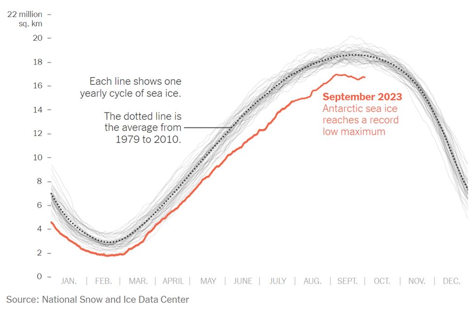
The example above is an instance where the benchmark line is used in a more serious setting and is represented by a dotted line on the line graph. The graph was taken from a New York Times article that discusses the current issue in the Antarctic Sea. As shown in the graph, this September marked the lowest ever recorded peak of sea ice, endangering wildlife. The red line represents the current levels recorded of the Antarctic Sea ice. In many scenarios, this would be considered the “actual” data in the graph/chart. In this specific graph, there are two types of benchmark (comparison) data. The first being the faded light gray lines that represent previous recordings of the sea ice level and the second is the dotted line with the average sea ice level, which is the main benchmark data and the comparison area. This chart was a great way to display this information, as it is clear to see the difference in sea ice throughout the years thanks to the comparison data/benchmark line.
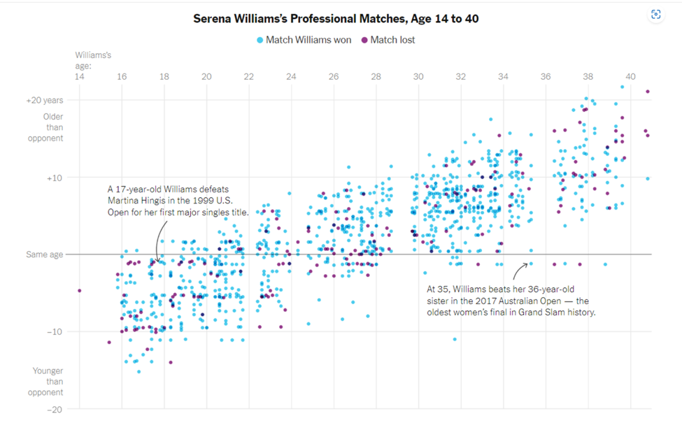
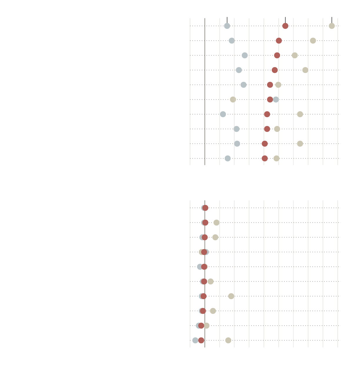
As previously mentioned, benchmark data sets can be used to represent and compare serious and important data, as well as data that is simply for fun. The chart above is a different presentation of a benchmark that takes on a less serious meaning. Serena Williams is a tennis player, and last year the New York Times put together an article and data visualization to compare Serena William’s age to all of the other people she has played and either won or lost to in each match. The gray solid line going across the entire scatter plot represents the benchmark (comparison) data, in which Serena Williams was the same age as her opponents. From here, it is easier to see how she performs with people younger than her, her age, and people older than her. While this type of chart looks chaotic, it is another perfectly acceptable use of a benchmark line within a data visualization.
In conclusion, benchmarks can be created and shown on almost any time of chart or graph that is trying to compare two or more things. It is an excellent tool that people can use to provide others with a better understanding of a situation. In different articles and publications that feature graphs, you will see them presented in a variety of ways depending on how the author chooses to do it. While none of the ways to show a benchmark are wrong, some are better suited for specific presentations of data. For instance, having a bar graph with overlapping bars to show the benchmark for all of Serena Williams’s matches and ages of opponents would have been acceptable, but a lot more confusing and chaotic than the scatter plot used with a simple solid benchmark line.
Benchmark Comparisons
When I look at data one of the most important concepts for me is relativity. What does that data mean relative to other data? When we look at relative data, we begin to really see the story of that data in the context that defines it. Benchmarking is a standard or point of reference by which data can be compared. Benchmarks represent a significant portion of data representation in many fields and can assist in the application of productivity concepts such as performance and service.
One of the most common benchmarks that we see often is financial benchmarks, specifically related to the stock market. People go to many different news sources to check on their investments but you will see charts that look very similar on every site. This graph shows the performance of Home Depot stock in the past year.

https://www.wsj.com/market-data/quotes/hd
This graph shows the performance of Home Depot stock compared to the benchmark set by the S&P 500:

https://www.wsj.com/market-data/quotes/hd
While HD is up 2.99% in the past year, it is not doing great when compared to the benchmark performance of the S&P 500, which is up 18.99%.
A New York Times article exploring the effects of pandemic school closures on the math scores of students showed some interesting results. In 2019 there was a distinct pattern between the students in wealthier districts scoring above average on math tests.


In 2012 there was a shift in all scores across the board. This change happened amongst all income levels and racial groups.

I enjoyed this article and the benchmarks showed that even though the researchers did not find the results that they had expected, they presented the data because it was quite remarkable. They had assumed that the children in poorer districts and minorities would have been even further behind benchmarks but the data showed otherwise. When data is presented that is the opposite of initial assumptions I find it more interesting because it shows the importance of data science and visualization. Without data we are left with assumptions…which are sorely lacking.
Benchmark Analysis
In today’s world, many data charts have been used in the market economy and small businesses. This blog is about benchmark graphs and how they allow you to identify improvement areas to get the company on par with growth and success. With the help of a benchmark graph, it allows businesses to compare their performance against competitors. In addition, it gives strategic decision-making ideas by analyzing the performance of competitors. The benchmark graph is innovative in comparison with a regular bar graph. This blog, it’s all about “The Employment Situation in January” The number of jobs added in January came in well above market expectations after unemployment from 2020. Based on the report from the U.S. Bureau of Labor Statistics the unemployment rate ticked up by 0.1 percentage point to 4.0 percent.
Average monthly job growth over the last three months was 541,000 a fast pace.
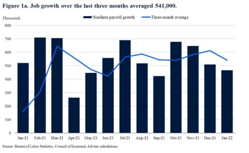
In this graph, the target line is a three-month average, and the bar graph represents nonfarm payroll growth. Since monthly numbers can be volatile and subject to revision, the Council of Economic Advisers prefers to focus on the three-month average rather than the data in a single month. This graph is the perfect example of good benchmark analysis since some bar column is above the target line which means there is growth in the number of jobs.
Labor force participation grew by 0.8% point year-over-year, a fast pace.
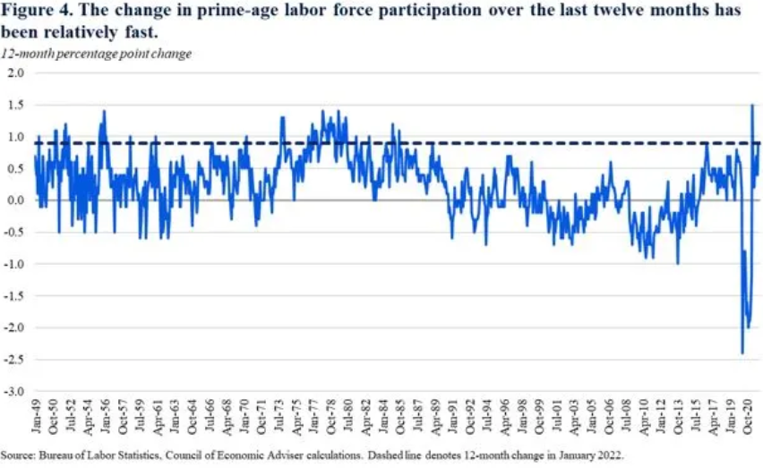
The above graph is an example of labor force participation. According to the Bureau of Labor Statistics, the labor force participation rate was 62.2% in January, up from 61.4% percent a year ago. The “prime age” (25 to 54) labor force participation rate was 82% up from 81.1% percent a year ago. The Council of Economic Advisers prefers the participation rate because it is less impacted by changes in educational enrollment and the natural slowdown in labor force participation caused by the aging of the population and retirements. As we can see in the graph back in the day the labor force was above the target line and it got below the line from the year 1990 till 2020.
Overall, a Benchmark graph is a powerful tool in data visualization for businesses and other organizations to gain better performance, tracking data, and identify areas for improvement and development. This activity cleared a concept of mine towards benchmarking and how it is used at a bigger stage. Getting the knowledge of this graph will help me in every sector of economic fields.
Reference
https://www.whitehouse.gov/cea/written-materials/2022/02/04/the-employment-situation-in-january-2/
Benchmark Analyses
By using infographic tools, benchmark analyses are presented in a variety of visual formats. In accordance with the Robert Wood Johnson Foundation’s considerations for selecting a benchmark for health equity. In other words, benchmarking can be used to evaluate health gaps and assess the quality of care to address these disparities. There are advantages and disadvantages when using different approaches to benchmarking health equity. It was concluded that there was no bet method for selecting a benchmark for health equity assessment.
Examining the results of the RAND study reveals how much hospitals are charging private insurers. Two scatter plots are used in New York Times article, to illustrate the most and least expensive hospitals for private insurers, compared to Medicare. In the first scatter plot, the most expensive hospitals are displayed, while in the second plot, the least expensive hospitals are displayed. Among the benchmarks was Michigan, where private sectors are about two and a half times those charged my Medicare. Further details about how prices vary greatly
This is powerful distinction that RAND made to conclude that market forces are not working. This is always important to know and understand, since this involves financial income and it’s everyone’s right to know when they have been taken advantage of. The ability to see these data numerics visually makes all the difference.
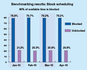
As another example of an infographic benchmark, the ormanager analyst offers benchmarks based on actual data from the sample of hospitals displayed. Comparisons are between two bar and 1 pie charts. As a result these correlations, they can differentiate between hospital productivity, hospital factors, like country (US or Canada), building type, and number of operating rooms. It was found that on average, US hospitals had lower scheduling quality than their Canadian counterparts. The turnaround time for US facilities was 15 minutes longer than expected compared to Canadian facilities.
Final Thoughts
As a result of my research, I have gained a in-depth understanding of infographic benchmark and the many domains and employment that they can be applied to in order to assist with the comparison of analytical data displayed in graphs. These tools have further piqued my interest and I would like to see more visual infographic comparisons in my own research fields and use them to make distinctions and not differences in future research papers.
Benchmark’s in Data
Many different types of data have an underlying benchmark included. A benchmark put simply is just a target or a goal that the organizer wants to meet or exceed. I have worked for multiple organizations who set these goals on a monthly or quarterly level then looked back over them to make predictions for the future. There are multiple different ways we can use benchmarks to visualize our achievements. We will take a look at some of these different visuals and see which ones work the best to portray a message.
The Benchmark Bar Graph
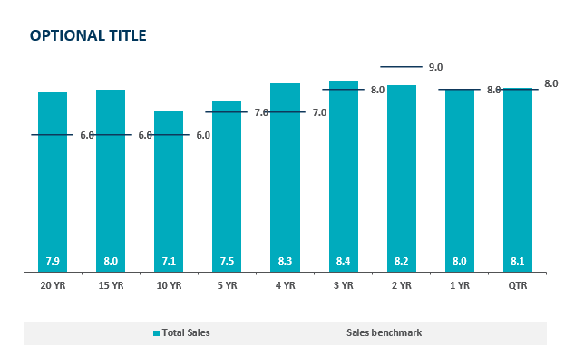
In a bar graph we can compare a value over time very easily but with the addition of a benchmark line we can see which time periods performed the best. Sometimes pure quantity doesn’t tell a whole story. Some months can see higher sales year after year. If we put a benchmark line in that month it is easier to see how it is really performing. This idea is highlighted in the above chart, the 20 year sales have exceeded goals by 2% which is great but as we get closer to the 2 year mark we see a miss of the goal yet a higher total sales. The 2 year mark obviously has a higher target to meet based on history and other factors. Growing benchmarks must mean the company is growing because they are achieving more and more goals.
Benchmark Line Graph
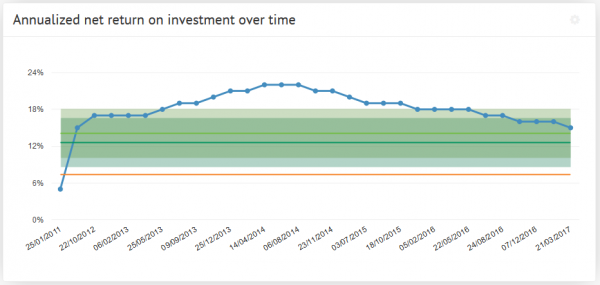
Here we see a different type of measuring a benchmark over time. The benchmark line here is the green portion and we can observe either exceeding expectations or shortcomings based on the blue line above. The benchmark is set steady at 18% and does not change. This means their goals do not change based on history or trends. Without changing goals how would this example grow. If we are trying to meet goals that always stay the same we’ll never see long term growth. Pushing goals up and up based on success will lead to meeting higher goals and higher growth.
Comparing Multiple Line Graphs
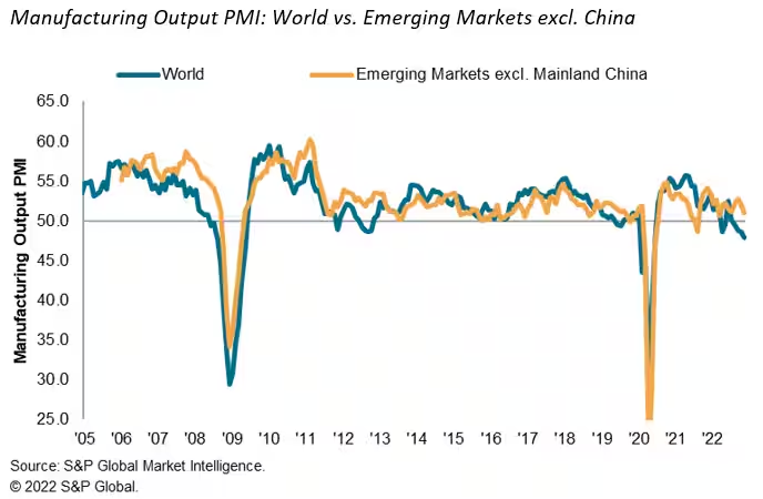
Here we have a graph of the emerging markets and how they stack up against the rest of the world. It measures total manufacturing output over the last 17 years. After a quick glance you don’t come away with much of an impression, this is due to a closely overlapping graph. I think this is a useful graph but it takes some time to really make a judgement on since the two lines are so closely related. I think it would be of more use if we saw it on a monthly level to really get some separation to see where the emerging markets are exceeding the world.
I think after all of these visuals we can understand what a benchmark really consists of. We also saw multiple different uses of them and can probably choose a favorite. I think the easiest one to read was the bar graph with clear benchmark lines that made it clear what points fell where in comparison with the benchmark.
Benchmark Comparisons
Some different ways people can show comparisons to a benchmark is through competitive, strategic, & performance. Competitive benchmarking is emphasized as the most effective form of benchmarking for businesses, allowing them to assess their true success by comparing themselves to competitors. It provides insights into industry trends and competitor strategies. To perform competitive benchmarking effectively, companies should establish clear goals and parameters and leverage digital tools for in-depth analysis, going beyond basic benchmarks like revenue and growth to gain a granular view of competitors’ data for more informed decision-making. Strategic benchmarking focuses on learning from industry leaders and best-in-class companies to understand their success and identify areas for improvement in your own business. It involves analyzing their business models and strategies to optimize various aspects of your own organization, such as marketing, online presence, or finances. Mobile app intelligence tools like Similarweb are highlighted as essential for gaining insights into mobile app trends and competitors’ strategies. Performance benchmarking aims to compare profitability and establish ambitious but achievable goals based on quantitative data comparisons, focusing on performance indicators like price, quality, speed, and reliability, ultimately driving continuous improvement.
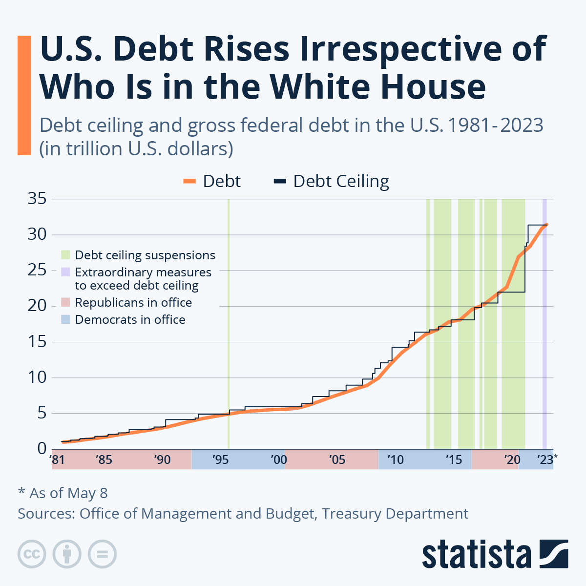
is this graph of the “U.S. Debt Rises Irrespective of Who Is in the White House” the benchmark is the debt. In this graph the numbers highlighted in blue at the bottom represent Democrats in office and red represents Republican. In this graph it shows typically it doesnt matter which group is in office because the debt rises no matter what.
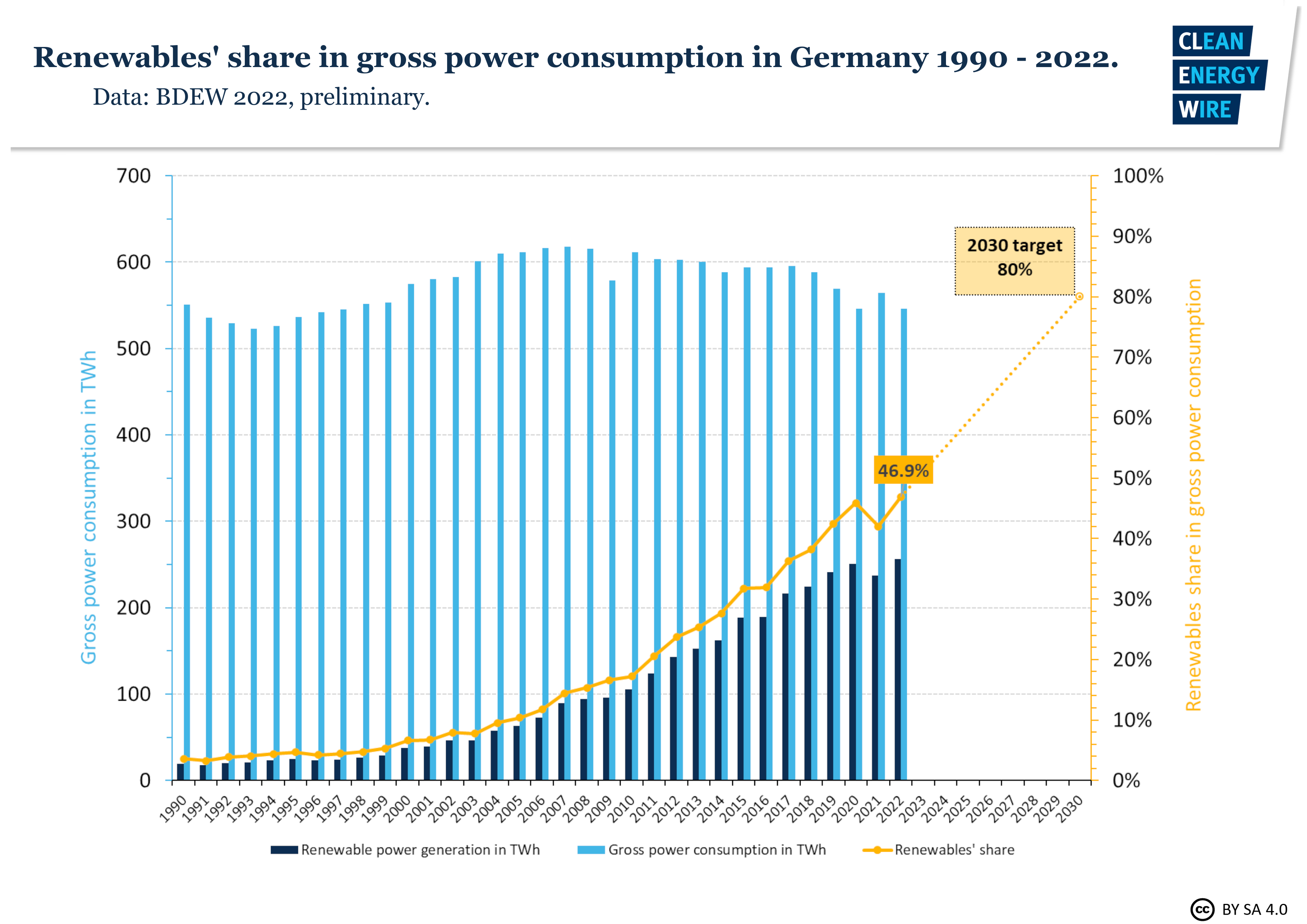
In this graph it shows Germanys power consumption throughout the years. The benchmark line is the yellow line indicating renewable shares. Germany is predicting that it will raise from 50% to 80% in the next 10 years.
sources
https://www.statista.com/chart/1505/americas-debt-ceiling-dilemma/