Lollipop Chart
As we continue to learn throughout the course of this class, there are dozens of ways to display data aside from the typical charts that we are used to seeing. One such example of this is a lollipop chart. A lollipop chart is a great alternative to displaying a significant amount of data that may be too overwhelming to look at and compare in a bar graph due to all of the shapes, shading, and numbers. It can also be helpful with a smaller set of data that may look odd or misplaced in other types of graphs. A lollipop graph – which gets its name due to the fact that it replicates what a lollipop looks like – takes this significant data and displays the same information in a much simpler way due to the design of it. Many people describe it as being a more “minimalistic” graph compared to the typical bar graph and prefer to use it when some data are similar.
A lollipop chart can be created a few different ways, however, the two ways I chose to use started with a scatter plot and a line graph. The scatter plot gives the horizontal lollipop look (due to the way it formats) whereas the line graph creates a vertical lollipop shape, once again due to the way it formats. Using Excel, I decided to create both types of graphs using the same data to compare how it looks.

The image above shows the lollipop graph in a horizontal display, while the image below shows the graph in a vertical format. The main difference between the two is accuracy. As we read about in the textbook, the vertical lollipop graph looks “prettier” but is not always as accurate due to the size that the lollipops are made in order to look more “put together”. For this reason, I prefer the horizontal look better as it is easier for me to comprehend, and yes also more challenging to make!
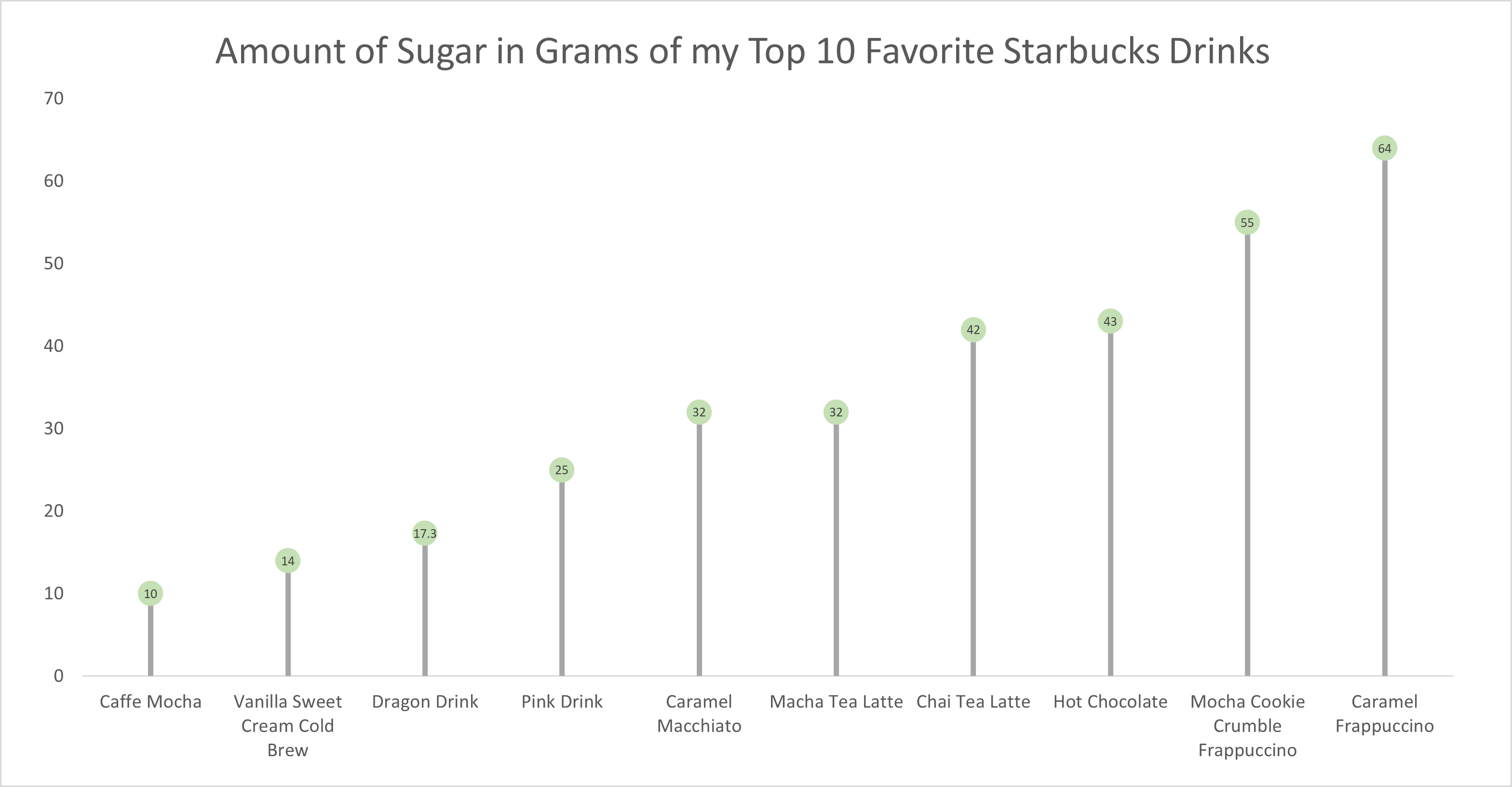
As for the actual data shown in each graph, I chose to create my own data based on research of the grams of sugar in my top ten favorite Starbucks drinks. The reason I chose to do this was because I am constantly getting Starbucks and attempting to “hop on the trends” of newer drinks, so I wanted to inform not only myself, but other people who like these popular drinks about how much sugar is in them. The grams of sugar are based on their “grande” size, although I typically end up getting a “venti”. As you can tell in the chart, which goes in order from least grams of sugar to most grams of sugar, nearly every drink with the exception of a few, has more than twenty grams of sugar in one of the smallest sizes available. Once again, this information presented is very eye-opening and something to be aware of. I ultimately think a lollipop chart was an easy and effective way to present this data because it is easy to get the important information and comparisons without getting overwhelmed.
Lollipop Chart
As data is becoming both increasingly important and more widely used/applied, it only makes sense that simultaneously there would be a growing number of fields working around such factors. This can become an issue for visualization artists, as with an increasing complexity and density to existing bases and collection methods, too much data may often be readily available than immediately necessary for an infographic. Sometimes many words may be conveyed within the motion or placement of the simplest of figures. One clever chart that may assist with certain large data pools, is a lollipop chart.
A lollipop chart is an excellent way to effectively illustrate a pattern to an audience when this pattern is hidden within a lengthy or complex dataset. As a lollipop chart is a variant of a bar chart with less visual clutter, these graphs are best used to display a distribution of values.
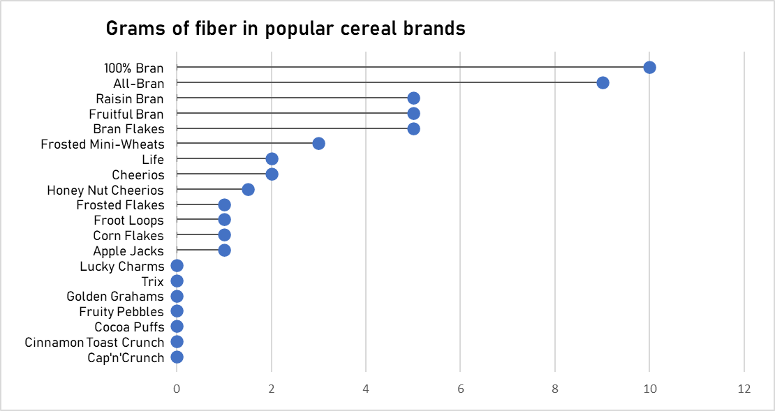
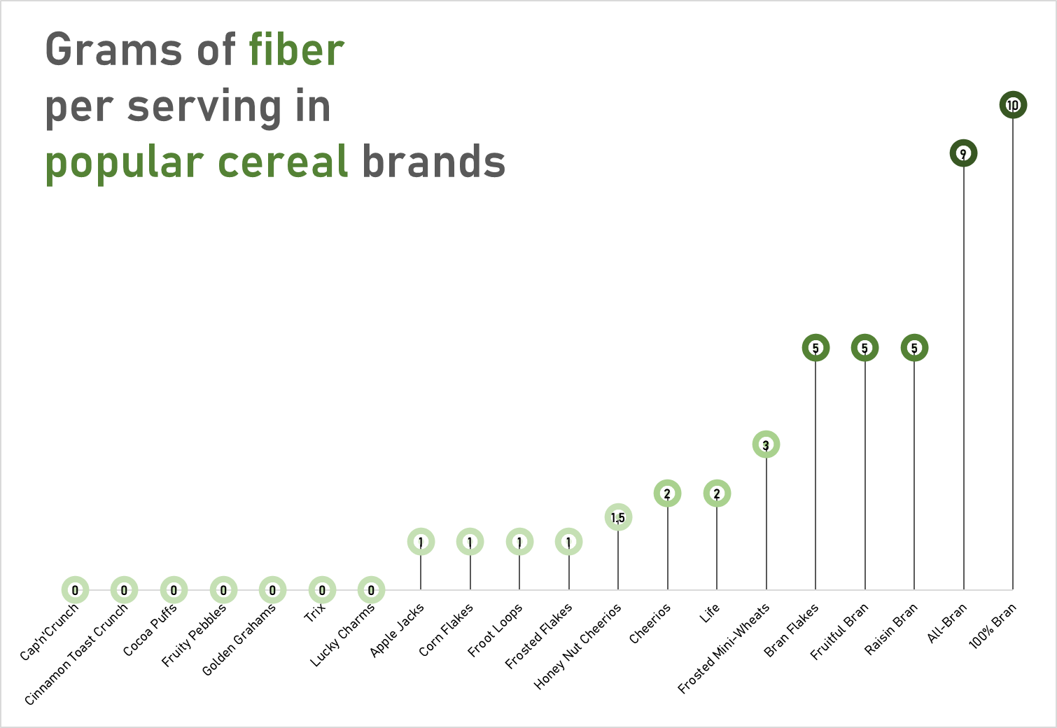
The data used to construct these charts was obtained from the “80 Cereals” dataset on kaggle.com
These charts would most likely visually fit a dataset with a more broadened distribution of values. However, with these two charts you can quickly see how a lollipop graph can demonstrate a concept with plenty of data to be easily deciphered. These graphs that I have created may be useful for someone who is looking to adjust their fiber intake, as I have separated the fiber content per serving in grams across popular cereal brands. However, the second graph is most effective, as with making use of the color spectrum of light to dark with increasing fiber content, the human eye may quickly identify significant regions of the graph.
Lollipop Chart
There are many forms in which data can be presented, such as a column chart or a bar chart, but what happens when there is a wide range of percentage rates, such as 90%? It is often the case that data can be visually distasteful when it is aggressive or overstimulating, and this is when the Lollipop chart is recommended and is visually pleasing. An axis is connected to a dot when the value sits on a stick.
By Analytics Vidhya, Lollipop charts are used for comparing different categories within a category. As a result of this chart, a well-organized comparison between classes can be seen. Here is an example of how a Lollipop chart can look. You can see the unique visualization that differentiates it from other charts by the small circles above the lines. When examining relationships, distributions, etc., this type of chart may not be the best option. Also, it does not work with all data as I discovered when I searched for a data set that would look visually appealing with a Lollipop chart. If you do not have the correct data, your Lollipop chart will not be accurate.
With data from the United States Census, I constructed a Lollipop chart that measured the effectiveness of changing business conditions during COVID-19 using the Small Business Pulse Survey. I selected 10 cities and calculated the percentage of businesses affected by the Corona VIrus Pandemic. As you can see in this visualization below, with the 10 cities I selected, I created a Lollipop chart. Choosing more cities in the data center would have made labeling more complex. I would have had to play around with the numbers and ensure they matched the bar that represented them. As well, it is also imperative to consider what tool you are using to create this chart. Excel will you a more complex method than if you go to a reputable website and follow the steps there.
Lollipop Graphs
By Shaun Sneddon
Unveiling the Lollipop Chart: A Sweet Way to Visualize Data
In the world of data visualization, a lollipop chart stands out as a charming and efficient tool. It combines the best of bar charts and scatter plots to make your data pop. In this post, we’ll explore what a lollipop chart is, when you should use it, and we’ll create one together.
What’s a Lollipop Chart?
Imagine a vertical line (the “stick”) with data points as markers (the “candies”). This is a lollipop chart! It’s ideal for showcasing a handful of data points, ranking items, highlighting outliers, and tracking changes.
When to Use Lollipop Charts
Few Data Points: If you have a small set of data to compare, a lollipop chart simplifies it elegantly.
Outliers: It’s great at spotting unusual data points that stand out.
Rankings: Show rankings or positions in a dataset clearly.
Changes Over Time: Use it to track how data changes over time or across categories.
Data Distributions: Combine it with other charts to display data distributions.
Creating a Lollipop Chart
For our example, let’s track the quarterly sales of three products – A, B, and C.
Input Data: Use your preferred data tool, like Excel or Google Sheets. Create columns for “Product” and “Sales.”
Design the Chart: In your tool, use a bar chart or scatter plot. Make the data points circular (or use candies).
Customize: Personalize your chart by adding labels, changing colors, and adjusting the size.
Titles and Legends: Don’t forget to label your chart correctly.
Conclusion
Lollipop charts are a delightful way to make data more appealing and understandable. They shine when you want to highlight key points, compare a small dataset, or reveal outliers. So, spice up your data visualization and give lollipop charts a whirl!
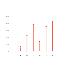
Lollipop Chart
This blog is all about how lollipop charts should be used and how they effectively visualize data. A lollipop chart is typically used to compare two or more categories or variables. It consists of a horizontal axis and vertical lines that represent the values of each category or variable. Lollipop charts show changes over time since charts can be used to visualize changes in data over time. Lollipop chart highlighting differences between categories or variables. It is also used for presenting ranking or ordering. For instance, I made a lollipop chart in Excel based on ranking.
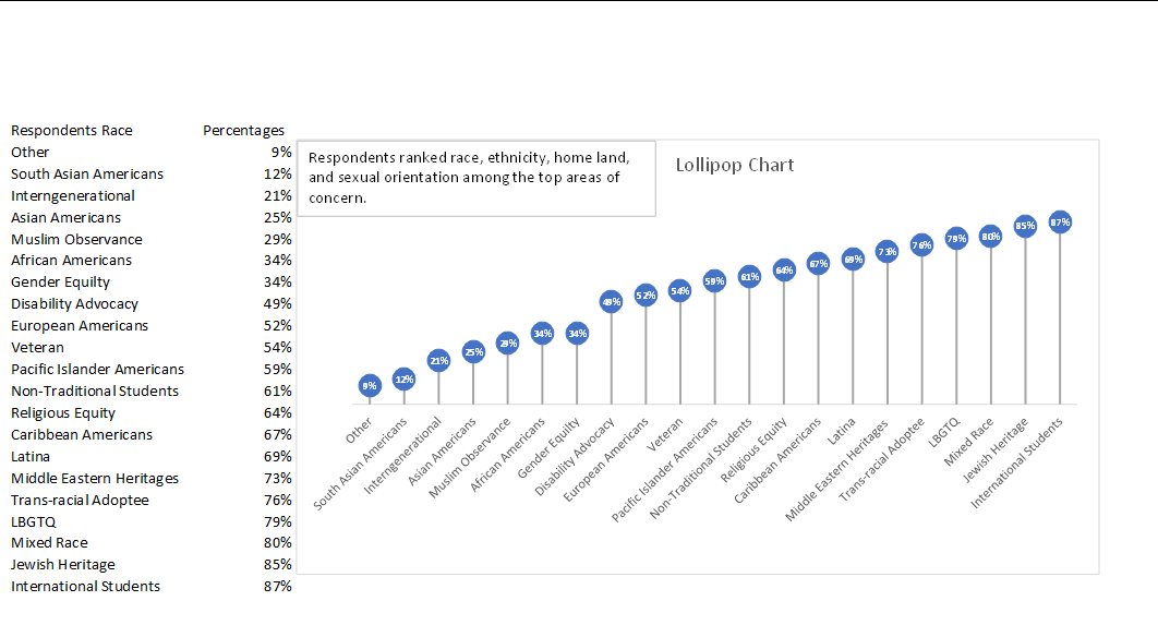
This lollipop chart is about respondents ranked race, ethnicity, homeland, and sexual orientation among the top areas of concern. You can see how each lollipop is labeled with data according to rank. Overall, lollipop charts are suitable for situations where you want to compare, rank, or highlight differences between categories or variables. Lollipop charts usually attract the reader because of the patterns within the data.
Reference
I chose this data from Evergreen Data.
Lollipop Chart
Lollipop charts are flexible tools for comparing data, ranking items, showing distributions, tracking changes, and highlighting outliers. They are great for revealing the order and values of data points. Lollipop charts work well when you want to focus on individual data points or unusual values, serving as a handy alternative to regular bar charts with clear data labels. Lollipop charts should be used when you want to emphasize individual data points or highlight specific values in a clear and simple manner, they are especially effective for showing comparisons between a small number of data points.
Here are some other examples of charts –

For the lollipop chart I constructed, I choose to use excell since its the eastest and most effectice tool I know how to access and use. For the data set I used a website called https://generatedata.com/, this is where I can get all my random data sets from.

Benchmark Comparisons
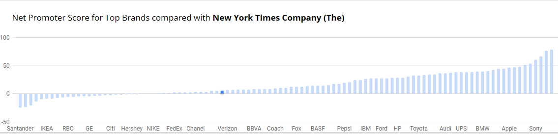
Benchmarks provide context, allows for assessment of performance, helps identify outliers within data and can be used to set goals and targets. Decision-making benefits, more informed choices, performance improvements and communication become effective with benchmark comparisons. There is quality assurance, allows for competitive analysis and even assessing effectiveness with programs and policy. You are able to conclude with meaningful insights. The example below is from NY Times and the Net Promoter Score for Top Brands. It’s a simple bar graph with minimal color. Net Promotor Score (NPS) is a customer loyalty metric that measures a customer’s willingness to return for another purchase/service but make recommendations as well. This can increase a company’s revenue. Scores higher than 0 are typically good and above 50 is excellent. The bar graph has list of companies on the y-axis with the scores on the x-axis
Benchmark Comparisons
Data visualizations often are made through comparison of values and the best way to do that is to include a reference point to evaluate data. Based on where the benchmark is located the viewer can analyze if it is above or below that point. This can help provide context to the data or it can be used to mark goals in data. In data visualization, it is important to have these indicators so that the information being presented has meaning.

The data above was pulled from an article uploaded to The New York Times called, “Where’s All the Antarctic Sea Ice? Annual Peak Is the Lowest Ever Recorded” by Delger Erdenesanaa and Leanne Abraham. The authors report that the annual peak of Antarctic sea ice has reached its lowest recorded levels. This decline in sea ice extent raises concerns about the implications of climate change for the polar region. What they did to visualize this data was to add in a “benchmark” shown as the dotted line to represent the average from 1979-2010. You can clearly see that where we are in 2023 (shown in red) that the Antarctic sea ice drops below the benchmark by an extensive amount. Based on the data shown, they are able to assess where the level should be and can make the achievement goal to be above that targeted area. https://www.nytimes.com/2023/10/04/climate/antarctic-sea-ice-record-low.html
Benchmarking Graphs
Benchmarking your data visualizations is an excellent way to convey an important
factor in your graphs, what the numbers should look like, and how they fare
in comparison to that number. Helpful in showing outliers like how something is over-
or under-performing, or showing how perfect fit a value is towards some specified goal
benchmarks are a powerful tool that can be added to most graphs.
To show you an example, the following graph tracks goods and services pre-
and post-pandemic.
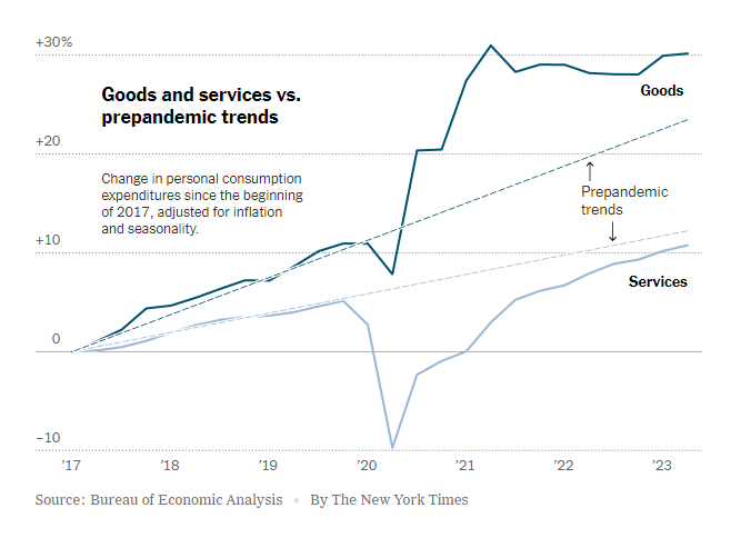
https://www.nytimes.com/2023/07/27/business/economy/us-economy-gdp-q2.html
It is easy to see the strengths of the trend lines as a way to measure the expected
values for the services and goods and how they compare to the trendlines before and
after the pandemic.
The following graph makes use of a perfectly horizontal benchmark line. This makes
reading the graph even easier than trend lines as being able to reference the single
value of the benchmark reduces user effort.
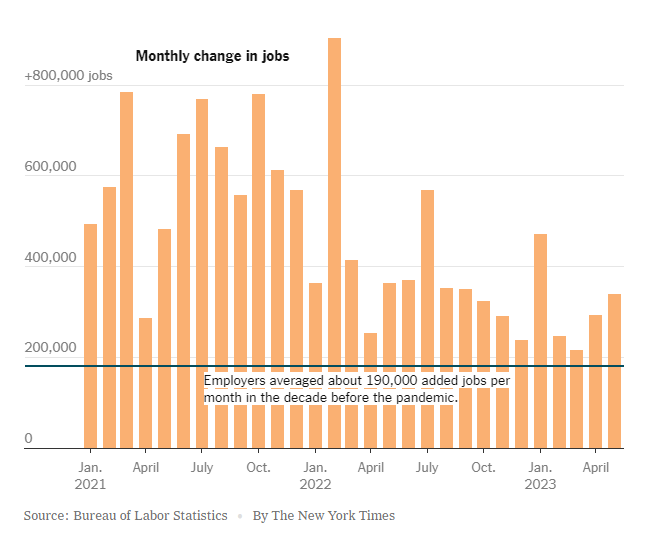
https://www.nytimes.com/2023/06/08/business/economy/us-economy-inflation-fed.html
The anomaly of the employment boom following the pandemic is immediately apparent with this example, highlighting the clarity that benchmarking provides.
Finally, this benchmark is just an average of the values in the graph. While not as
easy to interpret as the other methods, this one is a near-universal improvement that
can be made to any graph.
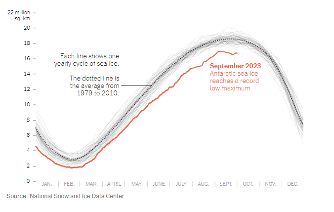
https://www.nytimes.com/2023/10/04/climate/antarctic-sea-ice-record-low.html?searchResultPosition=4
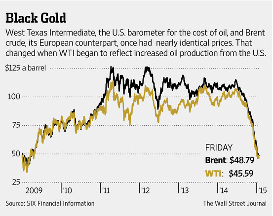
Benchmark Comparisons
By Ryan Metch
Using visualizations such as benchmark graphs allows us to better understand different types of data. The definition of a benchmark graph according to google is a visual tool that shows how fractions compare to a whole on a number line. Going off this graph from the Wall Street Journal, we can see how prices of European and American oil compare to one another. We can clearly see when changes occur on this graph, which is why a benchmark graph is a great tool to display this type of data.