Pie charts are used to show portions of a whole. An amount is divided into categories by percentage and the slice sizes are relative to the percentage of the category. Pie charts are great to use in showing the results of polls if there are a limited number of categories. If you have too many categories the chart becomes difficult to read. Below I have created two pie charts based on data from Pew Research regarding Americans’ views on money in politics.
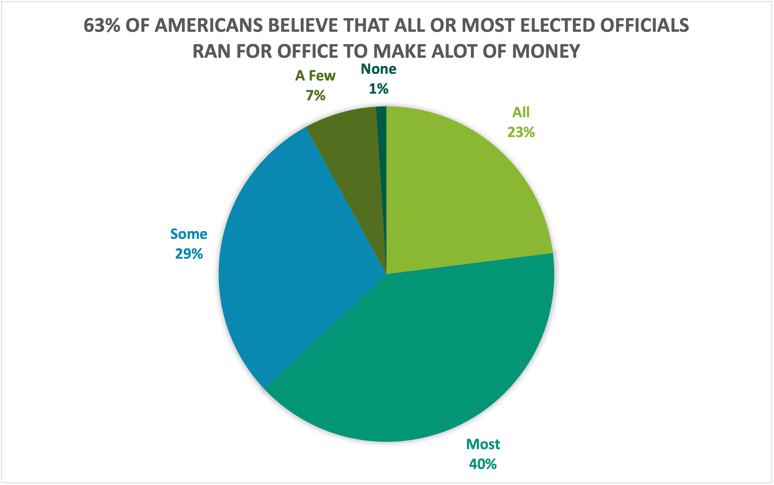
The above chart highlights what a higher proportion of respondents believe while the chart below highlights what a lower proportion of respondents believe. Choosing the right chart but also a good title for the chart is key for letting viewers know what information is important.
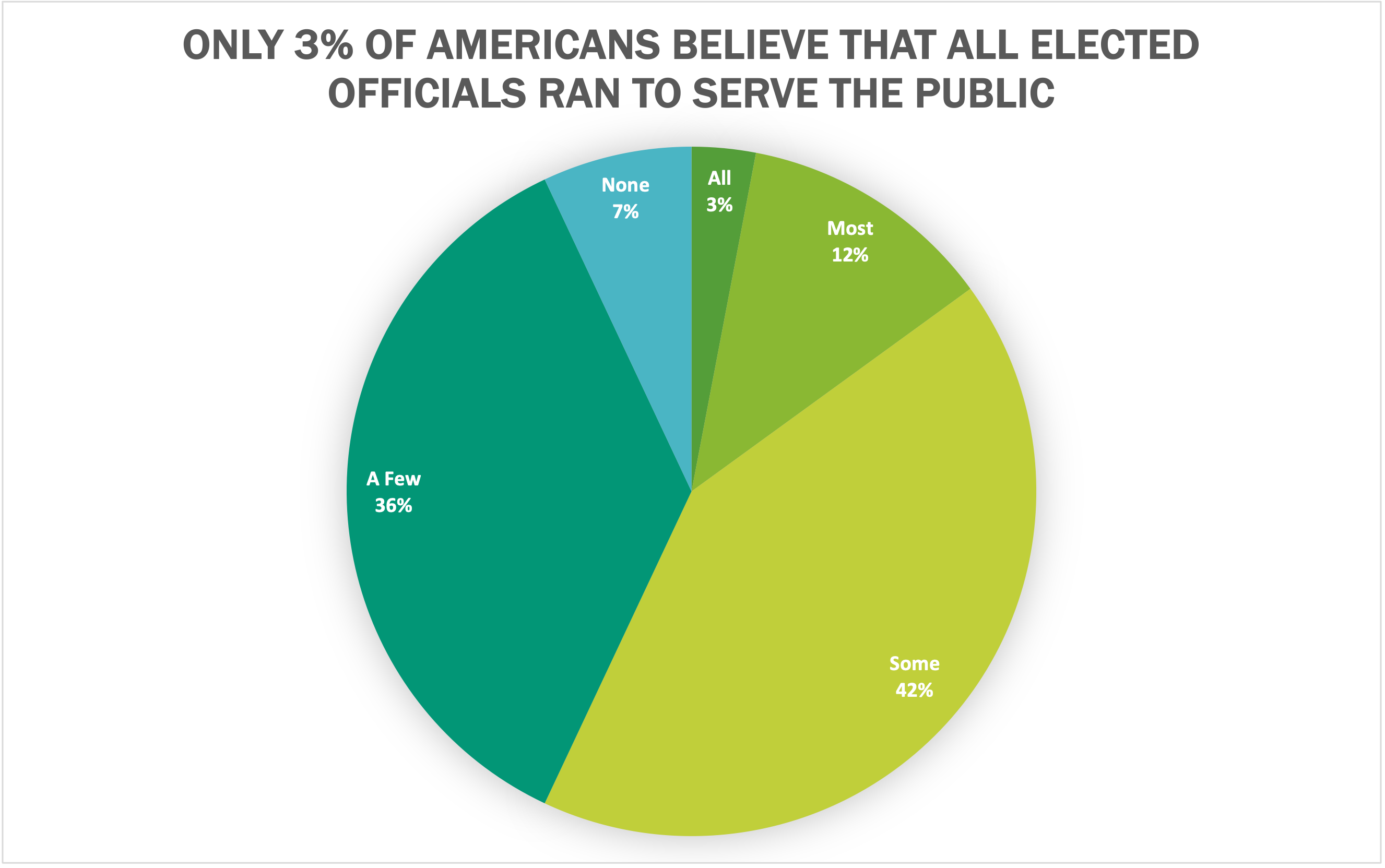
I believe that both of these datasets are great use cases for pie charts because they show what portion of respondents. Other good uses of pie charts is in finance. Household budgets are well represented by pie charts. Pie charts are also a great tool to use when visualizing portfolio allocations. One of the most important things to avoid with pie charts is using incompatible data. If the proportions do not sum to 100%, the data is not a good use case for a pie chart. There are many different options for visualizations and a pie chart is great for a simple and quick way to represent proportional data effectively to viewers.